Resources
2016 has been a year of re-branding. With the start of 2017 we are here with the biggest logo redesign of the year!
Inspired by Yellow Media Labs.
2016 was the year of rebranding. Greatest brands like Uber, Instagram, NatWest, and Deliveroo had rebrand or upgrades their logos. 2017 was the same like the earlier year. This year organizations keep on following the pattern of simplified logos which can be seen effectively on mobile screens also. These logos are normally vector formed, with bold colors and a neat typeface that can be utilized overall digital and print platforms.
Ahmedabad based design studio Yellow Media Labs has designed simplest images to showcase this year’s biggest rebrandings. Check out them and tell us your favorites.
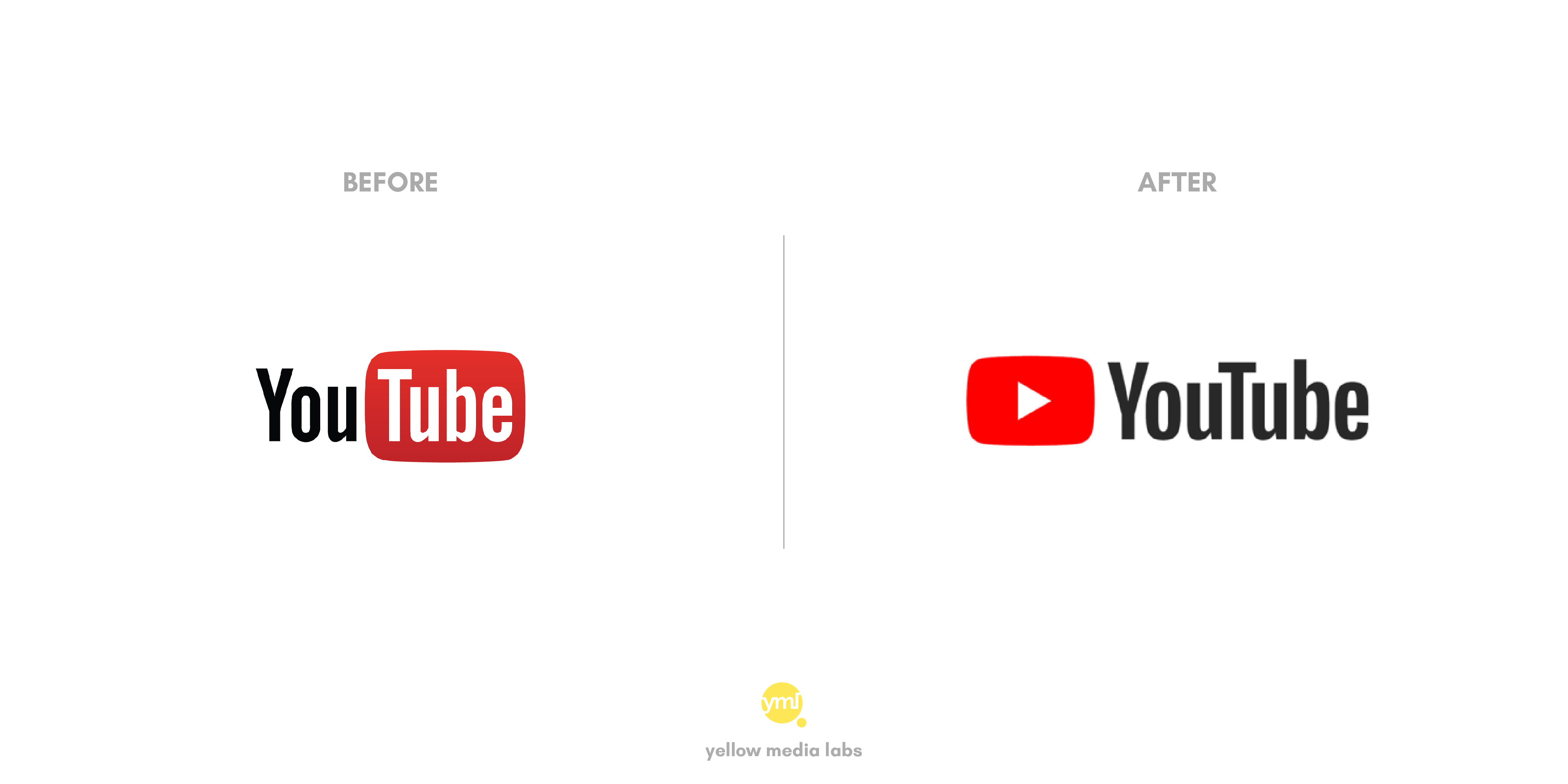
After 12 long years, YouTube has finally refreshed their logo. They removed the red “tube” which surround the word and moved it to the front of the word. Now a simple red button with Play icon is there to fulfill the purpose.
With the change in position, the logo also got a new typeface, color palette and changes to its desktop and mobile app.
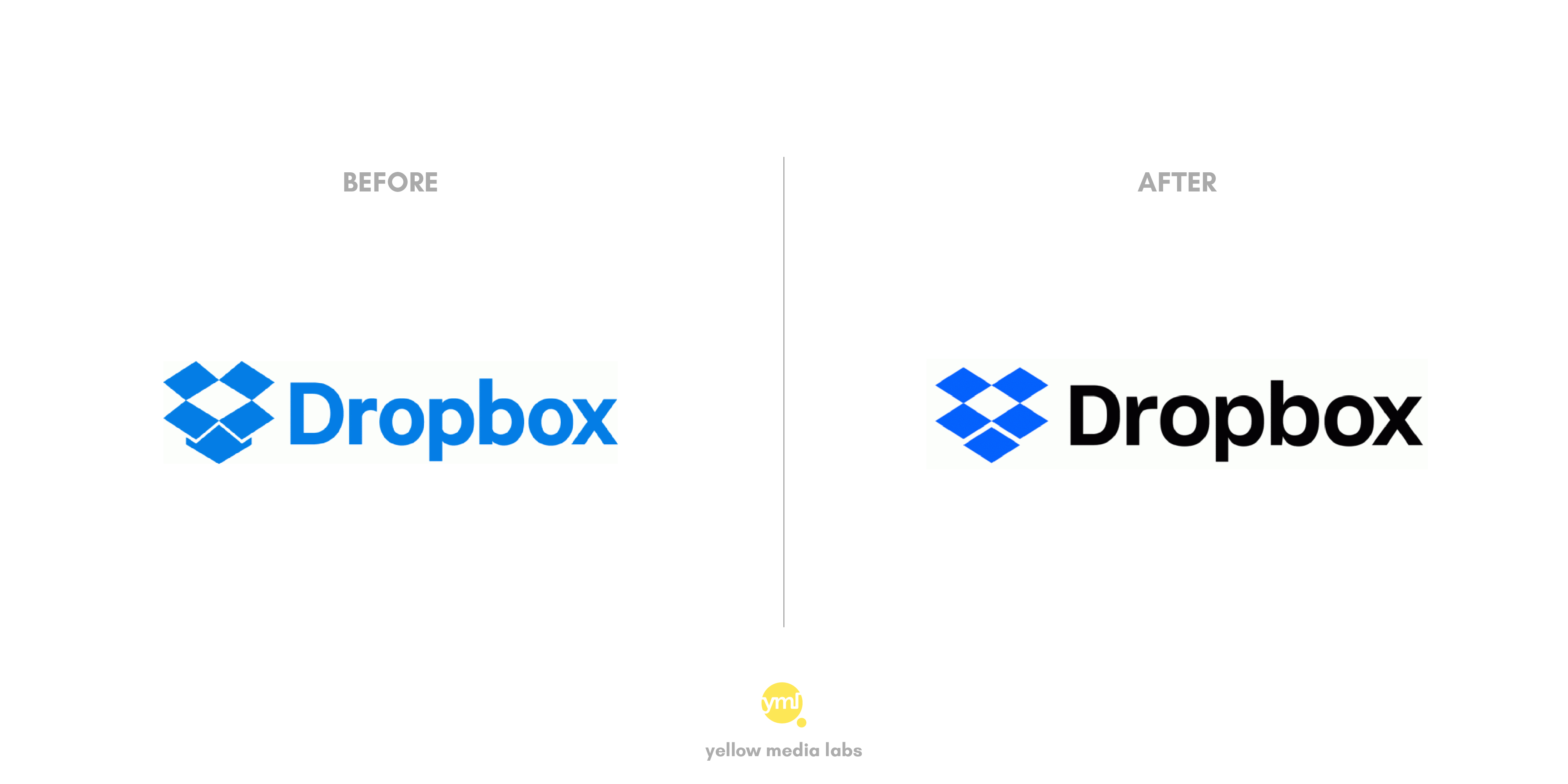
The online storage service provider Dropbox has also undergone logo design changes. With the adjustment in typeface and color of text, Dropbox has put a collection of surfaces instead of a clear box in front.
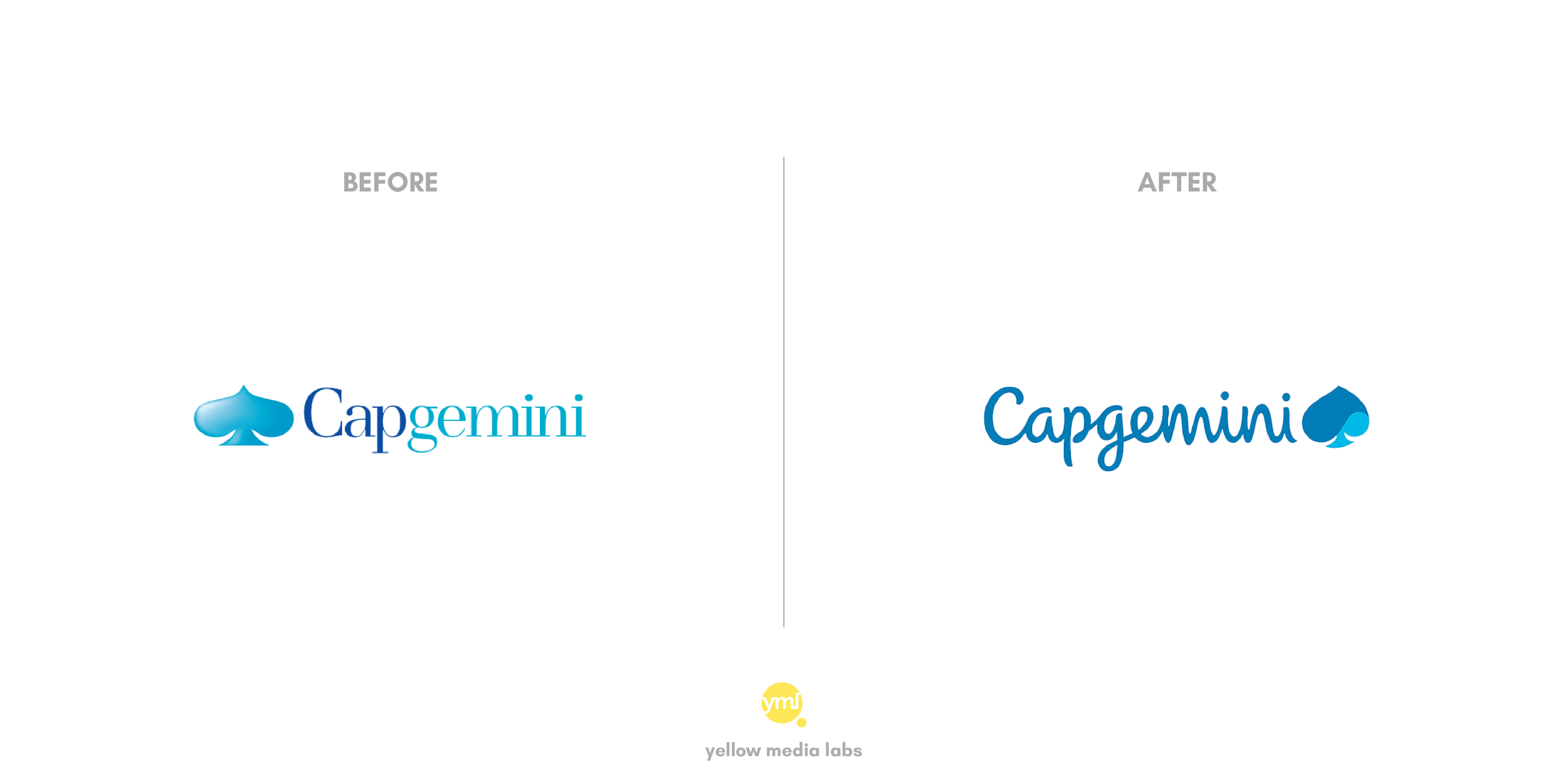
Capgemini rebrands their identity after 13 years with the unveiling of a new logo. As indicated by the organization, new brand personality utilizes three principal differentiators to mirror Capgemini’s novel character. These three center columns are dynamism, accuracy, and individuals.
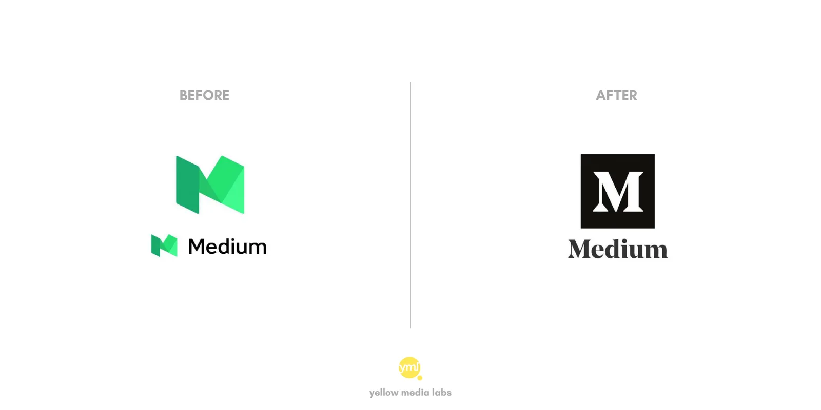
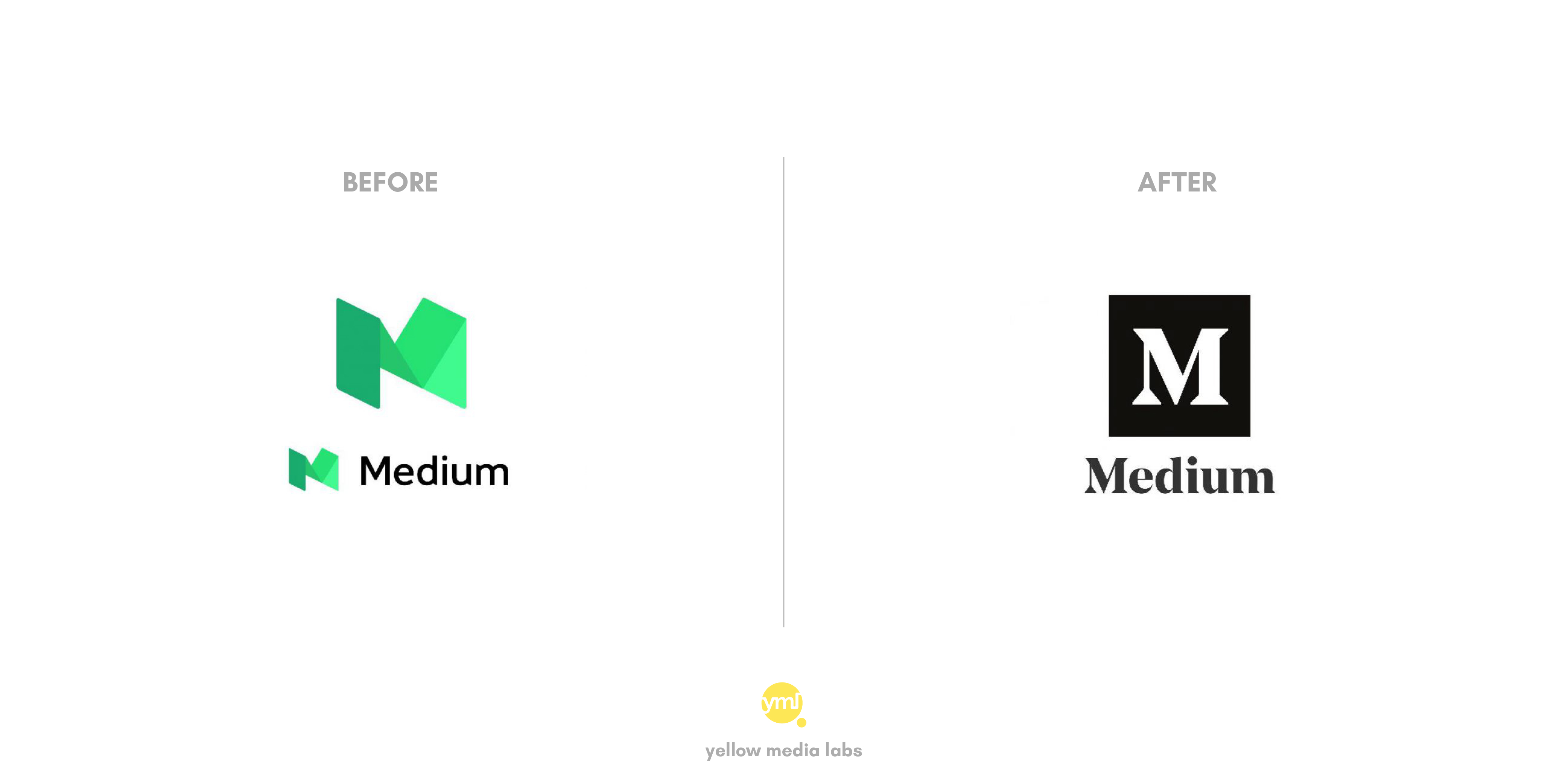
The online publishing platform has again replaced the logo it introduced in 2015. They unveiled a new logo and wordmark to replace the colorful, three-dimensional logo design it used earlier. The new highly contrasting logo is an unexpected change that gets back to the first look of the site from 2012 through to 2015.
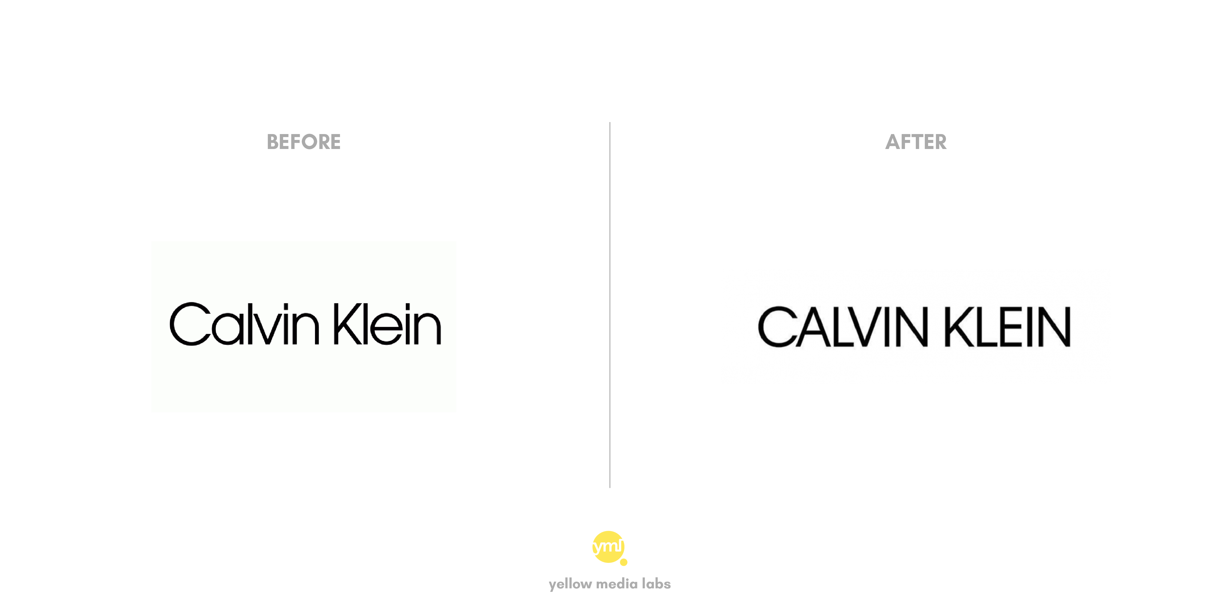
This year in February, Calvin Klein released their new logo which is not too far from the previous logo. With all letters in capitals, it aims to easy transform across digital platforms.
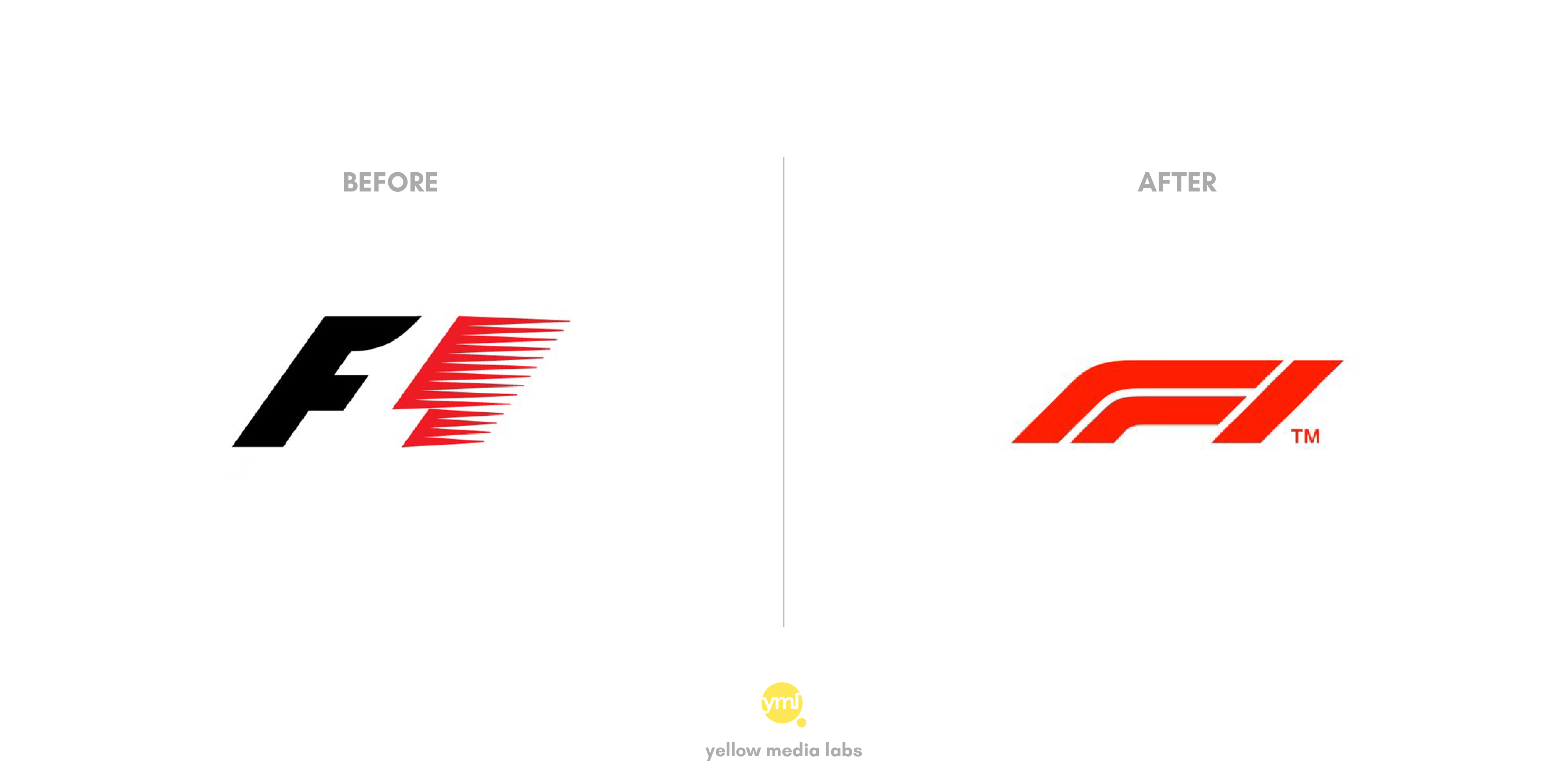
This year Formula 1 has also redesigned their logo first time in 23 years. The new logo is Designed by Wieden+Kennedy in London and drove by its official inventive chief of substance and plan Richard Turley. Logo echoes the shape of a Formula 1 car — flat and low to the ground with a suggestion of speed.
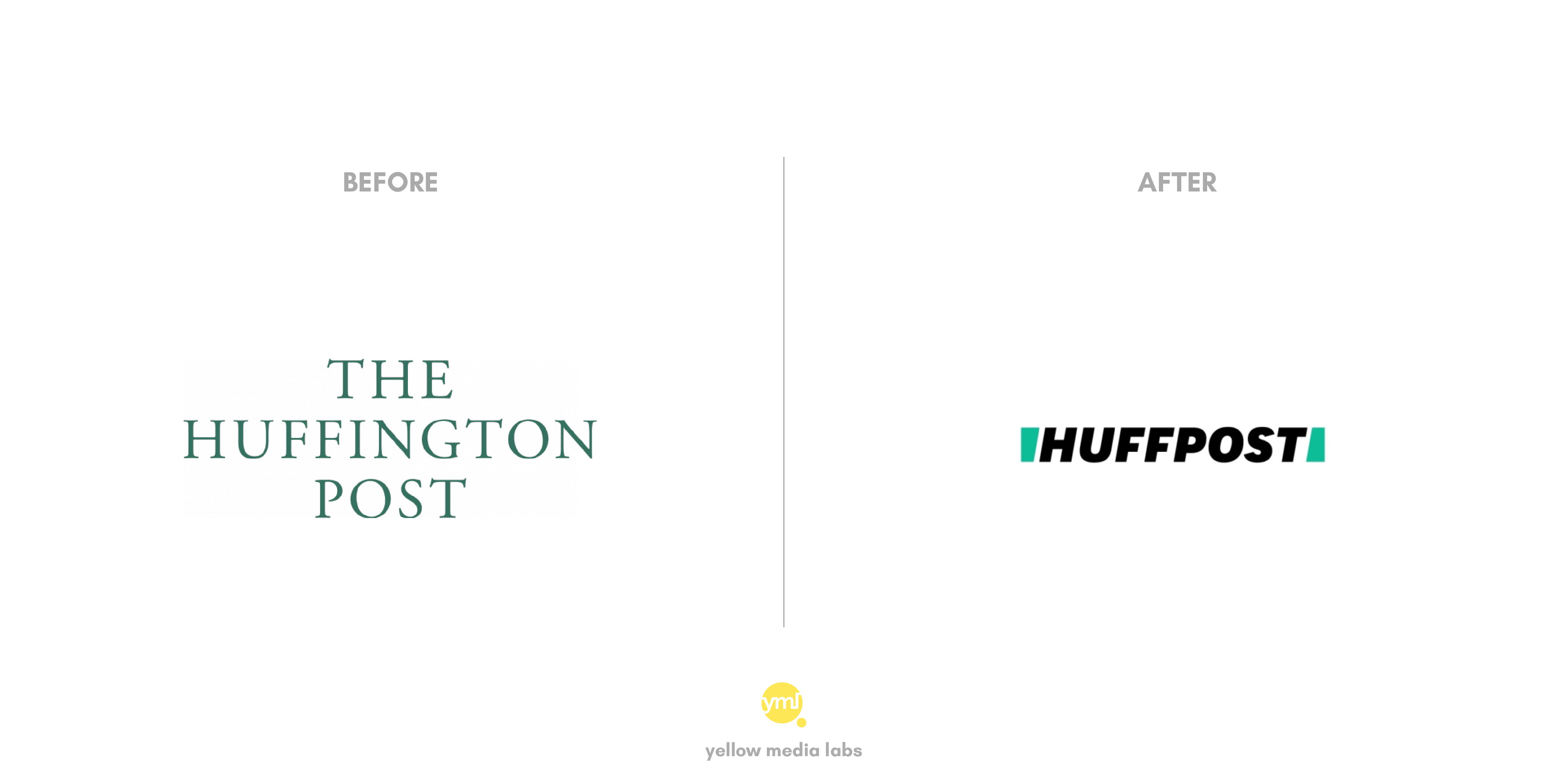
With the change in leadership comes rebranding in a logo. 12-year-old media startup Huffspot also re-brand itself this year. The new logo is surrounded by two green slices that set up together frame “a road, a slash, an abstract H,” as per the organization.
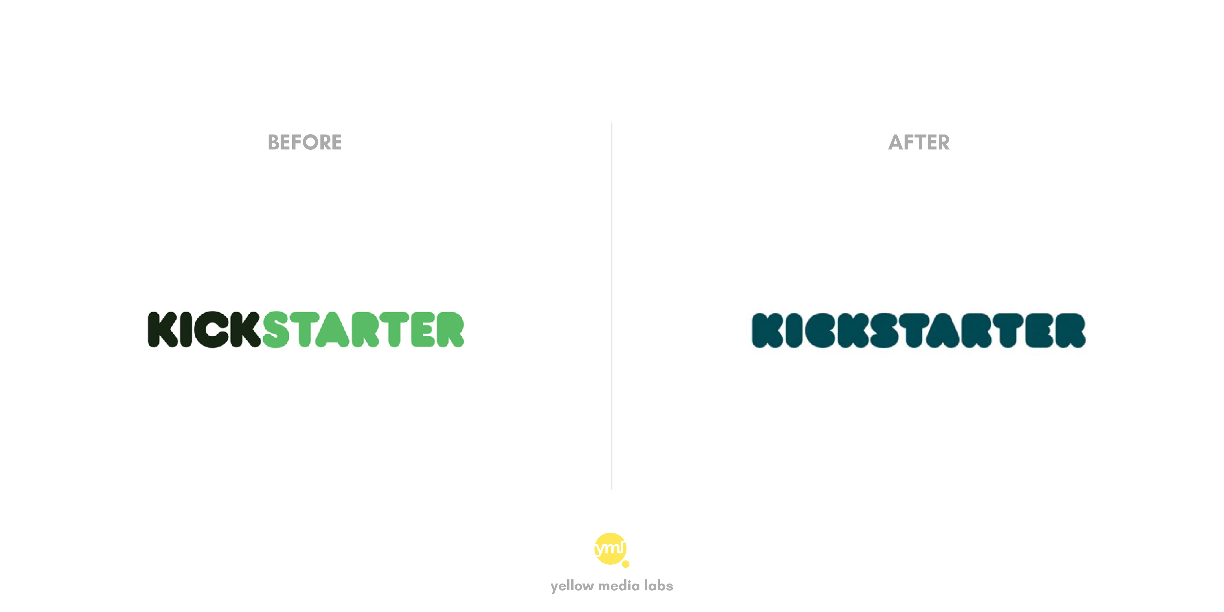
The funding platform for creative projects Kickstarter has undergone a change in color palette and typeface for its logo. There are two versions of small and large size logo. For small size, there is only letter ‘K’ in a new typeface.
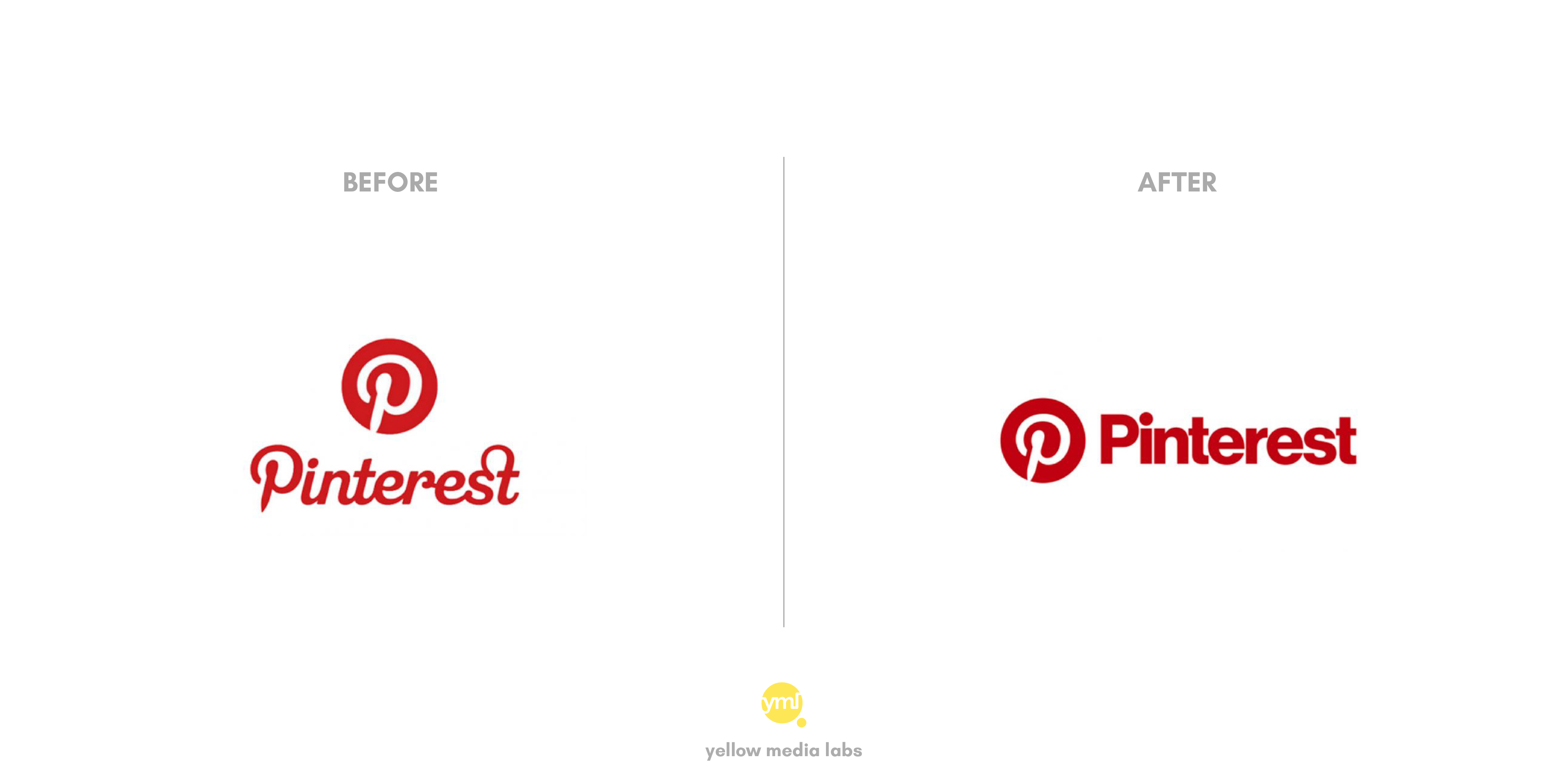
With a slight change in color palette, it looks like that Pinterest is following other social platforms by putting bold typeface. Now scripted P will also accompany words side by side instead of top.
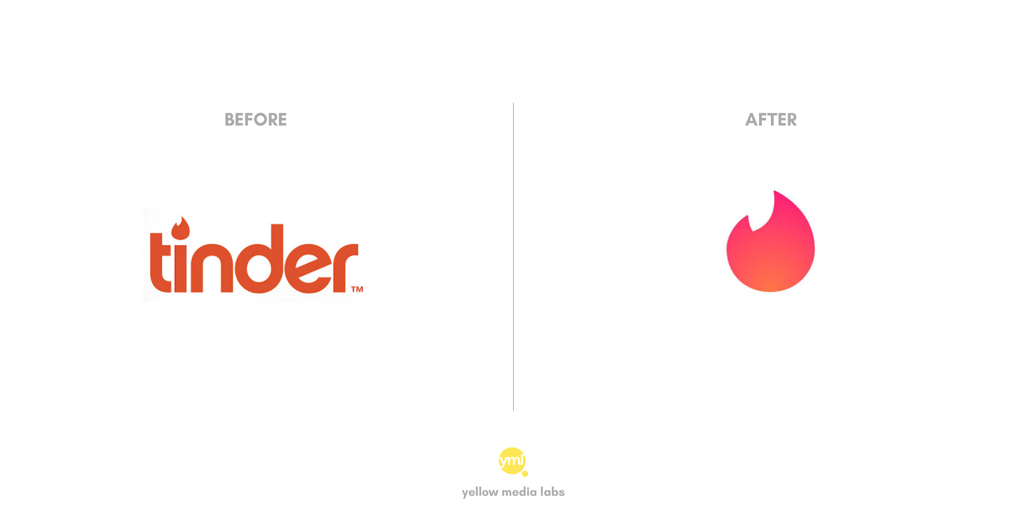
The location-based dating app Tinder has launched a new logo that gives typography the boot. In spite of the fact that the old logo spotted it’s ‘I’ with a form of the fire logo, the new design making only flame icon its priority. With the change in color pallet, they also use gradient color trend in a flame icon.
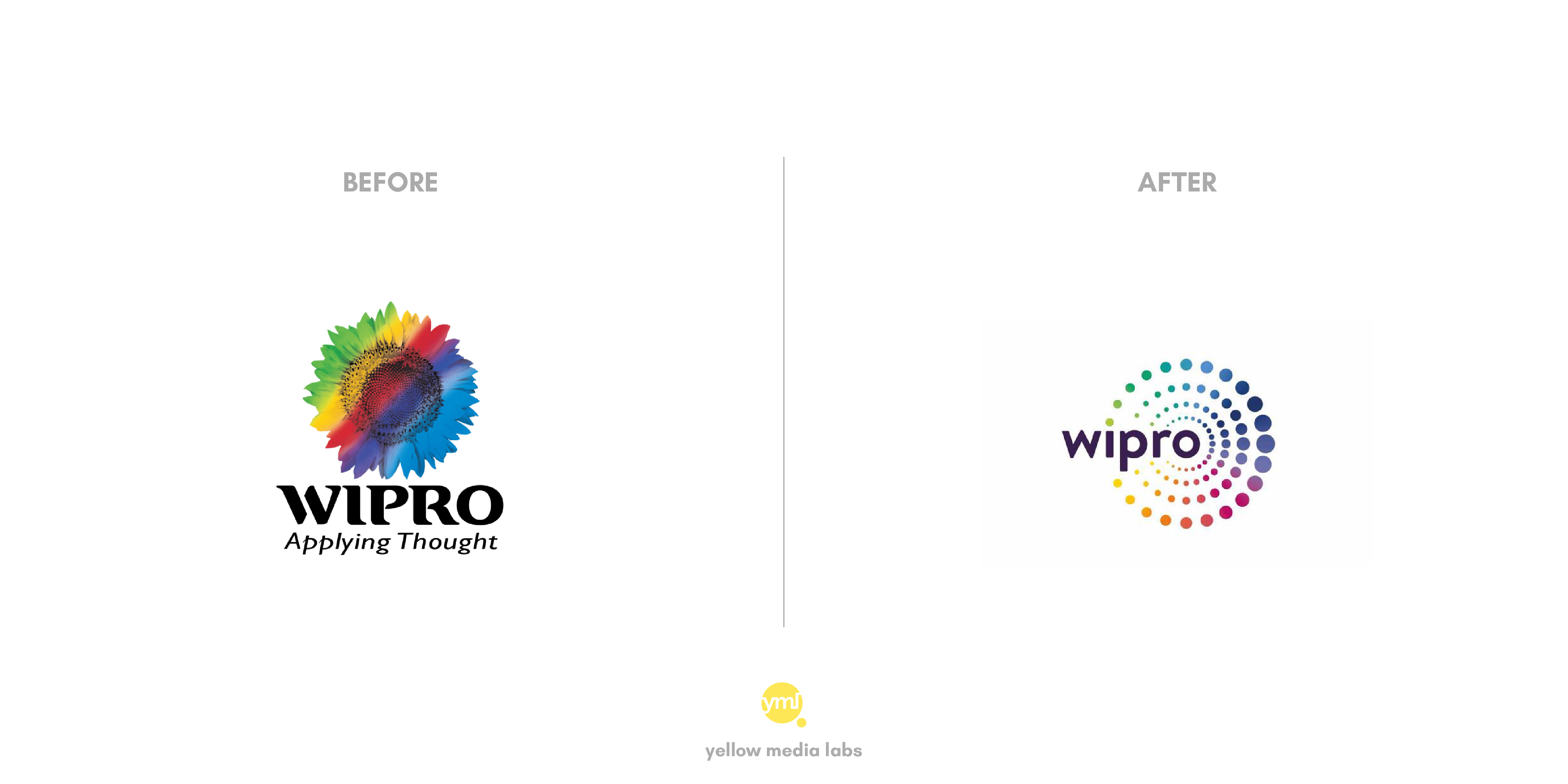
India’s third-largest IT firm Wipro has revamped its logo after almost two decades. The new logo, which replaces the multi-colored sunflower, comprises dots, which Wipro says, represent the way it “connects the dots” for its clients. On rebranding, Wipro chairman Aziz Premji quoted “Our brand identity is a visual expression of what we do and mean, for our clients… Our re-articulated values connect and resonate deeply with the new, vibrant, brand identity”.
In the Era of AI many brands updating their brand identity with new logos whether created by AI powered online tools like designhill logo maker or by professional designers, brands want their right message to be delivered to their audience.
Here’s a quick video reel showing all these rebrandings.
We are extremely thankful to Yellow Media Labs for sharing this amazing post. You can follow them on Facebook, Instagram, and Twitter.