


Resources
Here’s your guide to 12 types of icon styles, and tips for using them effectively in websites and mobile apps.
Icons styles make a big part of visual content – it works on various interfaces to communicate ideas, objects or actions. Not only does it amp up the overall design, but it can give better clarity, readability and personality for the end user when navigating websites, or understanding items such as signages.
After all, visual communication has been around since the stone age, with cave art.
Now, we come across icons on the daily – on roadside sign boards and even signages inside shopping malls. On top of that, icons are great for amplifying the overall messaging visually to supplement or reinforce content. It is especially useful for explaining steps, or even as a way to show off a brand’s identity.
Here, we break down 12 popular types of icons that you can explore with design.
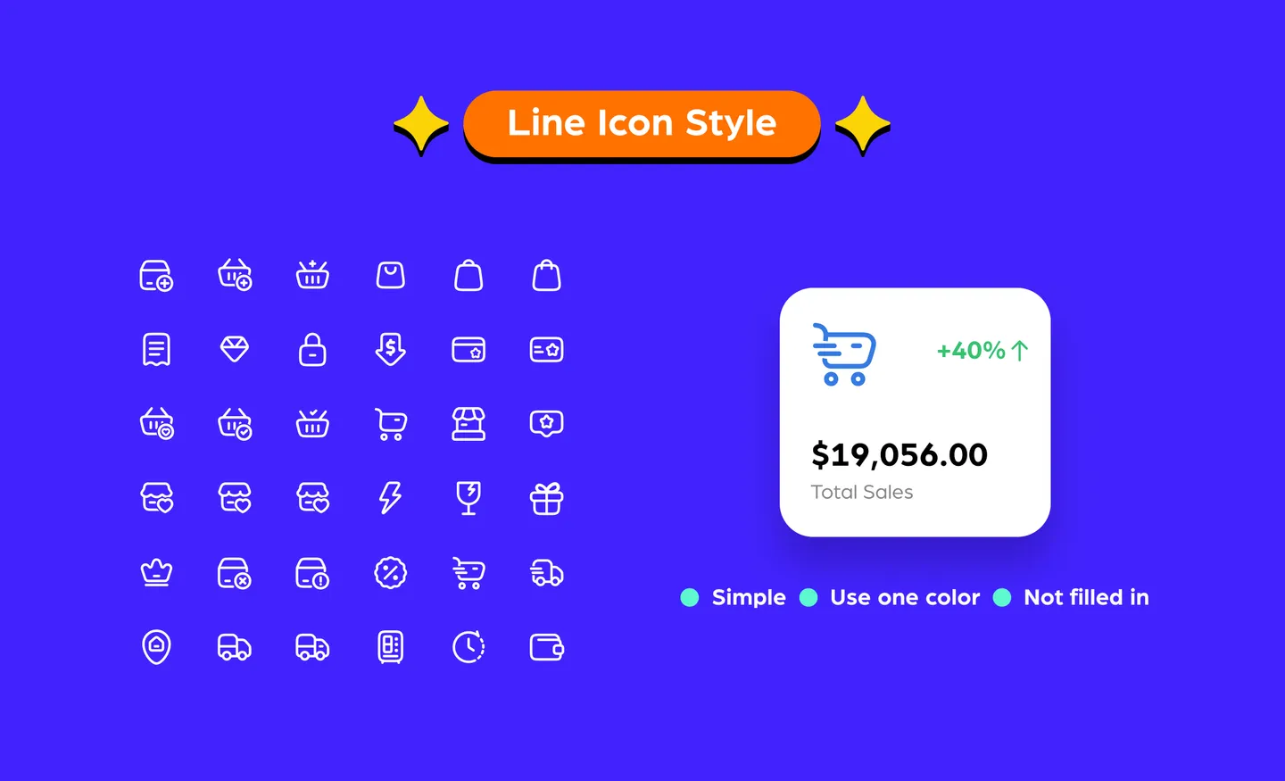
Line icon styles are known as symbolic glyphs that are outlined – common line icons are simplistic, use one color and are not filled in.
They are viewed as clean and easy to understand with design. Because line icons are outlines of common objects and actions, users can easily recognize them. Creating them is relatively easy – think of it as drawing shapes. To bring it up a notch, you can explore dimensional line icons (also known as isometric line icons) for a more interesting or less formal look.
You may often see line icons used in websites, especially e-commerce stores. These are the common choice to represent navigation items throughout websites. Some popular usages include a magnifying glass to indicate a search bar, a speech bubble for a call–to–action, or an envelope to represent a mailing list.
However, on more dynamic websites or creative assets, it can appear too simplistic and come off as boring because of its one–color, hollow appearance. A tip we would give to avoid looking dull is exploring two colors – one as the main outline, and a second color for the smaller details. To spice things up, you can also use gradients instead of a solid color for the outline.
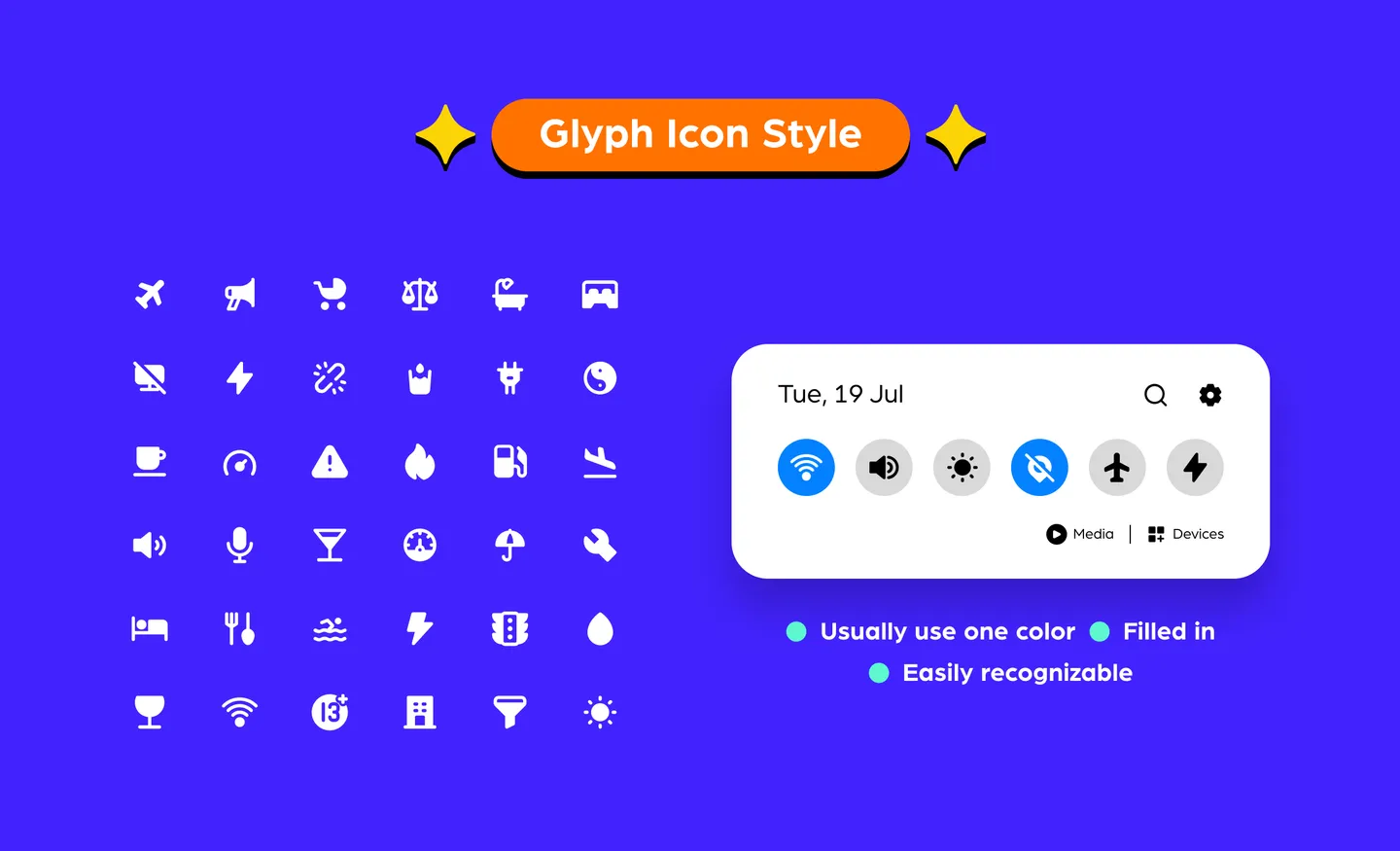
Here’s a fun fact: “glyph” is derived from the Greek word “gluphē”, which means symbol. Glyphs are filled–in monochromatic shapes that appear as a solid shape.
Glyphs icon styles are popularly used for key website elements in the form of speech bubbles, mailing icons, and camera shapes. You probably come across glyphs every day in signages, especially toilet signages that use female and male glyphs to indicate their direction within shopping malls and on the doors themselves.
Many glyphs are easy to identify for the end user because they are straightforward, simple, and commonly used. Much like line icons, they are easy to recognize because they are used in everyday signages. Glyphs work well even when you shrink them because of their solid shape.
However, glyphs may look better when they are used as favicons for websites. But because of its solid and one-color look, glyphs can appear quite dull and flat when used in dynamic creatives.
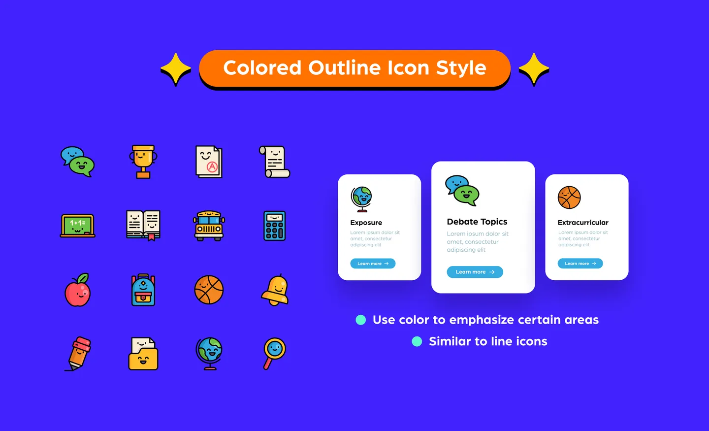
Colored outline icons are similar to line icons because they use lines of the same thickness to draw out a shape. However, colored outline icons use color to emphasize the objective and express the smaller details.
Colored outlines are a great way to add some life into an icon, especially a brand logo.
There are not really many drawbacks in using them. To make it work, you just need to know where to add color to emphasize your icon, how much color each area needs, and how many different shades of color to use. Using too many shades might look too busy – the best tip is to stick to one primary color, and a maximum of two accent colors.
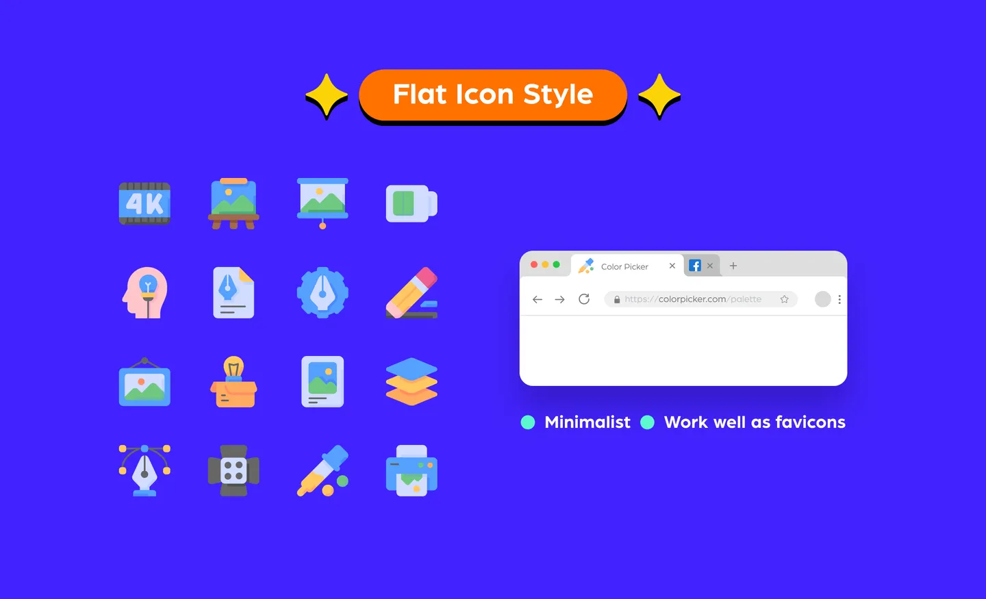
Flat icons have no depth, they are simply flat – just as the name suggests – and it uses two–dimensional (2D) elements that are minimalistic.
Flat icons work well as favicons (icons that appear on a website tab or address bar) – it is simple, easy to identify and minimal. Common uses for them are mobile app icons. If you look at your mobile now, most of the icons would probably be flat. That’s because they have to comply with Android and iOS’ guidelines on format, style and sizes.
But if used on a website landing page, it can fall flat, especially if you are using it on interactive content. Because of its flat appearance, the user may not be able to immediately understand that it is clickable.
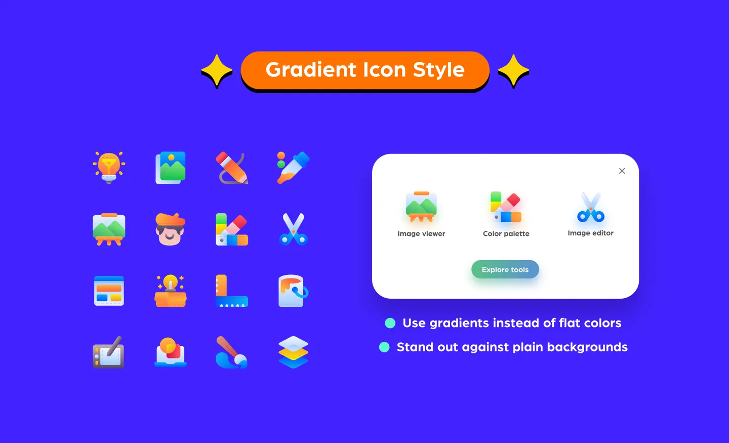
Gradient icons use the technique of blending colors. The colors tend to transition from light to dark, or from muted colors to more vibrant ones – depending on the look you are going for.
Gradient icons work great as brand logos, especially for mobile applications. A popular example of this would be the Instagram brand logo, which uses a blend of colors that almost mimics a sunset.
The use of gradients drive interest in an otherwise boring design. For example, on a plain background, the use of a gradient icon brings life to the design and gives the eye a break from any monotonous colors.
When using gradients, it’s all about the color combo. If you put two overly contrasting shades together to make a gradient without proper blending, it might appear more like color-blocking rather than a gradient. The trick is to know what color combinations work to make that seamless gradient on your icon.
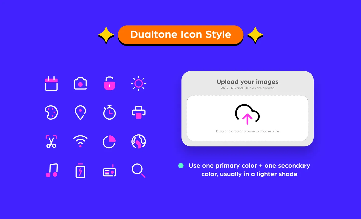
Dualtone icons use two colors throughout the design – it consists of a primary color and a secondary color. The secondary color is usually a lighter shade.
This style is simplistic and clean. Dualtones are usually easily identifiable, making them great for items such as website navigation. For example, dual tones can be used on a document upload icon, with the upload arrow as a secondary color. This gives the end user better identifiability on first glance as well, compared to sticking to one color.
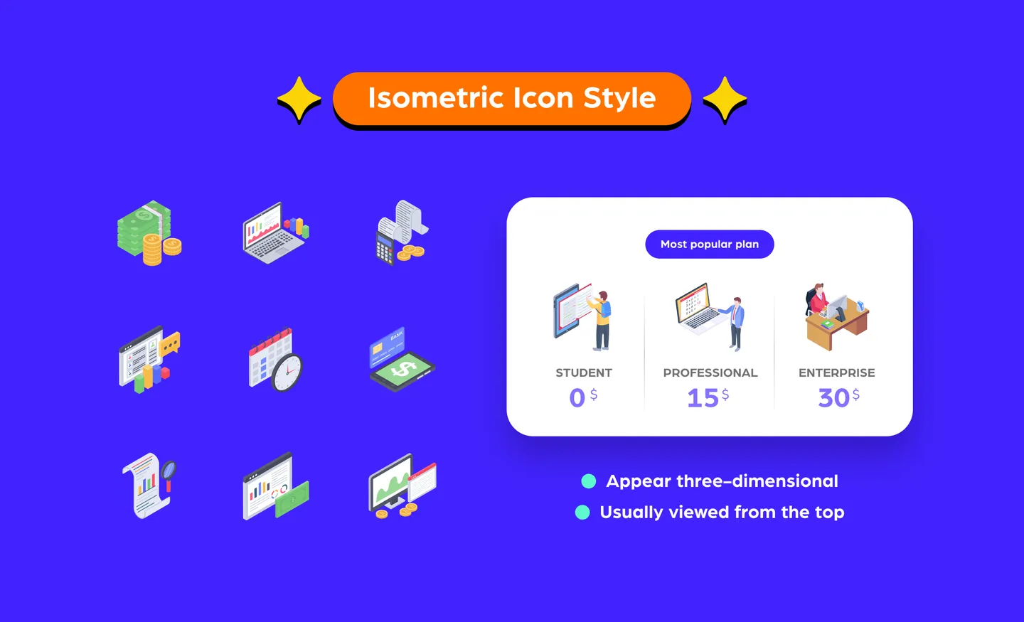
Isometric icons are two–dimensional designs that appear three–dimensional.
You can consider isometric icons an upgrade of the usual two–dimensional design. Generally, they add more interest and personality, while also used to better show an action.
Of course, playing with isometric design is all about the angles. It should be viewed from a bird’s eye angle and from a corner to create a realistic view from the user’s perspective. Most isometric icons are designed with equal horizontal lines at a 30–degree angle.
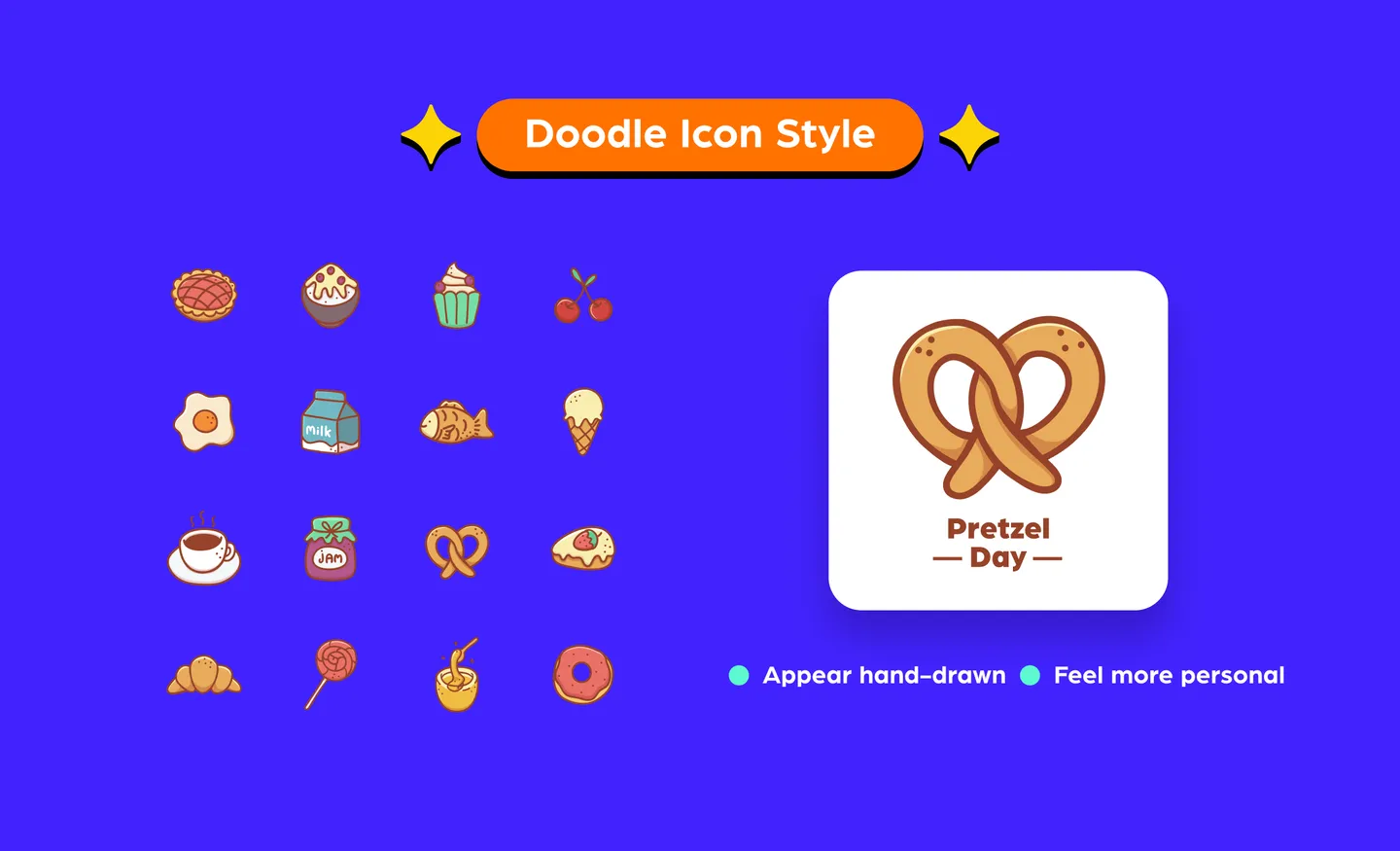
Doodles icons are hand-drawn icons that can be both colored or in black and white for a more authentic doodle feel. Their styles can vary – they can be simplistic with outlines, or more complex illustrations.
The hand-drawn aspect of a doodle icon gives a more personal feel when connecting with the audience. It sort of humanizes the design to resonate with the audience.
Doodles would look great on posters, especially brand marketing collaterals or on a website landing page. Of course, doodles are more time–consuming to make as you’ll need to work out the best way to draw details so that the icon is easy to identify.
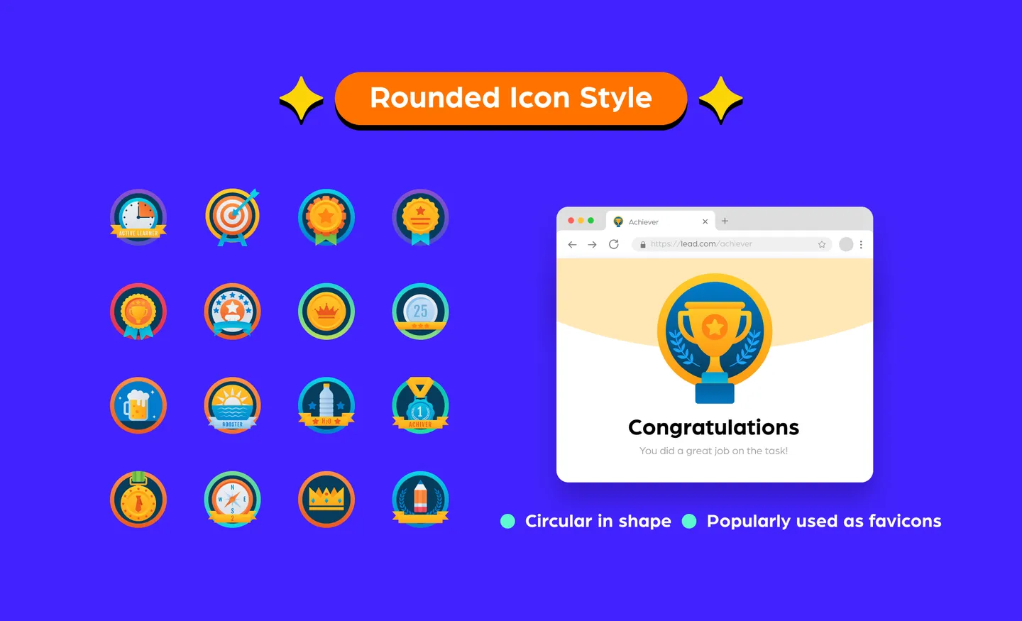
Rounded icons are icons that are within a circular shape. They tend to work well in logos or assets such as infographics.
Many brands use round logos because they fit well as favicons – if you look at your browser tabs now, chances are most of the brand icons are rounded. Even Google uses a rounded icon, while their homepage also utilizes rounded icons.
Their geometric shapes that resonate well with users but they can be tricky to use because rounded icons may not work well with other shapes. So, make sure to look at the overall design before using them.
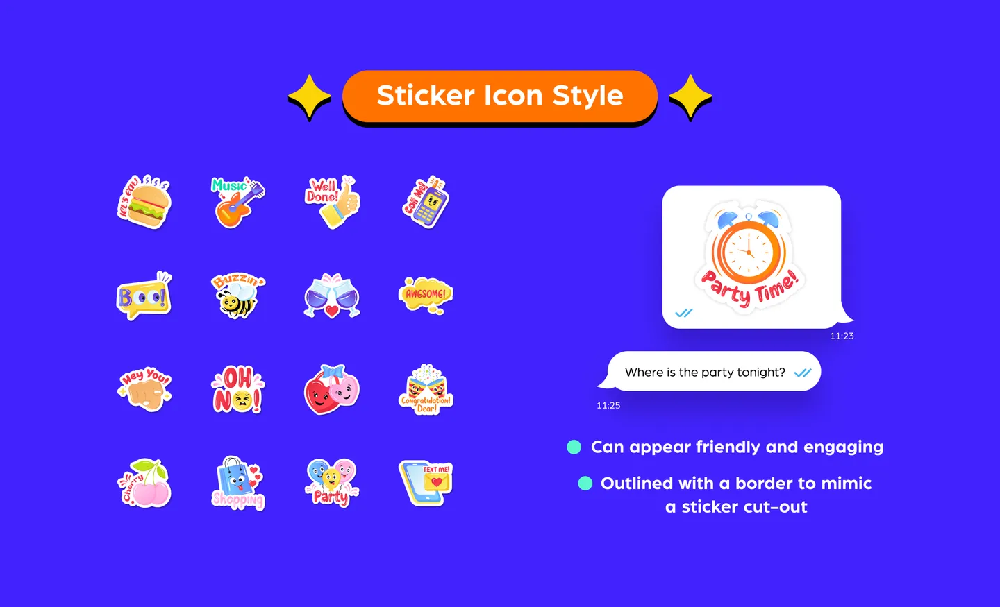
Sticker icons are just like their name – made to look like stickers. It usually is outlined with a thin border to mimic a sticker cut–out. There are some variations that are designed with a part of the corner or the outline folding inwards to resemble a sticker peeling off.
Stickers are obviously great as digital stickers for messaging apps or in social media designs. Using them can turn designs into a friendlier piece of communication to engage the audience. It also gives designers room to be a little bit more creative.
Additionally, creating a sticker pack for messaging apps has been a popular marketing method in recent years. Some brands create custom sticker packs that fit their brand color and messaging. With sticker icons, you can also use typography to engage the audience.
Although stickers are a bold choice when it comes to icons, when you use too many in one design, it might appear a bit too busy for one space.
3D icons are the opposite of flat icon styles – it is three–dimensional and tends to stand out. It appears to pop out from the design, instead of sitting flat on the page.
These work great on banners, posters, social media designs, and even when creating digital flipbooks using Flipsnack, making them versatile across most marketing collaterals. They would also do well on website landing pages as usage of 3D icons can be attention-grabbing at first glance – if done right. They garner interest and give your design a more lovely and friendly look, especially with the right use of color.
Nevertheless, it can be quite distracting if it’s overly designed. The point of using icons is to ensure the end user is able to recognize it. Hence, if the 3D icon is overly abstract with many elements, it might be hard to recognize at first glance. Our tip is to keep it to a minimal form, and the smaller it is, the fewer details it should have.
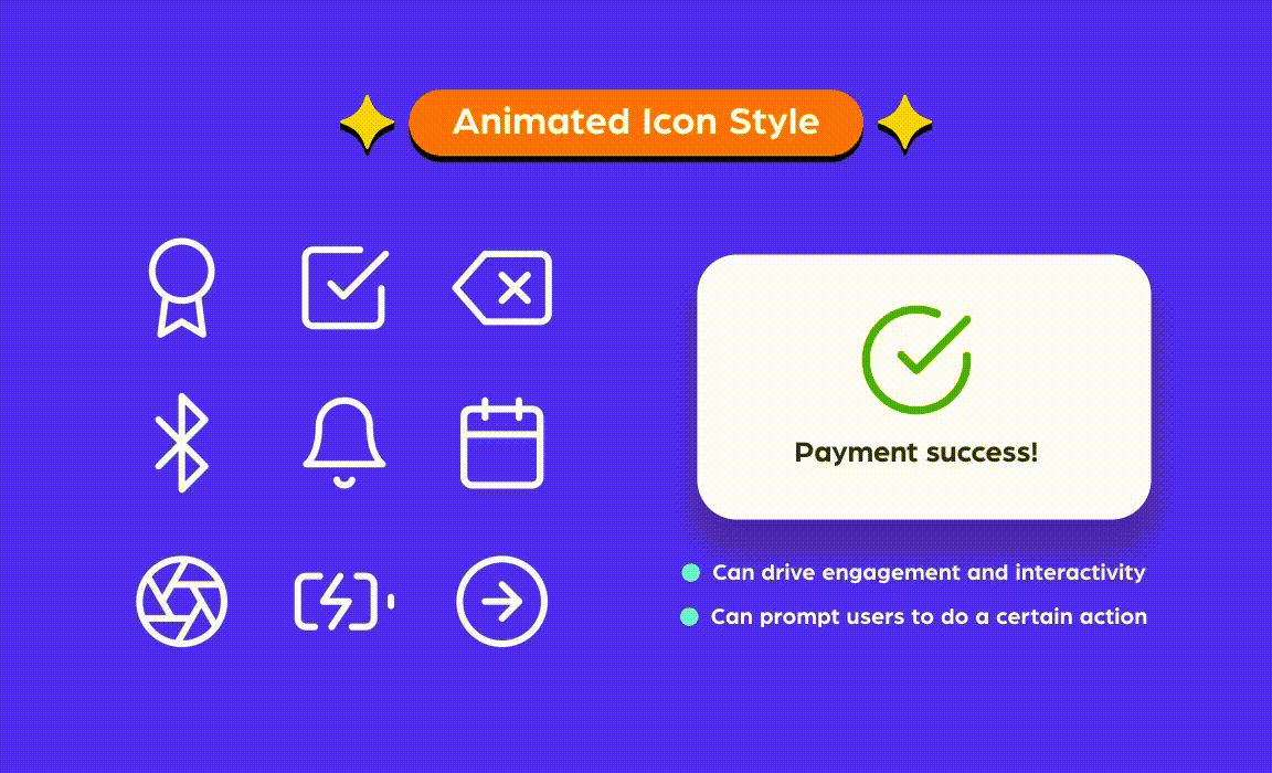
Animated icons are static icons that come to life through additions of design elements that make the icon “move”.
Because animation draws attention, it drives engagement and brings out content in an interactive way which is great for presentations. It is also popularly displayed while websites or mobile apps are loading – think of the classic hourglass that tilts 180 degrees.
Besides that, animated icons are used to indicate or prompt the user to do a certain action, such as scrolling down the page.
Animated icons drive a lot of 'pizzaz' to items such as a pitch deck and can please the end users if strategically used for websites – like for page loading, or using an animated icon to get users to scroll down a page.
When using animated icons, it can – ironically – affect the loading time of a page, especially when using it in the GIF format. But this can easily be countered with the right file format. For example, Lottie animations are lightweight – they’re about 600% smaller than GIFs, so you can use them as icons without worrying about slowing down your site or app.
Like most things in design, icon styles go through cycles. The first pixel art icons were born way back in 1981 by Xerox Star 8010! Nowadays, we have a plethora of icon styles with new software and techniques that have allowed us to upgrade from flat icons to three–dimensional versions.
While resources are plenty online, IconScout has over 4.5million design assets, including the icons we have listed above. You can access these icons with IconScout’s All Access subscription with a choice of all access to our entire resource library, or access only to our icons styles.
Or if you happen to be an icon designer, consider becoming a contributor for us with some of the highest royalty payouts in the industry. Find out more about becoming a contributor here so you can get started!
 Save 33%

