How I Built Iconscout
As per the title suggests this blog is about how Iconscout was build, so sit back cause it is gonna be a roller coaster ride!
The year was 2016, Chamestudio launched its first product named Iconscout. Iconscout went live with 1 lakh Icons on 12 Aug 2016.
? About the project
I started icon designing back in 2012, I observed that there was no perfect marketplace to get vector icons. There were Thenounproject and Iconfinder but both were limited to some functionalities. My idea was to redefine the experience by providing advanced features to seller and buyer — and I named it ‘Iconscout’. I’d continued exploration, I started my first company and product in 2016 after my graduation. Later in 2018, Iconscout added more assets including illustrations and photos.
? Overview
Here’s the case study that explains the entire journey of Iconscout, How it was built and transform the icon downloading and access experience to everyone’s workflow.
?? My role
I lead the design of Iconscout for Web and Plugins (for SketchApp, Adobe Photoshop, Adobe Illustrator, Adobe XD, Microsoft Office tools, and Google Docs+Slides) since the beginning.
Product Thinking
I discover the needs and insights of the customer in order to translate concepts into features that meet the right customer solution.
Product Design
To share our vision, I created a design system and prototypes. This helps me in testing, evaluating and defining the product.
Visual Design
I designed a visual style guide to help other designers go forward.
Product Planning & Management
With my core team, I define the product to meet user needs and business goals. I have given priority to the features and divided the product into several stages.
Leadership
I designed the right team structure for the entire product life cycle to work and succeed.
?? About the problem space
Icons production and consumption have grown rapidly since 2008. The icons are used everywhere in the world of emoji. Icons and emoji are an important part of communication and products. There were few icon services at that time, including Thenounproject and Iconfinder.
Our challenge was to evolve with customers and enter the world’s highly competitive segment of on-demand icons.
Thenounproject only used to provide monochrome style icons so the buyer will not be able to buy multiple style icons. On the other hand, Iconfinder was providing all kinds of icons. Its Icon pack functionality was also impressive. They won the hearts of designers with their pay-scale, but the experience of search and accessibility was very challenging. This is, therefore, an opportunity for Iconscout.
Finding small assets like icons, should not be time taking, it should be accessible from the tool you are working.
In the following challenge, I focus mainly on the experience of icon access. In addition, my role was to introduce new features to the Iconscout platform. But with the technical background, I could understand all the technical limitations and problems that my design could pose.
Set the Product Vision
Our vision for Iconscout was to provide customers with the best experience in the Design Resource Marketplace and help Designers do what they love.
During those days, we didn’t want to offer other design resources. Because Emoji and Iconography were highly demanded, we only want to offer all kinds of icons to our customers.
? Introducing Iconscout
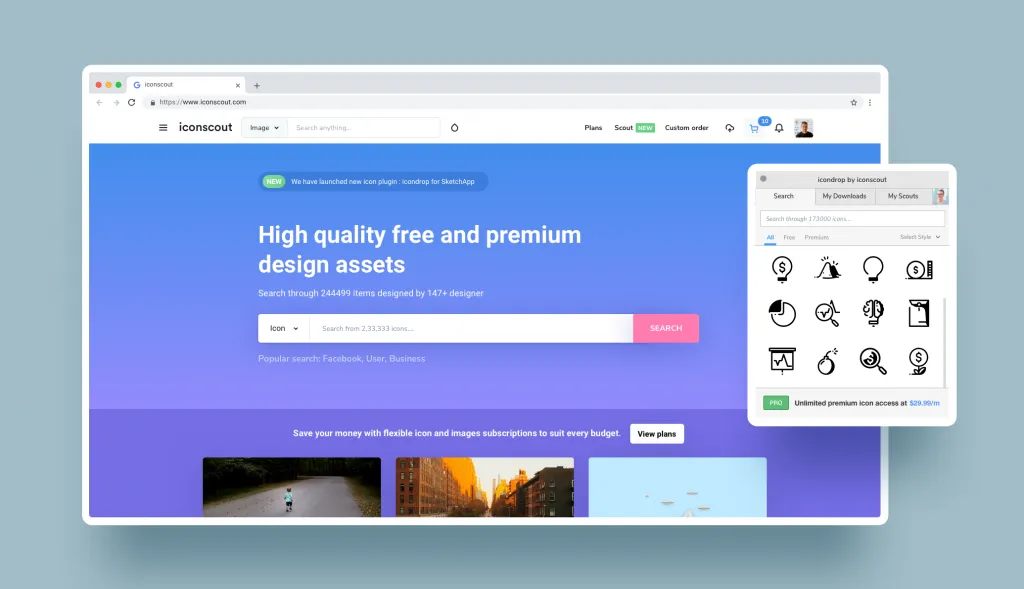
How we got there?
It will never be easy to build a product from scratch. Iconscout was one of the dream projects, so I was able to think and work as I like.
Design and Management were the biggest challenges I faced throughout the project. In 2015, I was completely new to the world of product design and startup. I worked on some freelancing things like icon and poster design before that.
Team management is more challenging because it feels like driving a car with your friends and you’re responsible if an accident happens. But fortunately, my team was very talented to make things happen. Although we faced many up-downs and spent sufficient time making design decisions. Since this product taught me everything about product design and management.
Since everyone knows how to build the product. Ideation-wireframe-prototype, okay? The same way I started my journey first with wireframe, now before I could start wireframing, it was a new challenge for me to decide on the platform’s flow or we can say “define the product”. The product was in my mind, but now it was time to put it on paper at the front of the team.
I don’t really know what the user flow is during those days and how to start it. But I just picked up the ‘Get Started’ concept and began to work on what my mind told me.
? The Approach
We can follow a different approach to speeding up the work. But the design of a new product and the updating of the existing product are different. During those days, I didn’t follow any approach, but fortunately, I was on the right track. My main objective was to understand the entire product before I started working. And it landed me on Discovery. I didn’t name this approach, either, but by reading this whole process you will see how I did it.
Before starting actual work, it is very important to understand the state of the product.
1. Discover ?♂️
My initial thinking about the product was clear, but I had to validate it with the real world. I must discover all possible cases related to the design marketplace for this part. We didn’t have user data at that time to do some user research but fortunately, I figured out to take surveys for different use cases.
User base and Use cases
I participate in a survey with our team and other people (Our designer friends) about why they love/hate existing platform and/or what they could expect from us. I can say I did Empathize test.
- Seller/Uploader: He’s using other platforms. He believes the uploading process takes time. Sometime due to the uploading process, he won’t be able to work on new designs.
- Buyer — Designer: He uses ready-made assets to prototype and speeds up the design workflow. But it is challenging to find the right assets at the right time.
- Buyer — Non Designer: He doesn’t know design, the assets have to be downloaded from an online source. But because of no knowledge and no option within the tool he uses, he won’t be able to edit the colors and size.
2. Define the challenges ⛰
After conducting the survey, there were some key insights after the survey that helped me to define the product’s first version.Below are problems of which I need to find the solution.
- Upload problem: Most designers don’t want to spend time uploading icons instead of designing them.
- Accessibility: Designers want to find icons very easily in order to speed up their workflow.
- Needs customization: Before downloading the icons, the non-designer customer wants to change color because they do not know the design tools.
After that, I figure out what I’ve got to work on.
3. Get Started with Content ?
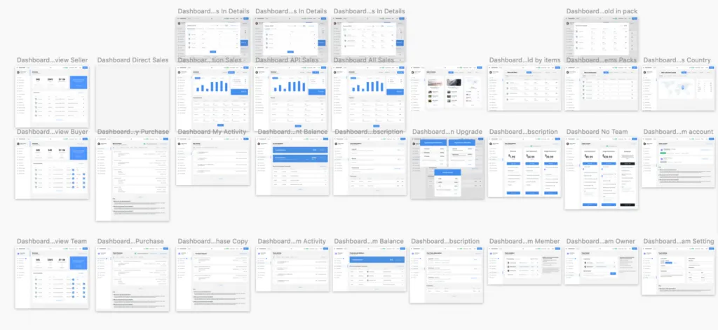
My earliest design challenge was to offer the platform to the team because all was in my head until now. I have listed goals for various users, created a user journey in A1 Sheet and showed to my team that how our users will use our platform and how many pages are required. I learn about the flow and segmentation of the user. The primary pages I got were — Home page, Search page, Icon profile page, Designer profile, Category page, Pricing page, Buyer dashboard, Seller dashboard, Sales report, Icon submission, and Subscription. There are many other pages but I’m not listing out here.
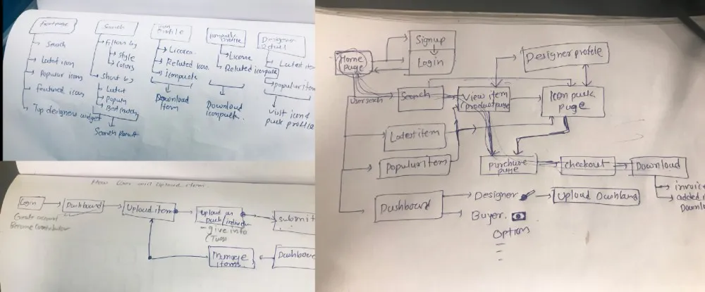
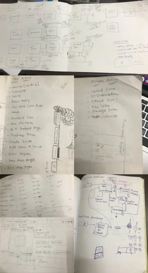
Worked on Cases and possibilities
We all know that a TEST CASE is a set of conditions or variables under which a tester determines whether the test system meets the requirements or functions properly. The same way, the design test case process can also help to find problems for each type of user and case in the product flows.
Another flow I created was the payment flow, which includes many cases and possibilities along the way (all I designed was actually started with flows-Start to End). There are two business models which include Direct payment and Subscriptions model. It was a little difficult for each type of user and account to have a good experience in the payment process.
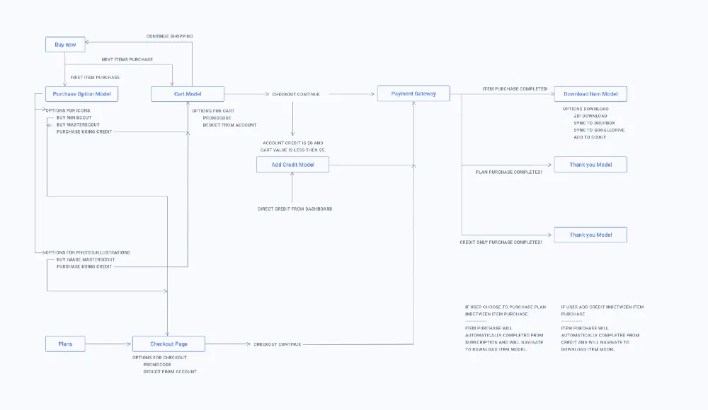
A solution of Customization
The simple solution of customization was the Icon Editor, which allows people to change the icon color before downloading. Because it usually happens that the available icon is in other colors, but your project needs in your brand colors. And for non-designer users who use icons for their presentation and documents, it was more challenging to edit colors. It’s one of the features I initially planned when I used to sell my icons on Iconfinder. I got the idea of Icon Editor in 2013.
A solution of accessibility
How I come up with the idea of Plugin
I explored the design tools after launching the first version of iconscout in 2016. During this time, I learned that many design tools such as Sketch, Adobe Illustrator and Adobe Photoshop have extension support. But at the same time, icons were imported manually by designers.
Many designers use the ready-made icons to accelerate design work because it was not really worth investing time in a custom icon for the early stage product. The designer, therefore, downloads the icon packs from online resource and imports them into the design tool.
So my first idea was to develop the plugin and import the vector icons into the canvas. On the same day, I discussed this idea and the solution possibility with my teammate Tarun Mangukiya and he gave a green flag to the idea. He said it is possible with the use of our Iconscout API. The idea of the plugin was unique during those days. No plugins were available for all current companies in this segment. So it was a feature of win-win for us. But almost half of the competitor comes with similar kind of extension support after a few months of our plugin release.
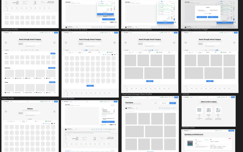
4. Wireframes and low-Fidelity Mockups ??
When I began to approach Iconscout’s first wireframe, it was my first wireframe in life and i did it on the blank paper. I couldn’t find the paper in all the mess I’ve created and my bad, I didn’t capture it on my phone. But here I’m showing you low-fidelity mockup made in SketchApp during Iconscout 1.1.
Iconscout web
5. First version ✌️
After working for about two months, I finally showed my team a few gimps. Here I am showing you something hideous, unpolished, unfinished work
Design Limitation: I didn’t follow any design system in the first version.
Iconscout web
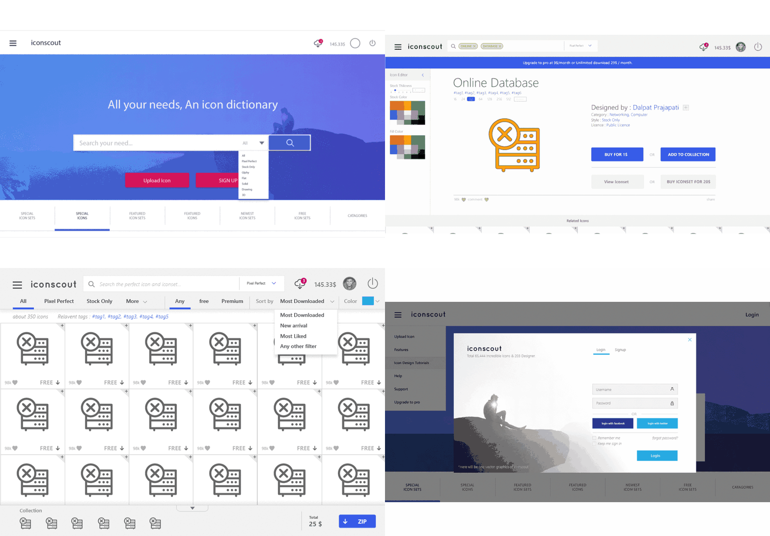
The first version of Iconscout web
Plugin
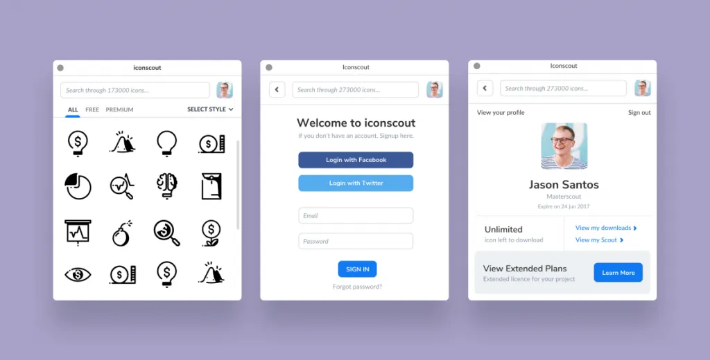
In 2017, I started working on the Icon plugin for Sketch App. Here’s the first version of Icondrop plugin I designed.
6. Evolution model ?
I have updated our product until we get out of Beta by continuously improving and feedback.
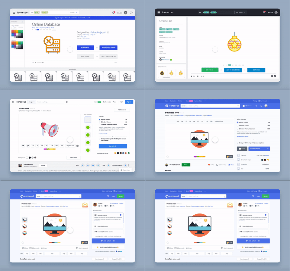
Iconscout
This is complete evolution of Iconscout from the first version to the latest.
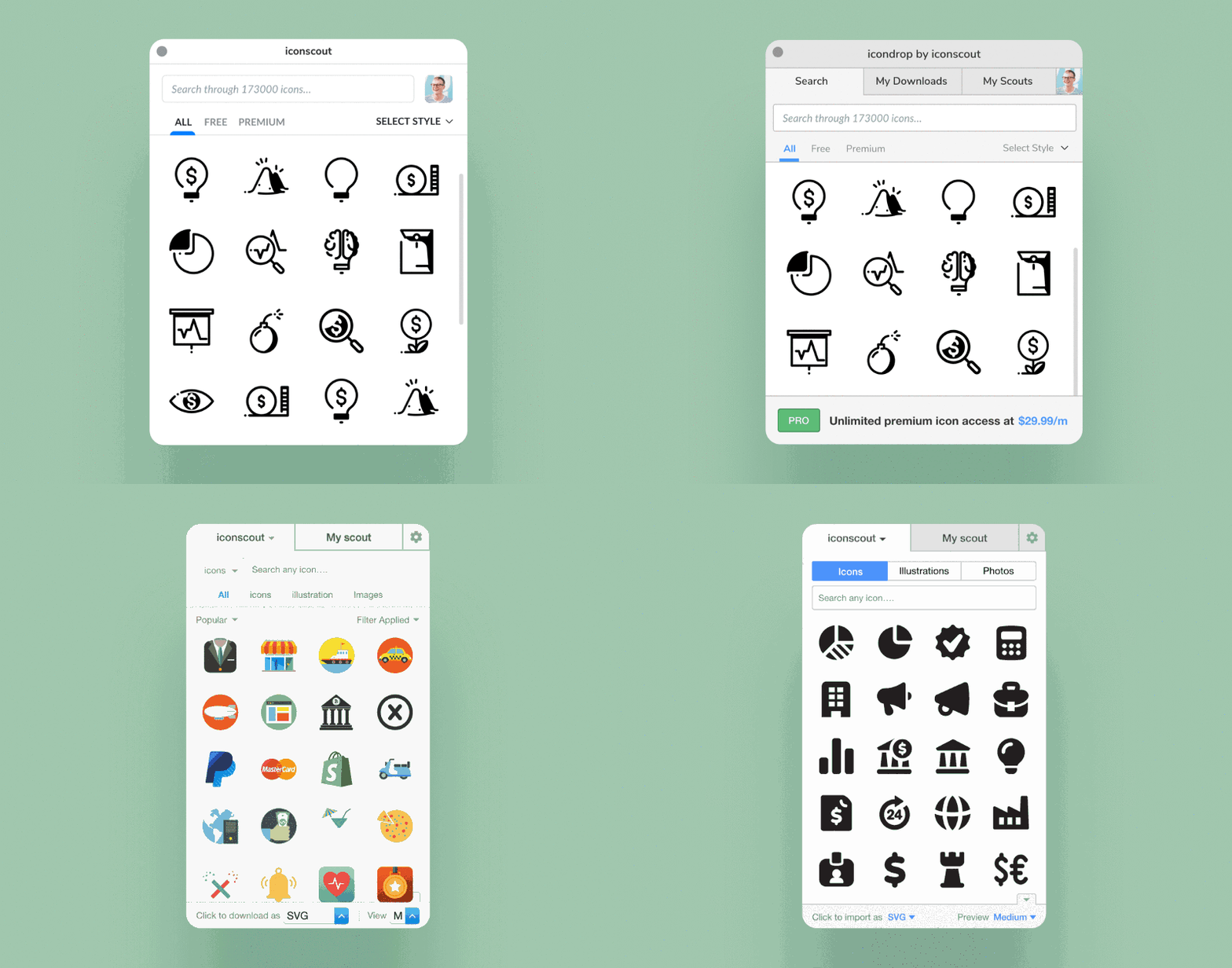
Plugin
Here’s an evolution of plugin from the first version to the latest version.
Feedbacks and Heatmap ?
We integrated Smartlook last year — a product analysis tool to measure user behavior with our product. These data helped me greatly to improve the layout and structure of the product.
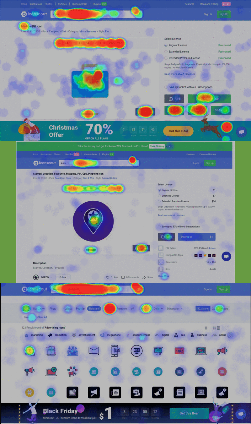
After analyzing the product with 10000+ visitors and watching 100+ recording, I learned about different problems that our customers were facing. I figured our few reasons why our customers were discontinuing from our platform. One of them was on the product page ‘ Icon Preview Size.’ I decided to remove the size of the icon and the reason is that our customer took the “purchase decision” after seeing the icon in different sizes such as 16 x 16, 20 x 20, 24 x 24 etc. But the problem with that was, the user thinks that the icon doesn’t look good in small sizes because of the bad quality of PNG (with watermarked). Initially, I removed the icon preview option from the product page, but later, I should improve the icon preview experience by changing the PNG watermark with the original PNG.
7. Latest Design ?
It took me about two years to get here. The latest component-based and scalable design. Here I’m only showing Homepage, Dashboard, Icon editor, Icon upload process and plugin. I won’t discuss other pages like Designer profile, Category, other Dashboard pages and more since they are pretty straightforward.
Personalize Experience
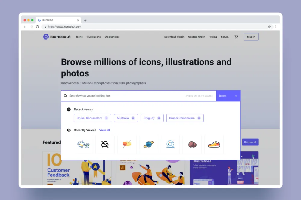
In the latest update, I am adding Recently viewed and Recent search in the search component.
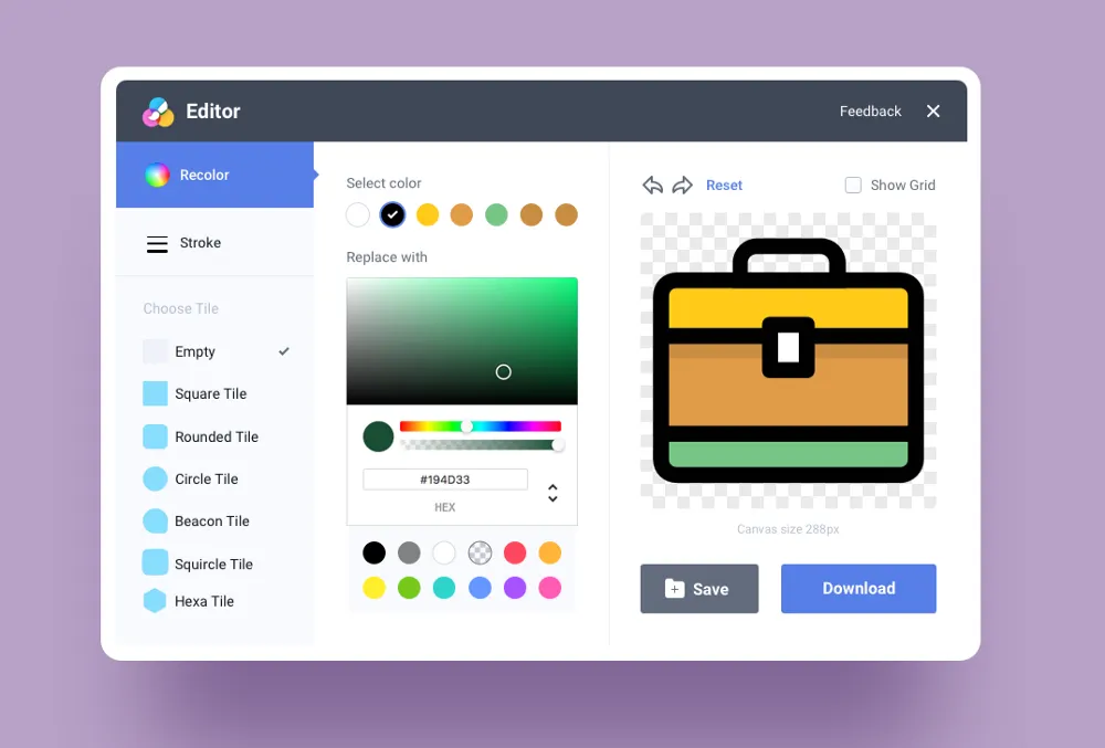
Icon Editor
Edit on the go for non-designers who have to change the required icon colors. Now, using the icon editor, they can recolor, change the stroke and add tiles (iOs, Android, iWatch and other shapes) directly on the web using Icon Editor.
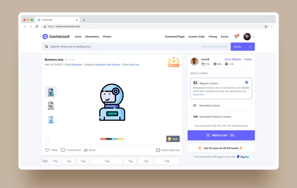
Product Page
Based on your use of the item, Iconscout offers multiple licenses, I make all licenses visible to the user to make the good purchasing experience. In addition, by making a bundle comparison algorithm, I added the Icon version panel on the left to show the same icon in a different style.
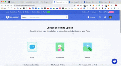
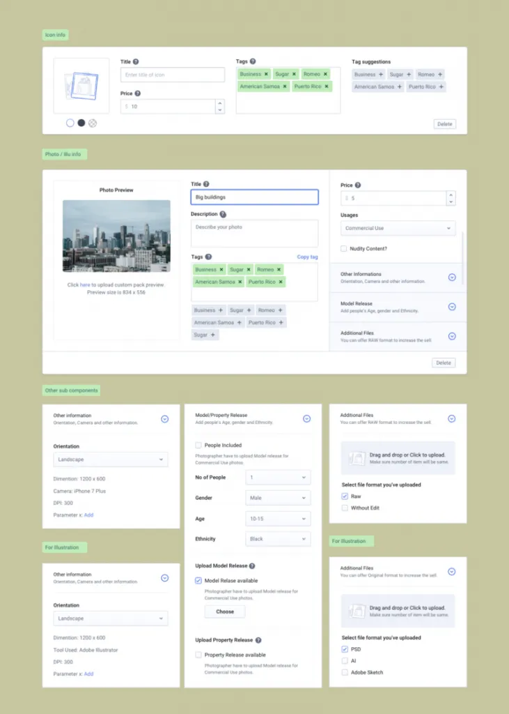
Upload Dashboard
The latest Upload Item card is very simple and efficient. Everything on one screen makes it easy for any contributor to fill the required details fast and multiple at once.
Plugin
Quick access to Likes and Downloads. Search functionality in each page like Icon Pack page and Designer Profile page.
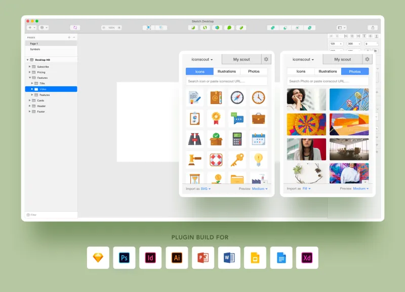
The plugin design is fully scalable and accessible throughout the platform. I have validated all the size of the window in the tool where the plugin is available. The plugin ‘s current layout is fully responsive to any window size in any tool.
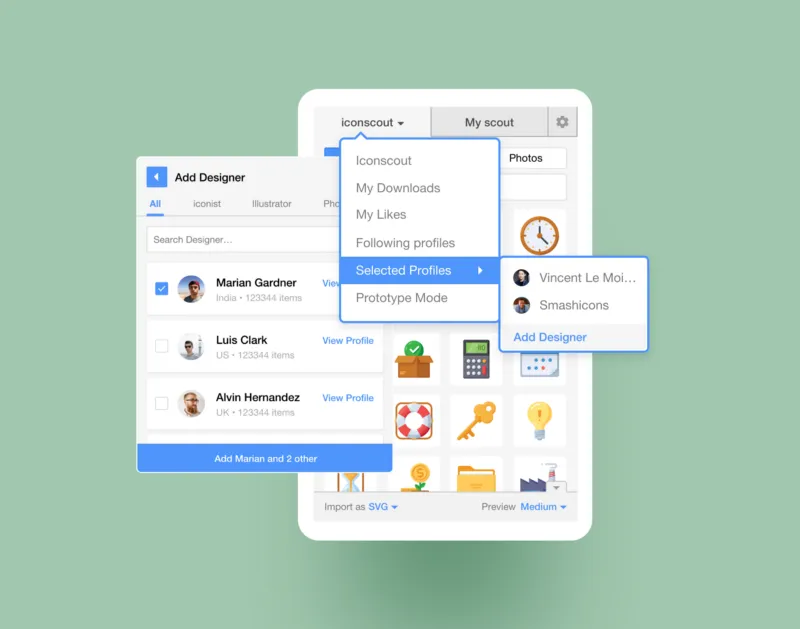
Plugin — Add Designer profile
I built this feature for those who choose and prefer the selected designer. Many designers follow the Google Material design icons for all their projects so that they can only select and search for Google profiles from Icondrop. Isn’t it cool?
⚙️ Design Execution
Designing and Developing better product experience without having a deep knowledge and the right resources can be frustrating. I faced some serious challenges in the way during Iconscout development. Some of them are here.
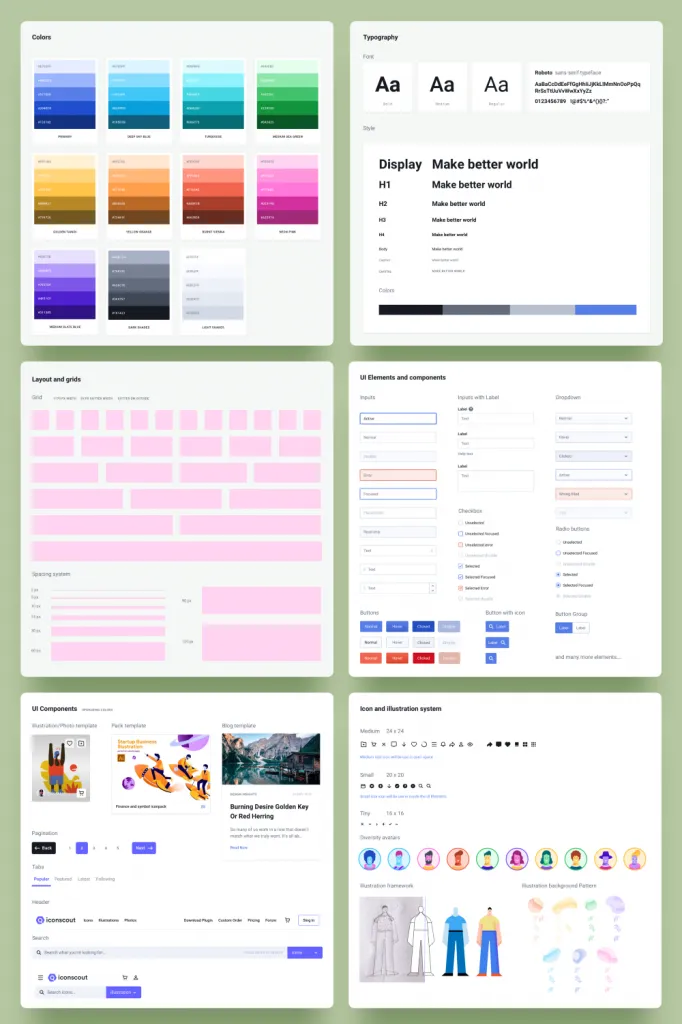
1. Design System
Based on my Iconscout 1.0 experience, it was clear that I need something to manage and accelerate the workflow. Productivity, collaboration, consistency, and accessibility were difficult to increase. Next, I was introduced to a random article on the Design System and it blows my mind.
Since I worked on the component based design back in 2011 in XAML during the college project, it was not difficult for me to understand and implementation of the design system.
The current design system is not complete or perfect. And somehow it will never be finished. It grows with the product. The process of developing and refining the design system will be practiced, delivered, and maintained over time.
2. Iconscout Grid System
The easiest way to display a collection of images on the web is to display the images in a row and column with three to five images per row but It wasn’t a perfect solution for Iconscout. Google Photos image grid reverse engineering has proven to be complicated. So I designed a custom grid and image size algorithm to make all screen sizes fully responsive. Here’s what outcome I expect.
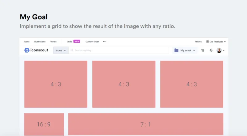
I divided this algorithm into 3 steps.
1. List out the possible image aspect ratio
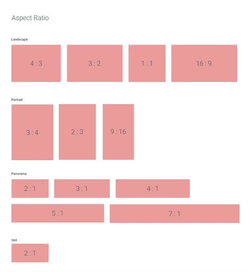
2. Set row heights by combining maximum and minimum image size
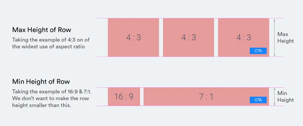
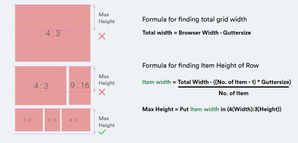
3. Calculate the number of images can be stored in a single row.
Once we have calculated the maximum width and maximum height using this equation, We just need to add an image in a row and check if total Row height > Max Height? If so, add another image and this loop goes on until the equation is false.
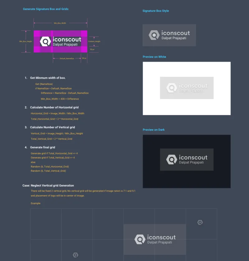
3. Image Watermark system
In 2018, we introduced Illustrations and Stock Photos on the Iconscout platform. Everyone hates Watermark photos, but why is it necessary? There are good reasons such as,
To provide digital art and photographs with safety and security,
To stop the cloning of digital art and photographs and
To sign the art with your authority.
Therefore, a platform such as us must ensure to contributors that your resources are safe with us and thus the watermark system is implemented.
It was a bit challenging to build a watermark system while Google researchers create an algorithm to remove the watermark. And it works cleanly, efficiently and fast. You can read the entire report.
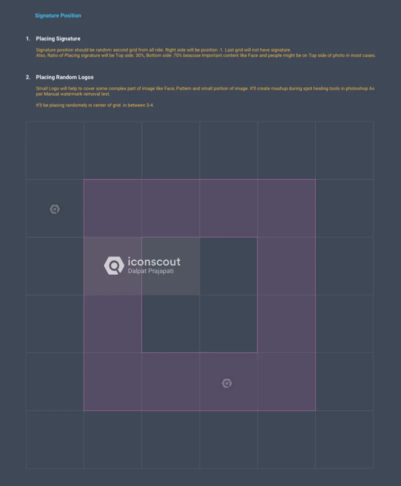
My main challenge was to build a system that does not generate a similar image watermark and beat Google’s algorithm. I choose to create a watermark with the name of the photographer and a random grid that generates a unique watermark for each photo.
4. Bringing our plugin to all platforms including Adobe XD.
Our greatest strength in 2018 was our plugins, our users of plugins grew rapidly. We have already launched the plugin for Sketch, Adobe Photoshop, Adobe Illustrator, Microsoft Office (Online + Offline) and Google Docs by mid-2018. Many of our users were now using Adobe XD. So in mid-2018, I started working on the Adobe XD plugin. To build the plugin, we participated in the Adobe XD extensibility program. We finally launched Iconscout plugin for XD in Oct 2018 after working with the Adobe XD team for 3 months.
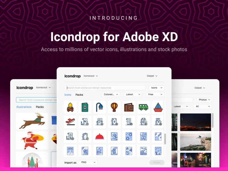
You might have a question in mind that why the interface is different than our standard plugin? It is more challenging to follow and execute a multi-platform design. Adobe XD does not support web view and HTML / CSS functionality. They have their own design system with limited components and options. My challenge was to design the XD plugin version with their design system without losing any existing features.
?Impact
For a designer, a product which doesn’t create an impact or solve some problem is the biggest failure. Our 5 out of 7 launches got featured on Product Hunt, Muzli by InVision and other publications in last 2 years.
1. Iconscout
We launched the first version on 12 October 2016. Luckily we got featured on Product Hunt on 22 October and took the #1 Product of the Day Badge.
What our buyer said,
There is a dramatic richness to this project, it claims its in “beta” but really has a great foot in the door both in terms of the user experience but also in the content. There is also a great amount of uniquiness in the packs when you compare it too Creative Martket, Envato, UI8, iconfinder. Sweet! Ill be a member.
Tayler — Designer and builder
What our seller said,
As an icon designer at Iconscout, I’m very happy about the way the team solves all problems I run into. Upload process is very simple. I can upload thousands of icon in just few steps. In a year they become one of the biggest icon market, this is pretty much visible on incomes too. I’m pretty sure that this track will lead to bigger successes.
Alpar-Etele Meder — Icon Designer
Iconscout served to 100,000+ customers until now.
2. Plugin
We launched Iconscout plugin for SketchApp, Adobe Photoshop, and Adobe Illustrator on 31 August 2017. Again we got featured on Product Hunt and received #3 Product of the Day Badge.
very nice. I like the UI and the search feature seems very intuitive. either way very cool…a tad on the expensive side.
Patrick Coombe — CEO, Elite Strategies Llc
Quick handy and useful stuff. No more googling for icons.
Ruchit Patel — Co-founder, All Events in City
Out plugin has 25000+ users, Most numbers are via Sketch and Adobe XD.
?♂️ Launching is the new beginning
Even if we launched Iconscout, it just beginning for me. The product will never be completed and the design will never the final version. Product always evolves at a different time and moment with experience and customer needs. Maybe the same set of features and experience won’t work after a year for the same set of people? Isn’t it? Yes, technology is growing fast, the minds of people are getting it fast.
The product will never be completed and the design will never the final version.
I’m often asked whether I’m proud of what I built. But I always lie in front of them and say ‘yes, but I’m not. Because things are totally different from what I thought after the launch. I’m struggling to accept the product’s reality. There are many problems with usability and experience and some critical features that people want were missing. But now I know what to do with it.
Now it’s time to follow the current product update approach. I’m following the parallel waterfall model in this new era of product to make things super fast.
?? What I learned
I was alone as a designer and thinker on this wonderful journey. There was no one on my top where I could learn something. But I learned from my experiences and the people around me measurably. During the project, I learned the following things.
- Validate your idea with targeted users before you start working — just talk to them about what you want to build.
- The user has some expectation about how your product will interact with them. — listen to them.
- Don’t develop all features at once — Go step by step. All features at once can create a mess in the product.
- During design, prepare test cases — just list all the cases your user will going to have.
- Give one problem more time — before that problem creates more problems.
And many other small things…
Now i value simplicity and data. I aspire to make people happy by giving them a good experience of what they are using. Craftsmanship and carefully designed experience are important to me.
? What will happen next
Iconscout’s goal is now bigger. Some of the experience will be improved and new features will be launched like
1. bundle profile in the plugin (Enhance the plugin experience),
2. Photo creator with icons, illustration and stock photos (with Indian content and Indian language).
3. In-house studio setup for craft the better designs including exclusive photoshoots with Indian models.
and many more…
I’ll hand over the product to my junior designer and he’ll lead the current platform design and maintenance.
? To all humans who helped me

I’m very glad the people around me have always helped in every situation. I’m grateful to my team members Varun, Tarun, Arpan, Jemis, and Mohit. Also, I’m very thankful to Rahul Chakraborty, Paresh Khatri for all help in design when I needed. Last but not least, how can I miss Shakti Goap and Siddharth Shetty who always push me to be the best.
That’s all for now. I think I have covered most of my design journey in parts.
Thanks for reading.
❣
Related Blogs
Access the world's largest Design Ecosystem: Assets, Integrations, and Motion.


