Top 20 famous Logo Redesigns in 2020
2020 we have witnessed few of the greatest and strongest brand logo redesigns of all times! What are you waiting for read the blog now!
A brand is recognized by its logo. We witness a shift in the design of the brand logo when there is a drastic change in the culture or direction in which the brand believes in. Such situations demand a new approach.
It takes a long and careful procedure to design a logo. A process of small, incremental refinements. One of the best ways to understand a brand is through the logo when a logo has redesigned the culture or to say their new approach can be understood by studying. Here we are with top logo redesigns of 2020.
First off, logos everywhere are getting cleaned up, stripped down, and their color palettes refreshed due to accessibility and versatility requirements. Secondly, a ton of global brands is looking back to their roots.
Let’s jump in and see how they do it!
1. GoDaddy
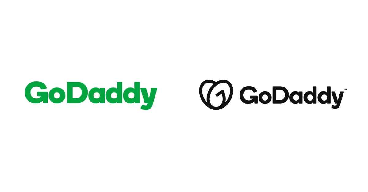
G and O have been combined forming a cute heart. The new logo breathes life back into the dull green logo and the GoDaddy brand with the updated color palette suiting a more modern context. This creates a personable brand impression.
2. Durex
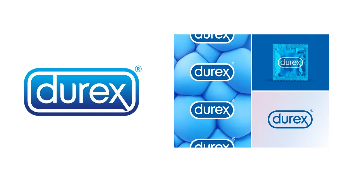
In 2020 Durex decides to reposition its brand into more sex-positive and inclusive, making the logo much fresher. They replaced the clinical-looking capsule logo into a one with a clean, single-line logo looking like a stamp. They even added a new font system called ‘One Night Sans’
3. Heinz
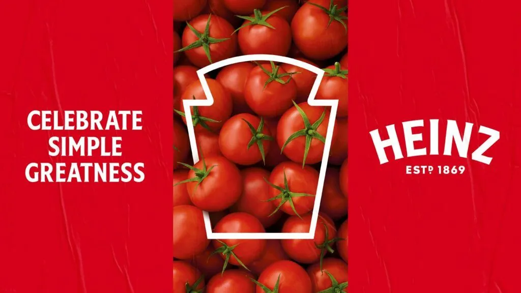
JKR agency recently tweaked the classic Heinz logo in font sans-serif and the surrounding elements to unify the brand logo. The theme is ‘simple greatness’ is depicted very successfully by the outline of the label, and other visual marks thus showing a simple, declarative power of the original logomark.
4. Adobe
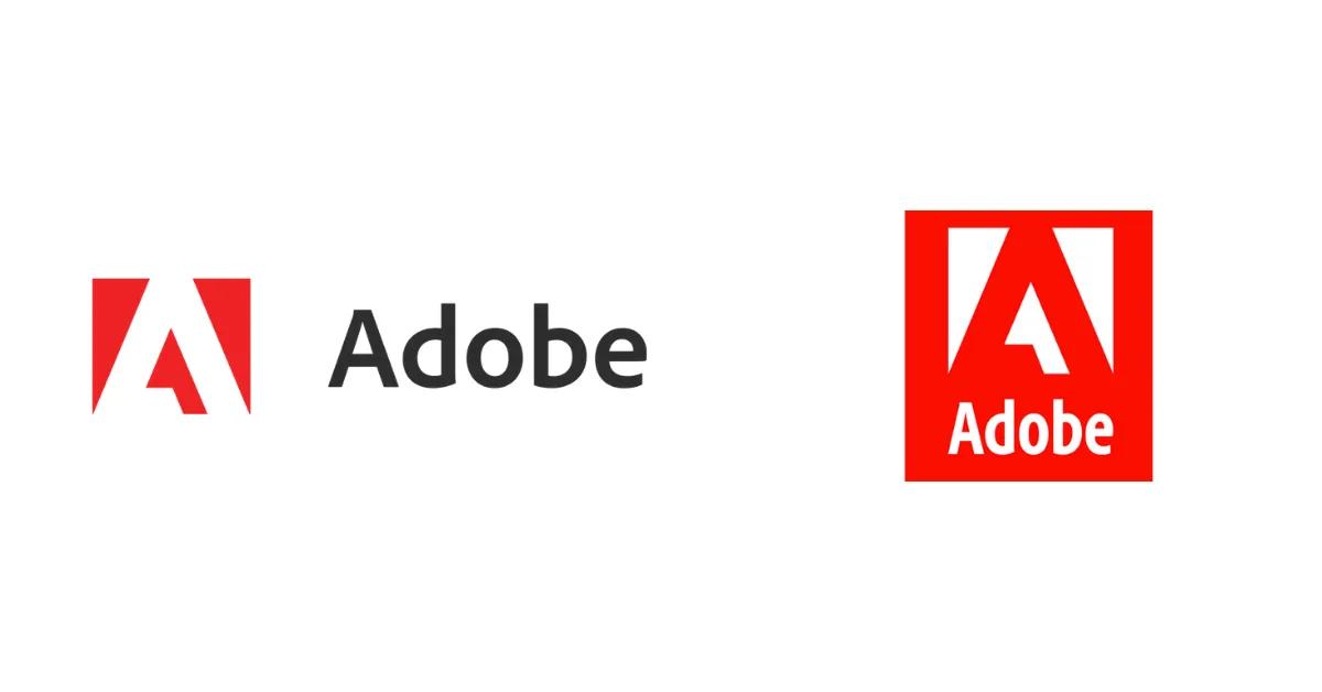
Adobe wanted the updated logo to be as functional as possible at all sizes and across all surfaces. With this context, they decided to shift with one single color red. Refreshing, the red color to be warmer and contemporized. It might not seem like a huge change, but the updated font and stacked logo modernize the brand suiting it’s growing and diverse community.
5. Girls Who Code
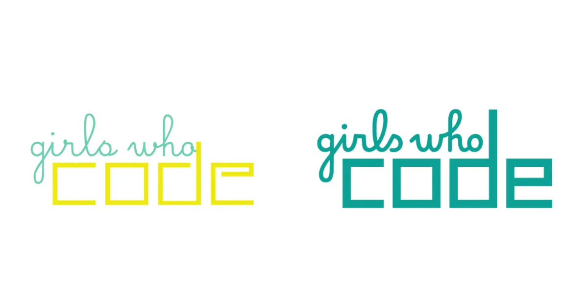
A non-profit global brand encouraging women towards technology careers. Girls who code’s old logo certainly needed an upgrade. As the centerpiece of a huge rebrand, the new logo has been thickened up and color simplified, giving it a bolder look that can be adapted into multiple contexts.
6. Cadbury
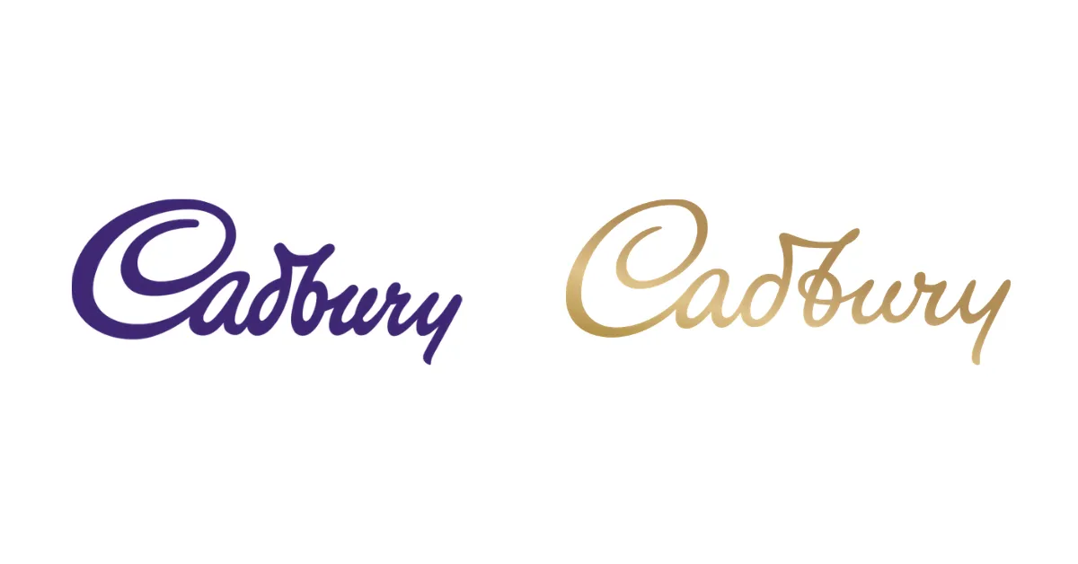
A lot of brands in 2020 are recreating logos in their historic element with digital twists. The humanization of the Cadbury logo was done by drawing on the original signature of William Cadbury, the grandson of the firm’s founder. The company paid £1 million for this simple logo refresh being a part of the global brand refresh.
7. Watties
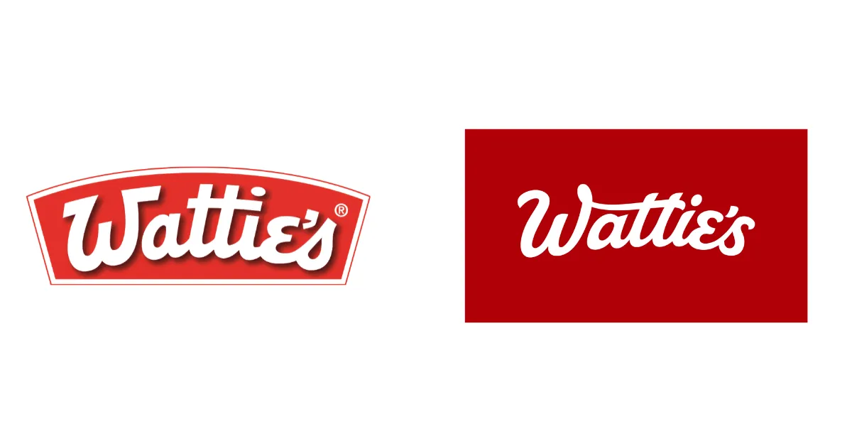
Watties has created beautiful scripting of their old logo, removing the drop shadow and container. Simplified vintage style logo is what stands out making the sign modern. The old sign was pretty cool, but a little too dated for a modern context.
8. Popeyes
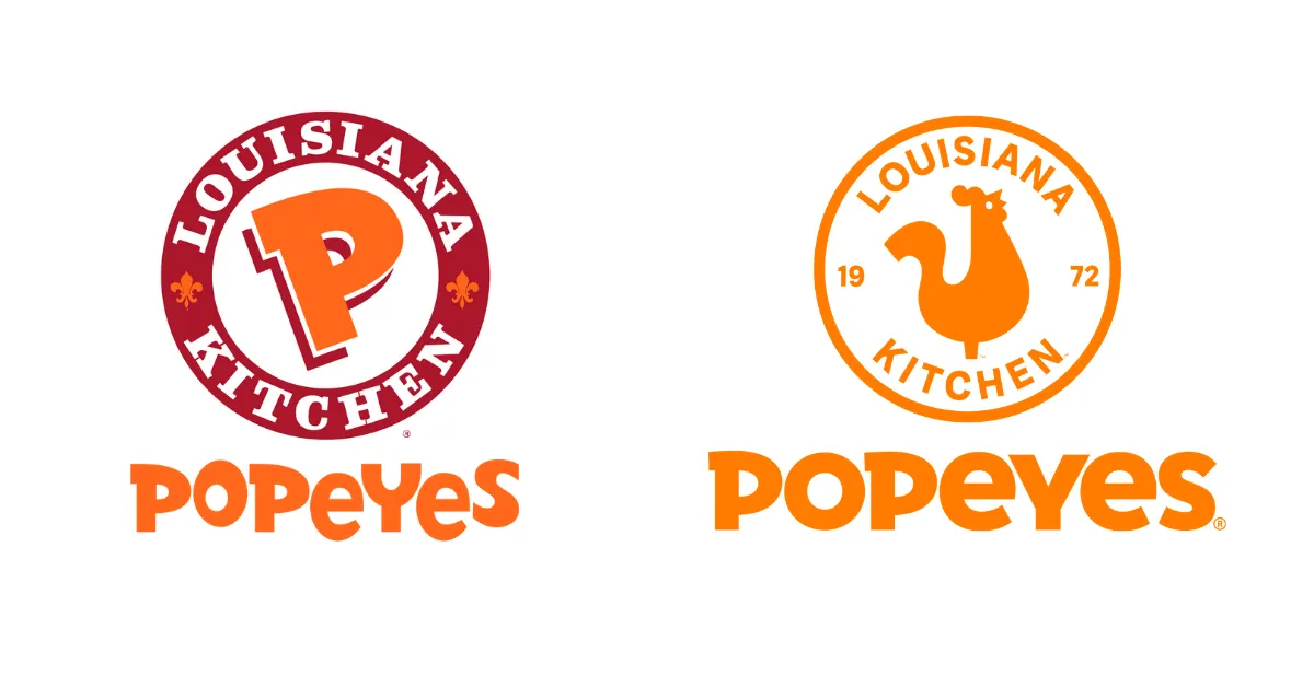
A modern recreation of a classic, artfully keeping the spirit of the old logo. The color palette was simplified to a bold, bright color like orange, and the modern wordmark makes Popeye’s 2020 logo redesign one to beat.
9. Iron City Beer
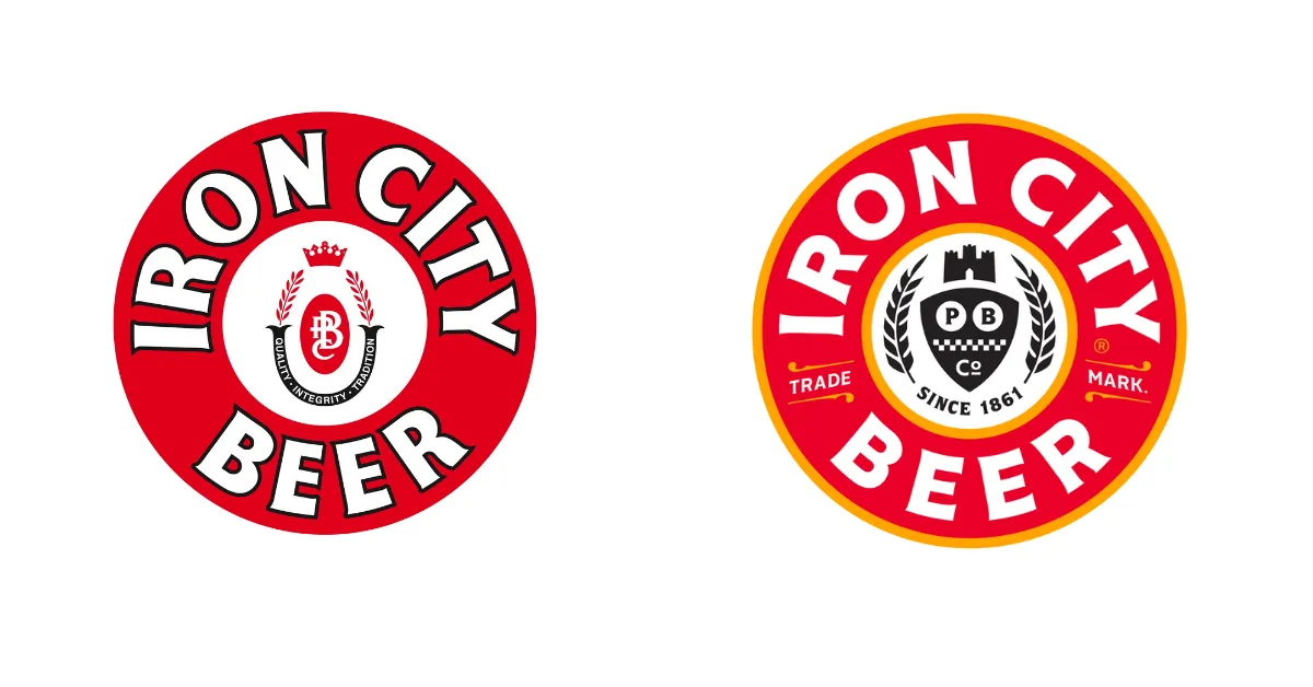
Iron City Beer’s recreation is a great example. The Pittsburgh Brewing Co. imprint freshened up their classic emblem logo with warmer colors, a bold sans-serif font logo, with new packaging. We think the update is one of the coolest modern beer logo rebrands of the year.
10. Badoo
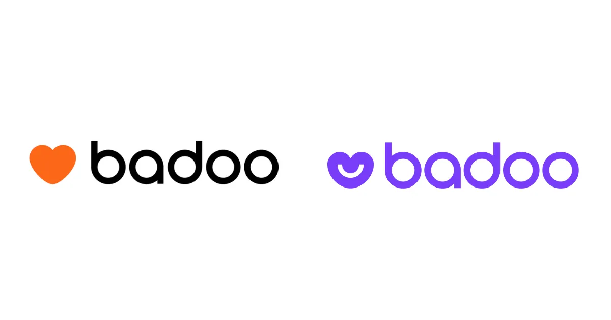
Badoo cooled down their color palette and softened up on their font on the logo. The addition of a smile to their heart-shaped logo mark breaks the mound in the dating space. Importantly, this shows how much a logo redesign is important for brand image.
11. TGI Fridays

From ‘Thank God it’s Friday’s’ to simply ‘Friday’s’, the TGIF restaurant icon released the brand’s declarative energy with a hint of the old quirky Americana vibe. Dropping the TGIs from the logo makes the brand a little less ‘you will find this restaurant in every movie theater you visit’, and a little trendier and more postmodern.
12. National Instruments
National Instruments – now just ‘NI’ – is a producer of automated test instruments and virtual implementation software. The logo recreated is a super simple monogram that spearheads the new, modern feel of the brand. This is probably one of the most drastic logo redesigns of 2020!
13. Festik
Festik is a Toulouse-based ticketing service. The new logo features fun and punchy sans-serif with a play of positive and negative space with negative ticket stamp detail on the K. The new logo works well because both the word and symbolism mutually reinforce one another.
14. Atlanta Brewing Co (Formerly Red Brick Brewing)
Brick Brewing is a brand identity for multiple product lines. A new name and brand: ‘Atlanta Brewing Co,’ featuring a faultless script logo and an amazing visual identity system was created. We love the interplay between the stunning script logo mark and the fun sans-serif slogan text.
15. BMW
BMW updated its logo with a clear goal to make it more appropriate for digital formats. Although for now, the primary role of the logo is to represent the brand in 2D communications. From where we’re sitting though, the transparent and modern aesthetic looks awesome by car too.
16. Oneplus
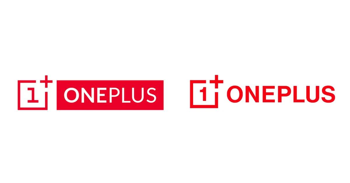
The Oneplus 2020 logo redesign has a curvier number 1 and a new font system. While it’s arguably a minor update, it sets the tone for a more flexible brand direction and integrated identity system. Additionally, the step away from the negative space font of the earlier logo is a great choice in this respect.
17. Tripadvisor

The review website kept their iconic owl instead flattened its colors into black, a more fresh and flexible design. Far from killing their character, TripAdvisor did a great job infusing the brand with energy and immediacy, thanks to the new capitalized font and bold logo mark.
18. Fnatic
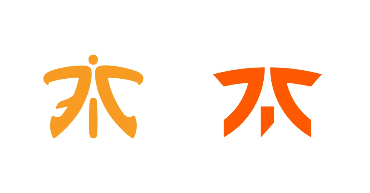
Gaming giant Fnatic's new logo is a continuation of their existing logo mark with a few adjustments. A bolder orange takes the place of older color. Plus, the symbol was further paired down to become a truly minimal logo. One of the most recognizable icons in the eSports world, Fnatic did clean up well.
19. Fisher-Price
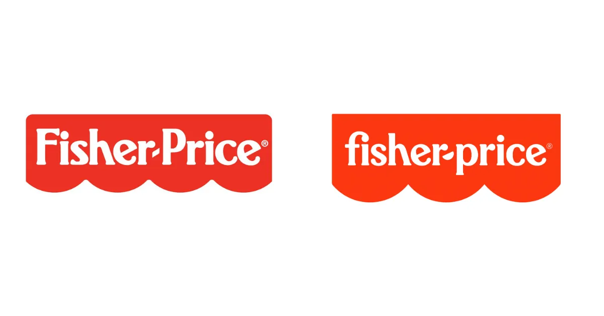
Fisher Price’s new logo is a more playful and flexible version of the old one. The four-piece container was reduced to three semi-circles, symbolizing the three founders and the intersection between kids and adults. The font was redrawn and monogram versions of the logos were added for use in multiple contexts.
20. Gordini
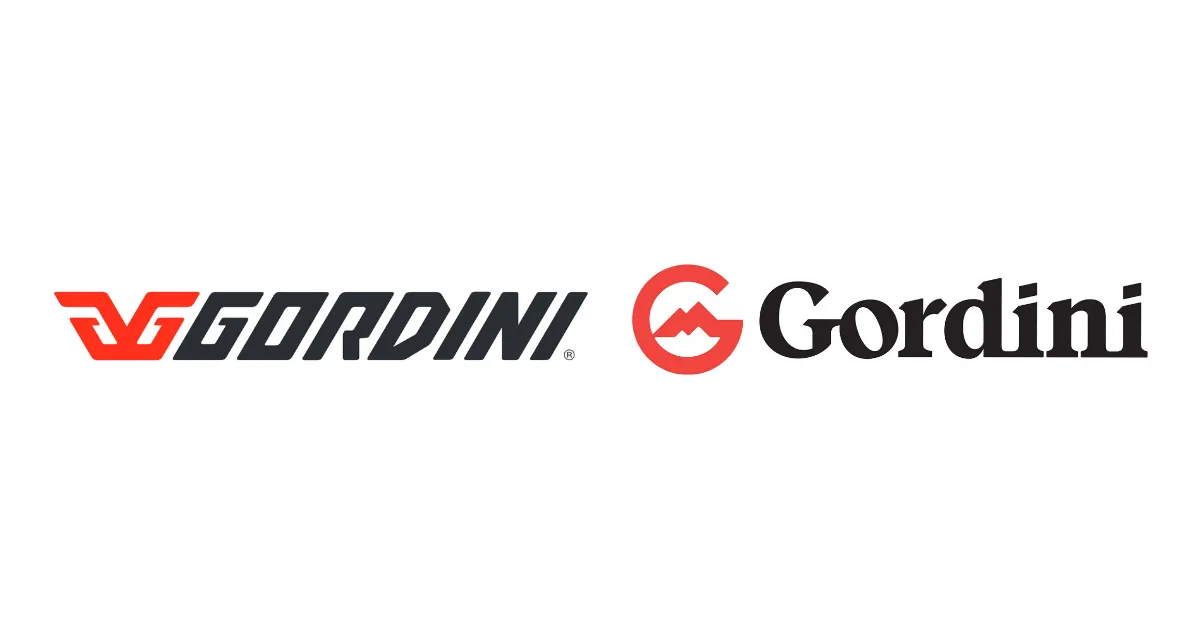
Cali’s Libre Design Studio redesigned the entire brand identity to bring it up to date for 2020. We love the simple, effective symbol in the shape of the G letter. Did you notice the mountain on the inside? And the improved font adds a kind of chic vibe.
21. Intel
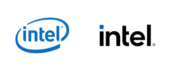
Intel changed its logo for the first time since 2006 on 2nd September. Did you know It's only their third logo since 1968? A newer, simpler, and more generic logo. The company announced its new branding to coincide with its 11th Gen Tiger Lake processors. The company is embracing a wider palette of blues to go along with the logo.
We will be back with another interesting blog soon. Keep exploring other great logos on your own, and stay tuned for more logo redesigns!
Visit Iconscout and get millions of icons, illustrations, and stock photos for your next project. Check Free icons, Free illustrations, and Free stock photos on Iconscout.
Related Blogs
Access the world's largest Design Ecosystem: Assets, Integrations, and Motion.


