


Tutorials
Use 3D assets in
![View details about our figma plugin]()
![View details about our adobe XD plugin]()
![View details about our google slides plugin]()
![View details about our powerpoint plugin]()
Free 3D Icons
Use Lottie animations in
![View details about our figma plugin]()
![View details about our canva plugin]()
![View details about our adobe XD plugin]()
![View details about our google slides plugin]()
![View details about our powerpoint plugin]()
Free Lottie Animations
Use Illustrations in
![View details about our figma plugin]()
![View details about our canva plugin]()
![View details about our adobe XD plugin]()
![View details about our google slides plugin]()
![View details about our powerpoint plugin]()
![View details about our MacOS plugin]()
![View details about our windows plugin]()
Free Illustrations
Use AI in
![View details about our figma plugin]()
AI Images
Smart Tools
glTF 3D Editor
Edit 3D icons & export glTF/GLB models for web & AR.
File Converter
Batch convert assets to SVG, PNG, PDF, & EPS instantly.
Illustration Kit Editor
Mix & match styles to build custom vector illustrations.
IconScout API
Integrate millions of design assets via our REST API.
Gateway To The Ultimate Icon Usability Guidelines
We all know how to use icons in your website or let's just say UI. Do you know what to do and what not to? We are here to tell you about the same.
Icons have been flooding the websites recently. Wouldn't you want to know what Iconography is? Let's look into it, shall we? Icons are the symbols or images used in any computer interface to refer to an element. Icons are those tiny creations that we use in our daily lives like emojis or profile pictures, and whatnot. Before we go ahead, let's be honest here for a second: It has never been easy to attract an audience to your website. You work so hard in creating the perfect User Interface for your business or company to display superior brand value. But it is all about letting the message reach your audience. We all want to create something that would produce unexpected results, and using Icons we can achieve those.
Icon usability makes your website and mobile applications attractive and provides way better graphics with much easy interaction and bedazzling. Icons usability adds invaluable assets to an increasing number of interactions. While you are using icons in your design, here are few things you need to take care of before you get started.
Icons Usability? What is that?
In a designer's language, icons usability is a great strategy to attract customers. These are the visual representation of a creator's mind that help conveys the message to the audience. Icons are the universal language for people with different languages and even those who cannot read. Digital creations have evolved so much, and now option for using icons is available for almost anything.
Iconscout library has over 2.9 Million+ icons. And Iconscout has its very own production Unicons, perfect pixel icons in styles like Line icons, Monochrome icons, Solid Icons, and Thin Solid icons. Along with some pretty unique illustrations, 3D, and the newly launched Lottie Animations.
Design on purpose
First and foremost, you need to decide the theme of your website. When it comes to website or UI design, to be precise, whether you're creating a user interface from scratch or modifying a pre-existing one. Using icons can play a crucial role by connecting with your user and give meaning to your design. Icon usage is what will create the bridge between you and the user. For instance, you're designing an e-commerce website, and you want to keep it simple and precise. In this case, you would prefer using icons which are minimal, required for add to cart, categories, home, profile, and many other options. These are to be placed on your website to convey the meaning and carry out their function.
Know your audience
One of the fundamental rules of business is "Never assume you know your audience." You need to know who, why, what, how, where, and when your user would use your service. Remember that you can't please all people, so focus on your target audience to supply your services. One should always consider cultural norms as the meaning of particular icon usage can vary in different cultures. Last but not least, the icon usability is crucial in appropriate language.
Planning is essential
Integrating as well as creating icons for your UI requires careful planning and attention to detail. You first got to plan out the whole layout of your website and execute it accordingly. Then comes the part where and how many variations of icons you wish to include in your website. You may want to consider using icons of similar style in your website and application UI as it gives a cleaner look. In terms of the look, the icons need to fit in the theme of the whole UI. Now, it's time for the next step.
Size matters
Let us think about size and scalability. The icons usability should be based on configuration, pixel perfect, and perfectly scalable. Icons are available in various file formats like PNG, SVG, JPEG, etc. SVG is the most preferred as these are scalable vectors, making scalability easy it be your website or mobile application. Using icons which are smaller in size require minor detail, while larger icons require a more profound and richer design. Whatever the size, you must create icons with details making the icons look perfectly irresistible.
Use a single icon family
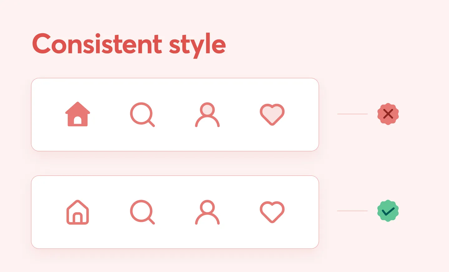
It's essential to get the right balance between consistency with the icon usability, such that the overall look and feel of the design does not look flat and dull. Many decisions related to icon style and size need to be made carefully but do not forget the theme of your website. It would be best if you consider using icons of the same design and style. Thus, icons should be single-family, making your UI theme highlighted, user-friendly and making your brand value stand out.
Be familiar with formats
Here's a quick overview of different file formats since you must be aware of varying file formats.
- JPEG: Joint Photographic Experts Group - Standard image format for containing lossless compressed image data and maintaining high-quality image. The sharing of JPEG images is quick and efficient.
- PNG: Portable Network Graphics - The successor to the GIF, higher quality, millions of colors, and supports alpha transparencies. PNGs are not scalable as compared to SVG.
- SVG: Scalable Vector Graphics - Universal and scalable vector graphics are the ideal file format. These are primarily scalable, making them suitable for mobile applications as well as websites.
Icon size vs. Text size
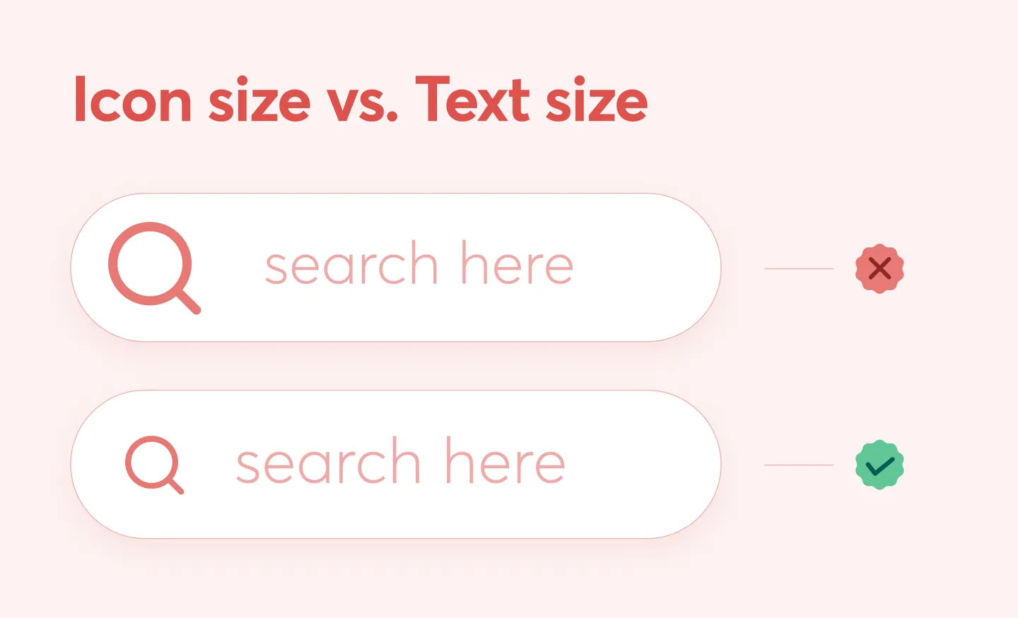
One of the biggest tips you will get is to have the same size of icons and text. This rule can vary as per the segment of the website or application. The proportion needs to be precise so it is friendly to the user's eyes. Taking the example of the search bar, you can look at the visual given above. The size of the magnifying glass is the same as that of the words search here, making it look pleasing. If it would have been larger, then it would look pretty odd.
Keep it simple
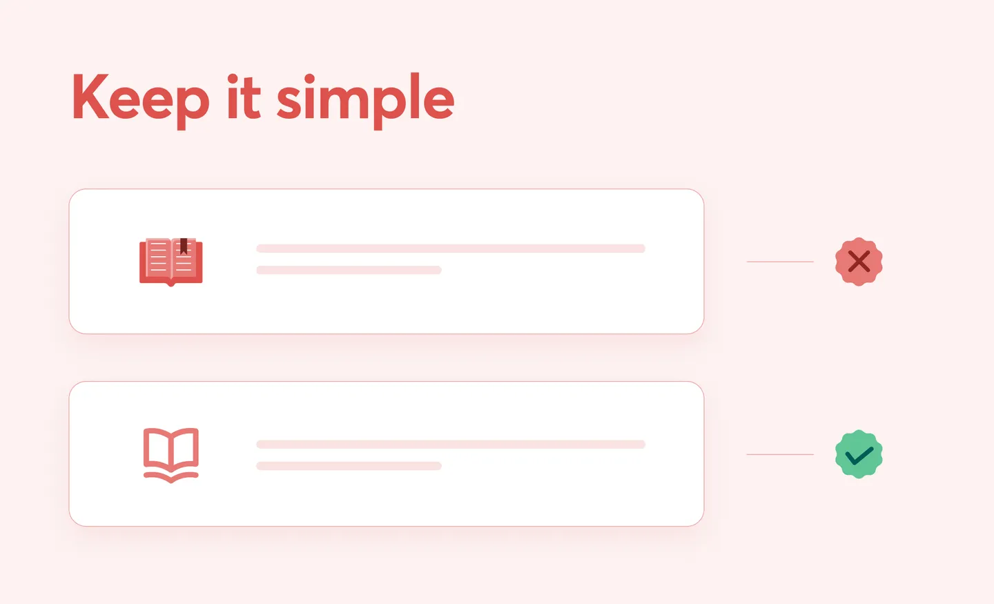
We are taking the example of the book icon here as you can see what an enormous difference an icon design can create. Using icons of minimal detail and design is much more suitable than an over-the-top detailed icon. Icons might be tiny creations, but they play a much more significant role than we imagine. It is said that details make any design over the top, but when it comes to using icons, size is prioritized before detailing or structure. Now with the age of minimalism, always keep your website, application, even UI simple. Be smart and keep it simple.
Alignment in button
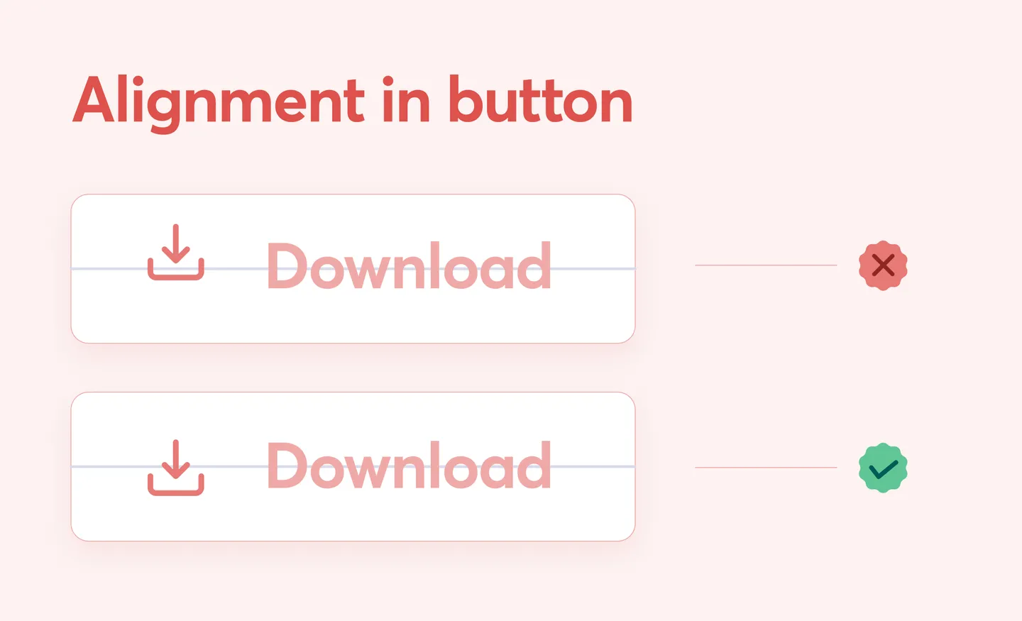
'Alignment in button' who would have thought that such a rule exists. Well, let me break it down for you. Icons and words go hand in hand, and alignment is an essential factor here. The icon and words should be next to each other and fall on the same central axis, thus centrally aligned. The same is displayed in the picture above very clearly in case you have any doubts. It is essential in your UI that all your icons are aligned uniformly. If you look closely, you would see the difference that incorporating alignment can make your website or mobile application. Don't forget to consider alignment while using icons.
Spacing
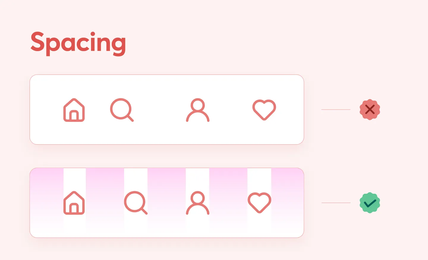
Icons make the task for users much more effortless. With one click, you can make anything possible. Now, to avoid confusion or misclick, a fixed pixel of space is kept between icons. This is consistent throughout the website providing your customer easy icon usability. Now the icons also require breathing space; this spacing makes it possible for them. With all the alignment and icons, you have to make sure that the placement of the icons does justice. With the right amount of measure, your set of icons can look more than great! We have provided you with a visual below, which will help you guide on this topic.
We hope with these rules, your website or mobile application UI will look fabulous the way you wanted it to! It was simple to follow, isn't it! Here we are at the end yet again, so we hope you find these rules of icon usability helpful and use these in your next UI project.
How can we forget our amazing icons created by our contributors in a lot of different styles and variety. To explore icons all you have to do is click on the button given below! So what are you waiting for ? Click now!
Creating and maintaining UI is easy, so here is a link where we have listed some of our best UI assets just for you guys! Don't forget to visit Iconscout and find millions of icons, illustrations, 3D, and the newly Lottie Animations too for your next project.
If you have any suggestions or work on anything, you can write to us on our Community Forum on Discord.
We hope you enjoyed it. We will be back with another blog soon! Till then, Happy Designing!
Share on


Related Blogs

Access the world's largest Design Ecosystem: Assets, Integrations, and Motion.
