


assets
Use 3D assets in


Free 3D Icons
Use Lottie animations in

Free Lottie Animations
Use Illustrations in


Free Illustrations
Use AI in
AI Images
Smart Tools
glTF 3D Editor
Edit 3D icons & export glTF/GLB models for web & AR.
File Converter
Batch convert assets to SVG, PNG, PDF, & EPS instantly.
Illustration Kit Editor
Mix & match styles to build custom vector illustrations.
IconScout API
Integrate millions of design assets via our REST API.
How to Use White Space to Build More User-friendly UIs
Hey you all! we are back with yet another blog. today's topic is different as well as unusual. Hope you have fun reading it!

Good UI and graphic design is when the designer has thought through the smallest elements of a website, all intending to make it user-friendly. If you are a UI designer, you would know about the pressures of balancing content, design, and functionality on your website.
Using white or negative space effectively is one of the most critical tools designers have. As important as content is, white space makes it better structurally and in terms of readability. The user experience is central, and having the pages designed with the user in mind makes websites and applications far easier to use.
This is not a new concept. A lot of brands, especially the premium brands have used space quite effectively in their brand assets and also in their user experience design.
What is white space?
White space refers to the empty space around the elements on any design. This could mean the space between an image and a text block or the spacing between two lines in a paragraph. This does not mean it has to be “white”. This is why negative space is a commonly-used synonym: It just specifies blank space that can be occupied by the background image or color.
Why use white spaces?
There are many reasons for using white spacing. White space is a great aesthetic element for designers. It can add structure and character to a website and take the design to the next level. But white space also has a few other important roles to play. Some of the important elements are below.
1. Enhances the focus of users’ attention
White spacing is very effective in moderating the user flow on any website and helps viewers to focus their attention on the really important bits. Having less content means that the user is not being distracted by other components that are likely to be less important.
2. Improves information flow
By using white spaces, designers can create a smoother flow of information on a website. In a form fillout use case, for instance, the user can move from one form to another in a systematic manner with negative space, providing relief and a clean look.
3. Improves readability
On content-heavy pages on a website like a blog, spacing majorly improves the reading experience of the user. Having enough space between letters, lines, and, and menu icons makes it easier for the user to peruse the blog, and not get overwhelmed by the information.
4. Impacts branding
White space also has a role to play in brand perceptions. Premium brands tend to rely on white spaces a lot to convey the position of their brands. Minimalist approaches are a recent trend, and white spaces play an important role here too.
So how can you use white space more effectively?
Using white spaces effectively is a fine balance between content, design, and function. You need to pay attention to all these elements of design before you start working on the design and incorporating white spaces. Before we begin, let’s take a quick look at some simple jargon.
Macro and micro white spaces
Macro white space refers to the white space between the various larger design elements on a page. This refers to the space between the sections, images, text, or any other element on the page. Macro white spaces have a major impact on the visual identity of a website.
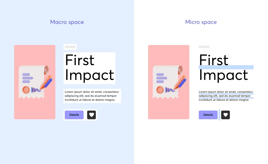
Micro white spaces are the smaller spaces that come into play such as the space between words, line height, and margins. These micro white spaces are critical in improving the readability of content.
Active and passive white space
Active white space is used to enhance the page structure and improve the flow a reader follows on a website.
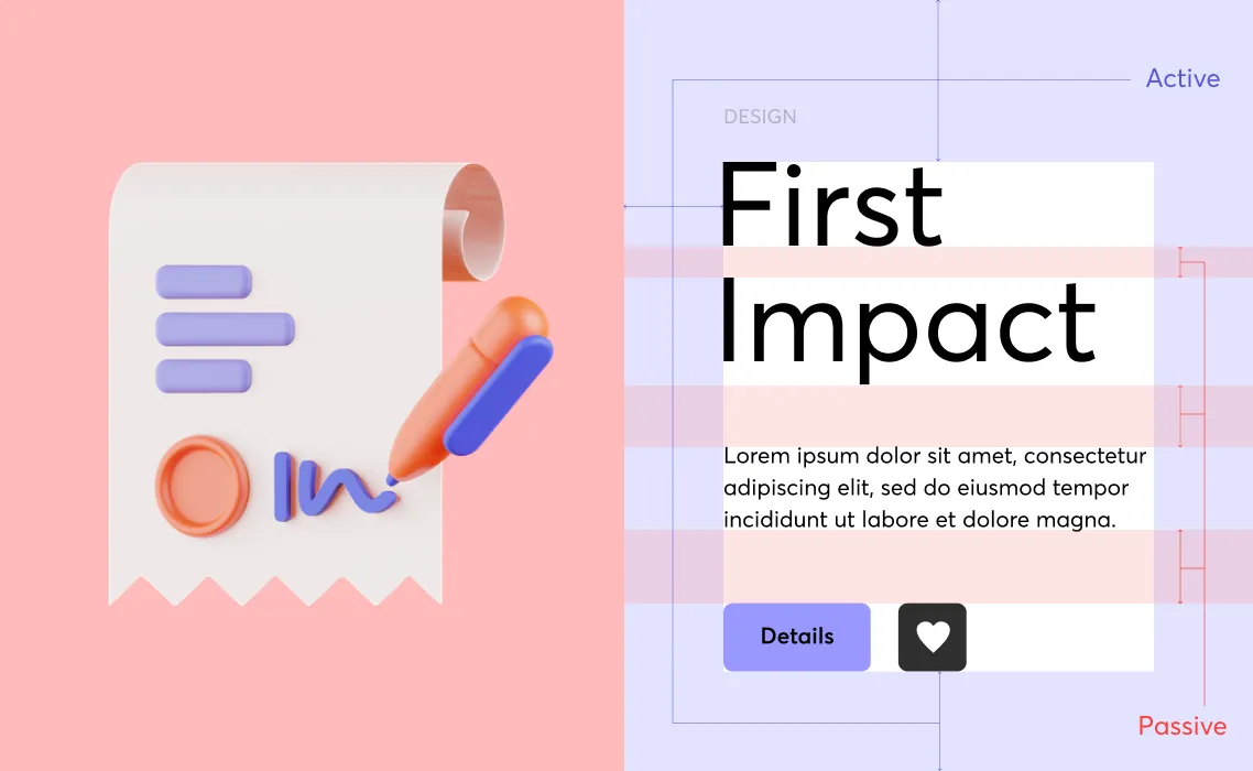
Passive spaces do not perform any structural functions but it has a bearing on the readability and includes aspects such as the white space between the lines and paragraphs. Let’s look at some of these steps.
1. Say more with less
When working with marketers or content creators, a major pushback you often get is the urge to fill all that screen real estate with content. However, good white space design involves saying more with less. So, reducing the amount of content you are working with is a good place to start.
When it comes to space in design, here's an interesting rule of thumb: ensure that there are always fewer than 15 points of user attention. This includes headers, subheadings, lines of text, buttons, and anything similar. By keeping the content to a minimum, you will have more space to work with on the rest of the page. Don't think of minimal content as a waste of space. You're actually improving content legibility and the overall user experience.
2. Get the hierarchy right

The next step in the process is to structure your content and figure out the hierarchy of content. This is going to be important in determining the elements where the user’s attention is to be focused on first, and what should come next. Finalize your headings, CTA buttons, and other elements on the page and check which elements fall in which level of the hierarchy.
3. Plan out your macro space, micro space, and other active spaces
While placing the various content on a page, first look at the macro white spaces you can use on the page. Provide enough space between elements for the page to look less cluttered and clean.
Use active spaces in the blocks of content to further improve the layout and page structure. Refer to the hierarchy that you have decided upon to ensure that these active and macro spaces accentuate the elements that need attention, and give less importance to the more supporting elements.
4. Garnish with micro and passive spaces
The next step is to look at the smaller spaces that you can use to improve the readability of a page. Space out the words and lines properly so that it is easy to read. Make sure there's enough space between columns, as well as space between lines.
If you are dealing with blog content and pages with more reading content, using these micro and passive spaces can be the difference between a longer stay on the page and a quick exit.
5. Measure and optimize
The last step in the process is to constantly keep track of the page performance and see if you are getting the right results. Whether the page is meeting its goals would be the most important indicator. But beyond this, analyze the user behavior on these pages and see if the user’s attention is falling on the right spaces. You can use tools like heatmaps to see the user activity and active element or elements and optimize the design accordingly. It is also advisable to A/B test the important pages to understand which designs are performing better.
UX design is all about putting the user’s experience at the center. It is quite easy for marketers and developers to fall into the trap of cramming information onto their web pages. But all this does, is confuse the users. White spaces are a designer’s most important tool. It has both aesthetic and functional roles to play in a page’s performance.
Even if you are dealing with web pages that tend to be content-heavy, media pages, and e-commerce sites, for example, it is possible to use white spaces smartly to ensure a better user experience. The concepts remain the same but it has to be modified to fit the requirements of the content. Overall, being consistent, and having empathy for the user is critical in making white spaces work for you in a design.
We hope you try these out and have fun. Also, don't forget to share and subscribe! You can check Iconscout to download from Millions of icons, illustrations, 3D Assets, and Lottie Animations. We have a massive collection of assets! We will be back with another exciting topic soon.
Till then, Happy Designing!
Share on


Related Blogs

Unwrap the Ultimate Creative Gift: Full Access to 12.9M+ Assets & AI Tools
