


assets
Use 3D assets in


Free 3D Icons
Use Lottie animations in

Free Lottie Animations
Use Illustrations in


Free Illustrations
Use AI in
AI Images
Smart Tools
glTF 3D Editor
Edit and create stunning 3D Icons in no time
File Converter
Convert your graphic assets into various format easily
Illustration Kit Editor
Try our Illustration Kit Editor to experience endless design possibilities
IconScout API
Integrate highly-customizable design assets within your platform
How (not)to design UI that irritates
A small list of UI that gets on everyone's nerve. So if you are a programmer do not forget to check it out!

Originally published by Shreya Saxena on Medium.
A small list of user interactions that get on your and everyone else’s nerves.
Untimely or Too many Notifications
Google shows me the traffic information from my home to workplace even at 1 AM. Seriously? What is your machine learning algorithm up to?
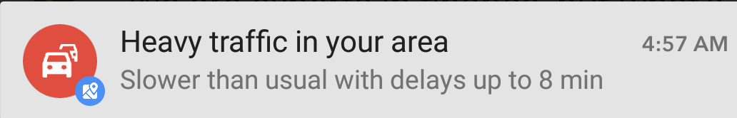
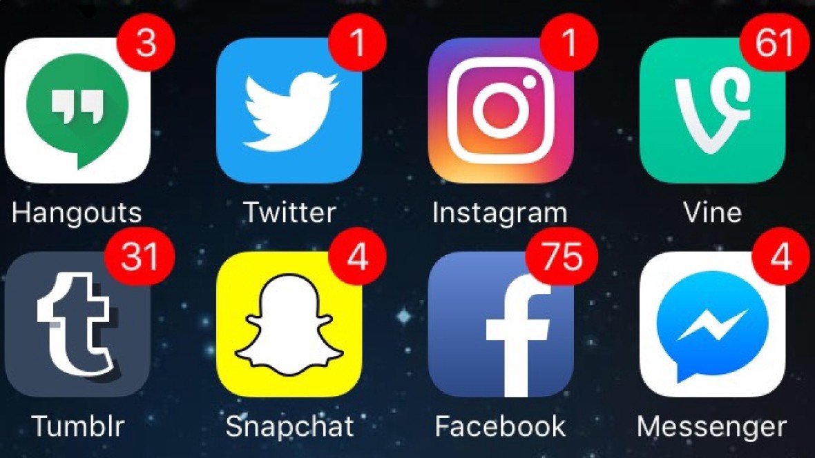
How many times have you cringed at the number of notifications you get from websites?
While users might like to be reminded of special offers and discounts, important information related to them, however, the context is important. It doesn’t make sense to show someone special offers on shopping while they are searching for some news about the natural disaster.
Forced Logins and Registrations
There are many apps that force you to register/sign up before you can even get a taste of the kind of service they offer.
I think the user should be given a choice whether or not he/she wants to subscribe to a particular service. It shouldn’t be forced by interrupting the user’s main task. It’s a bad UX, after-all.
When Forced to Like/Subscribe/Tweet
This is quite common. Like it’s said in Game of Thrones: “And any man who must say ‘I am king’ is no true king at all.”

When you want to read a full article, or before you even start watching the actual content of the video, isn’t it annoying when YouTubers or sites, waste your 1–2 minutes asking for comment, like or subscribe? I mean, get a spine. If your content is great, there’s no reason why people won’t return to it again. Or if you must, keep these formalities at the end of the content so that users that are genuinely interested are not bored.
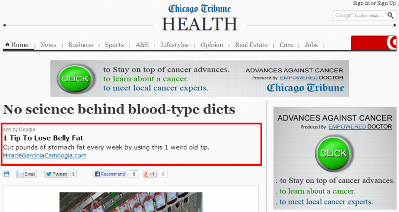
Popups
This needs no explanation. Popups have been annoying since the beginning of Internet!
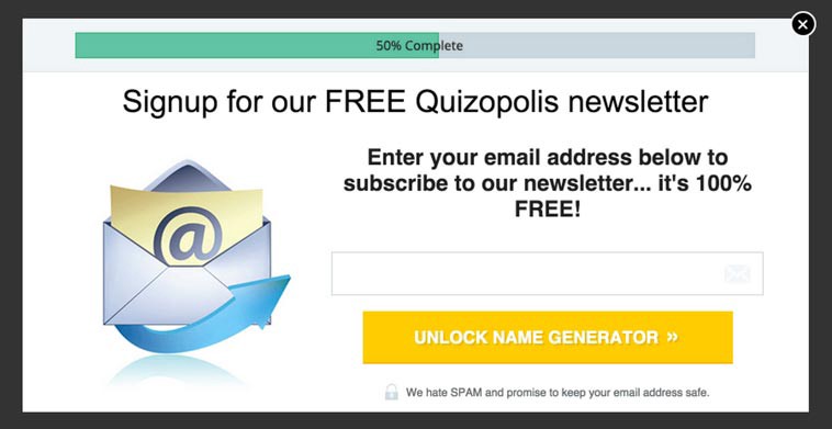
The big overlays that ask you to enter your email before you even finish reading a blog, is a plain disregard of user’s task. There are a place and time for it. Personalised Popups that require confirmation before a user deletes a file are good, while the popups that ask for a subscription to the newsletter as soon as you land on their page are bad UX.
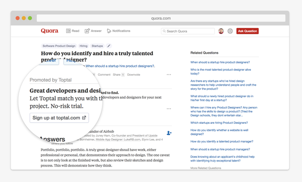
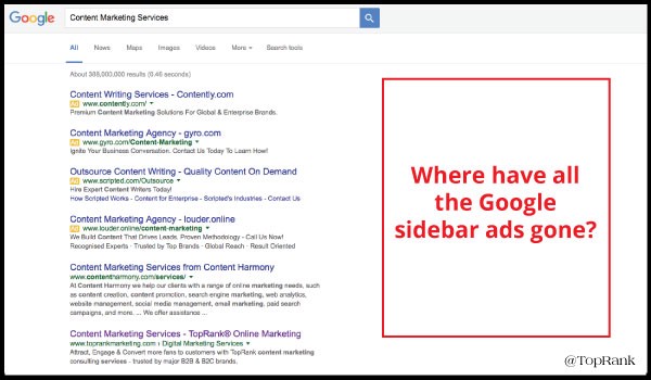
Poor User Interface
By poor UI I do not mean to say that the site is doomed or bad. It might still offer a good UX. The crux of the matter is, when UI is distracting, so much so that user is left bewildered as to figure out which section is which, differentiate between ads and the actual content of the site.
A polished, consistent UI takes time and effort, surely. Facebook was not built in a day. But, and I emphasise, anyone who cares enough about providing a rich user experience is capable enough to build UI that focuses more on solving user’s problems rather than aggravating them.
If you want to build a great UI and avoid inconsistencies that might occur when designing from scratch (like different colors for recurring elements or inconsistent font sizing), you can use a UI Kit. The components from UI kits are created to fit together perfectly as part of a consistent design. Plus, you will shorten the time that goes into designing your website/web app.
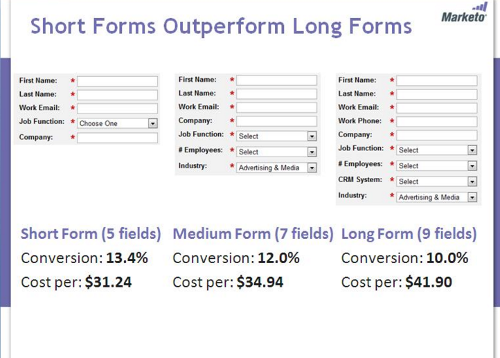
Forms
They are a necessary evil. However, there are both Good ways and bad ways of designing them.
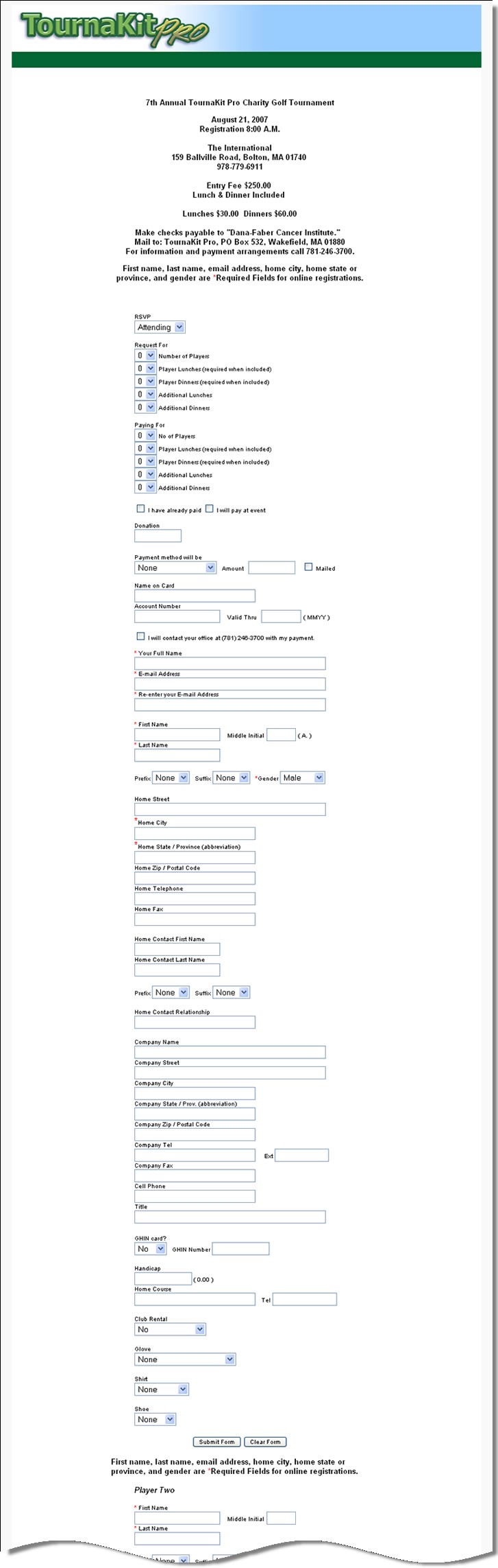
Form fields that are not grouped properly, placeholder text that is used as labels for fields, lengthy forms — the list of what can go wrong in forms is endless.
Over to you
We hope you find this article helpful. Have you come across any bad example of UI design that we forgot to mention? We’d love to hear about it in the comments below! Also, don’t forget to check our latest article on Partnership with Online Presentation Making tool Ludus. Don’t forget to share and subscribe! ?
resources
bad ui design
design
example of bad ui design
how to excel ui design
inspiration
software development
things to avoid while designing
ui
ui design example
ux
Share on


Related Blogs

Access the world's largest Design Ecosystem: Assets, Integrations, and Motion.
