Grid System: How to Build Better UI Designs with Layout Grids?
Explore our new blog which teaches you everything you need to know about layout grids and best practices of grid systems before releasing your next design.
Grid Systems have been in use for a long time in print publications. Ever read a newspaper? See how news is presented in the form of grids and text blocks. It’s simple, yet systematic.
However, grids are as important in print as in digital media. Nothing is more frustrating than a website or mobile app with inconsistent design and blocks of text. Not only does it look unprofessional, but it also makes it harder to navigate and read. That's where grids are useful.
Undeniably, the secret to good design lies in how visual elements are organized and arranged with regard to their positions. And you can achieve this using a layout grid.
Like color, typography is an essential part of UI/UX design. Layout grids also form an important part of them. Without grids, your text and images will be all over the place, creating a mess.

Hence, to make it easier for you to understand, we have put together this guide about grids. It will show you:
- What are grids?
- Types of Layout Grids
- Layout grids in interactive design
What is a Grid System?
A grid system, in simple words, is a combination of vertical and horizontal lines that intersect with each other. These intersection points are then used to arrange the content on the website or an application. The grid system allows designers to arrange content in an easily digestible and more manageable way.
The grid acts as an invisible glue between the elements. Even when they are physically separated, it keeps holding them in place.
What are the Types of Layout Grids?
There are four types of grids:
- Manuscript Grids
- Column Grids
- Modular Grids
- Baseline Grids
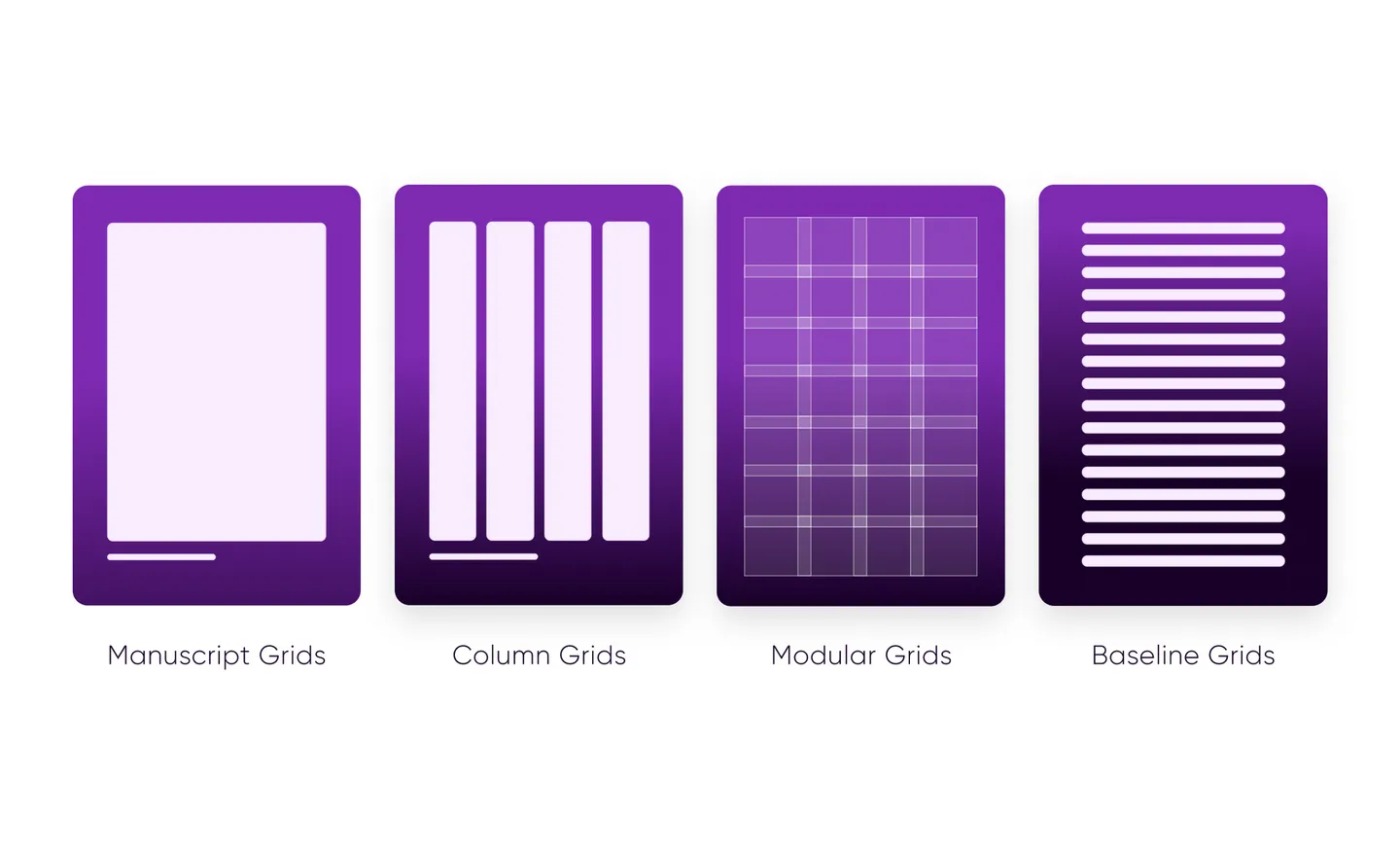
Let's explore each of these to know where you could use them.
Manuscript Grids

Manuscript grids, also known as single-column grids, are the most basic version of the grid structure. It is a large rectangular area that takes the majority of space inside a page or format.
These grids are useful for displaying continuous blocks of text, or you could use images to fill the blocks. They are commonly used in print publications, such as books.
Column Grid

Column grids, as the name suggests, organize the elements into columns. Depending on the configuration, column grids may have as few as two columns or up to six columns.
There are two types of column grids, symmetric and asymmetric.
Images in column grids can be placed in one column or across two columns.
Magazines, research or academic papers, online newspapers, and blogs use column grids.
Modular Grids
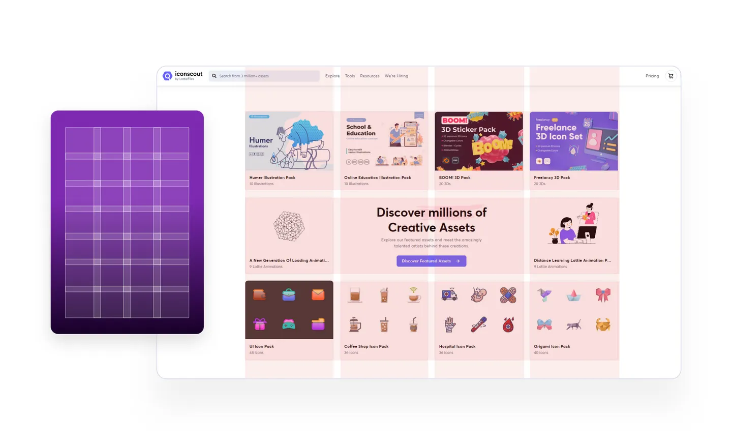
Modular grids have both columns and rows. They have equal-sized modules. These types of grids are useful when you want to have more control over complex layouts.
Newspapers use modular grids along with column grids to have more control over the layout. With modular grids, endless variations are possible.
Baseline Grids
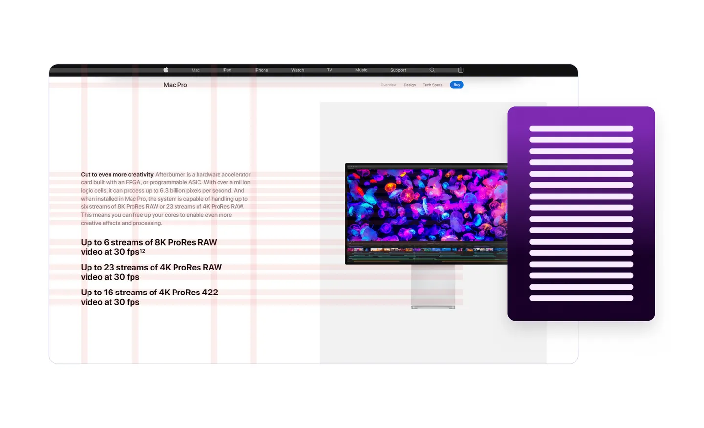
The line where your text sits is called a baseline. A baseline grid can be applied to any layout grid to provide rhythm to your text.
The grid ensures that the bottom of each line of text (baseline) aligns with vertical spacing.
Baseline grids are seen in lined notebooks. They keep the rhythm of the text. No wonder the teachers in school want you to use lined notebooks instead of blank ones.
Layout Grids in Interactive Design and Their Benefits
Interactive designs do not have a fixed size. The reason behind this is that people use devices of variable screen sizes, such as smartphones, smartwatches, tablets, and desktops.
So, when people move from one device to another, the elements need to be re-organized to accommodate the changing screen size. To accomplish these changes, a layout grid is the best choice.
The grid system improves the quality of design in several ways, including:
It helps create clarity and consistency
Consistency is critical, especially with digital media. It helps users know where to look for a piece of information. Grids create a foundation for consistency, which indirectly improves clarity.
Makes design responsive
Responsive design has become a necessity today. Your audience will run away if your website is not responsive and is both desktop- and mobile-friendly. Therefore, designers use grids to create consistency in design across multiple screen sizes.
Makes design easier to reuse and modify
Digital media is constantly evolving. One of the main advantages of digital media is that once you create it, you can reuse it. The same is the case with grid design. You can reorder these grids to create a new version of the design.
FAQs
What are the four basic layout types?
Manuscript, column, modular, and baseline are four types of layout.
Which grid system is best?
The application of the grid depends on the format. For example, the manuscript grid is suitable for books but not newspapers or magazines.
Key Takeaways
Grids have been helping artists (including writers) of all kinds since the 13th century when they were first used. Grids act like a skeleton that holds the elements together. They help you find a perfect balance in your designs.
Now that you have a good understanding of layout grids, their types, and their benefits, you can use them in your design.
Have any questions? Ask us in the comments section.
Don’t forget to take a look at our newsletter. It’s free!
We send daily design tricks and tips straight to your inbox and trust us, you don’t want to miss them. Besides, there’s nothing to worry about, we promise to never spam you.
Do visit Iconscout to download from our 3M+ assets library of icons, illustrations, 3D. This massive collection of assets in the form of a library waiting for you, so what are you doing here? Go and check it out right now!
If you have any suggestions or want to be a part of the community, you can write to us on our Community Forum on Discord.
Till then, Happy Designing!


