10 Best Design Systems You Must Know in 2020
It is believed that in the future, every brand and every product will use a Design System, simple or comprehensive, strict or loose, mono, or cross platforms.

Design Systems have become a key part of any company everyday work. From discussions to creations, it seems that it has become an integral part of designers life. It is believed that in the future, every brand and every product will use a best design System, simple or comprehensive, strict or loose, mono, or cross platforms. Here we are today with our top 10 design system count down. Ready for a fun ride so let the countdown begin.
1.Material Design by Google
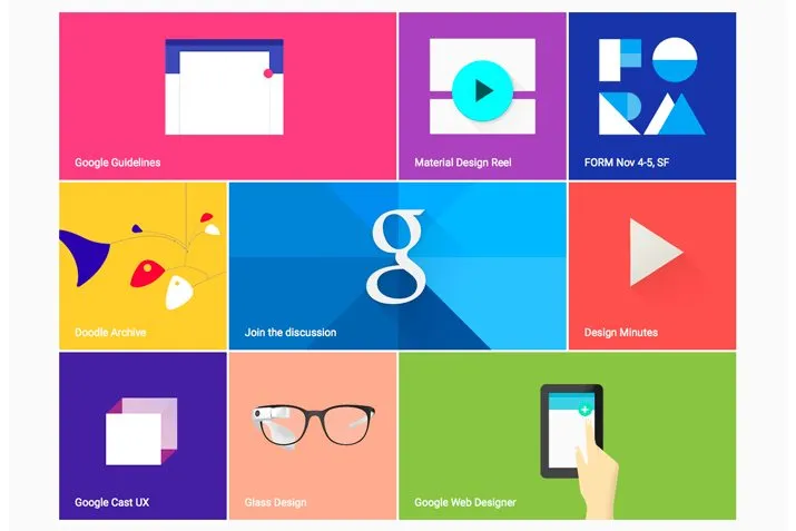
A modern design language developed by Google in 2014, Material Design aims to create a visual language for users that brings efficiency and modern together created by the innovation of technology. It helps to unify user experiences across all devices and platforms. It is an open-source code, a beautiful collab between designers and developers. It includes many sections including, motion, style, layout, color palette, typography guidelines, icon design, even the ability to create dark material themes, and more.
The first version of Material Design had one drawback that was important for brands that want to adapt it to their style. All Material Design applications were extremely similar. So in 2018 Google launches Material Design 2.0. This version was an answer to the above criticism. With multiple styles, layouts, depth effects, cool animations, they are empowered to make truly unique branding themes.
Users of the system have the tools and resources needed to create a unified UI.
2. Mailchimp

Mailchimp has been always cited as one of the best examples for a detailed company brand tone but they also have also been known for its pretty thorough design system that is focused on a pattern and a pattern library. You can find detailed guidelines for colors, buttons, alert messages, and every other aspect of the marketing platform. To add more to it there are guidelines that have plenty of examples and explanations that break down the most important concepts. Email and marketing automation service is available too.
MailChimp features a well-established design system, available years before design systems sprouted fully. The design system is robust and is kept simple and user-friendly.MailChimp also has a handy content style guide available.
3. Uber Design by Uber
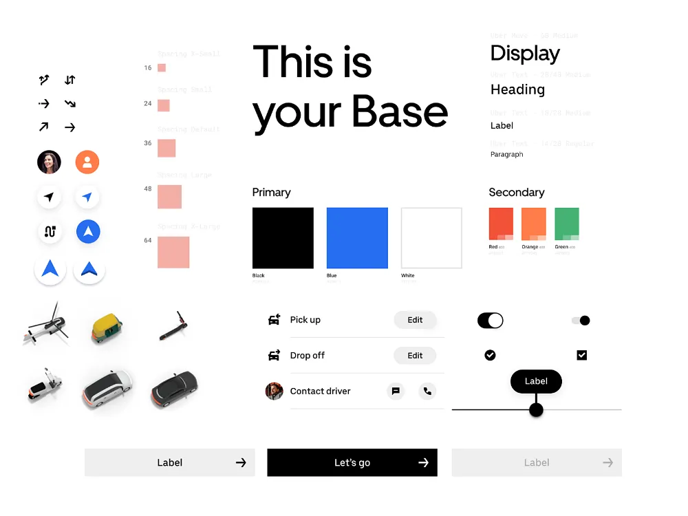
Uber describes its brand as a bold, new brand and its design system defines those principles too. The design system covers the integrity of the brand visuals, from logo usage to color, composition, and event photography, and motion. Uber’s design system revolves around elegant simplicity and subtly recreating the famous U wherever possible. By creating a system that not only acknowledges but also leverages Uber’s evolution into a platform, with a robust, consistent set of basic elements while enabling them to freely explore. This system should be able to welcome incoming innovations without disrupting the existing experiences that feel familiar to so many users.
The ultimate goal of their design platform is to make every designer a little better at thinking of everything in terms of systems — grids, typography, language, motion, accessibility, and so on. This allows everyone to design together, to learn from a common source, and to have a shared understanding of product quality across the company.
4. Lightning by Salesforce
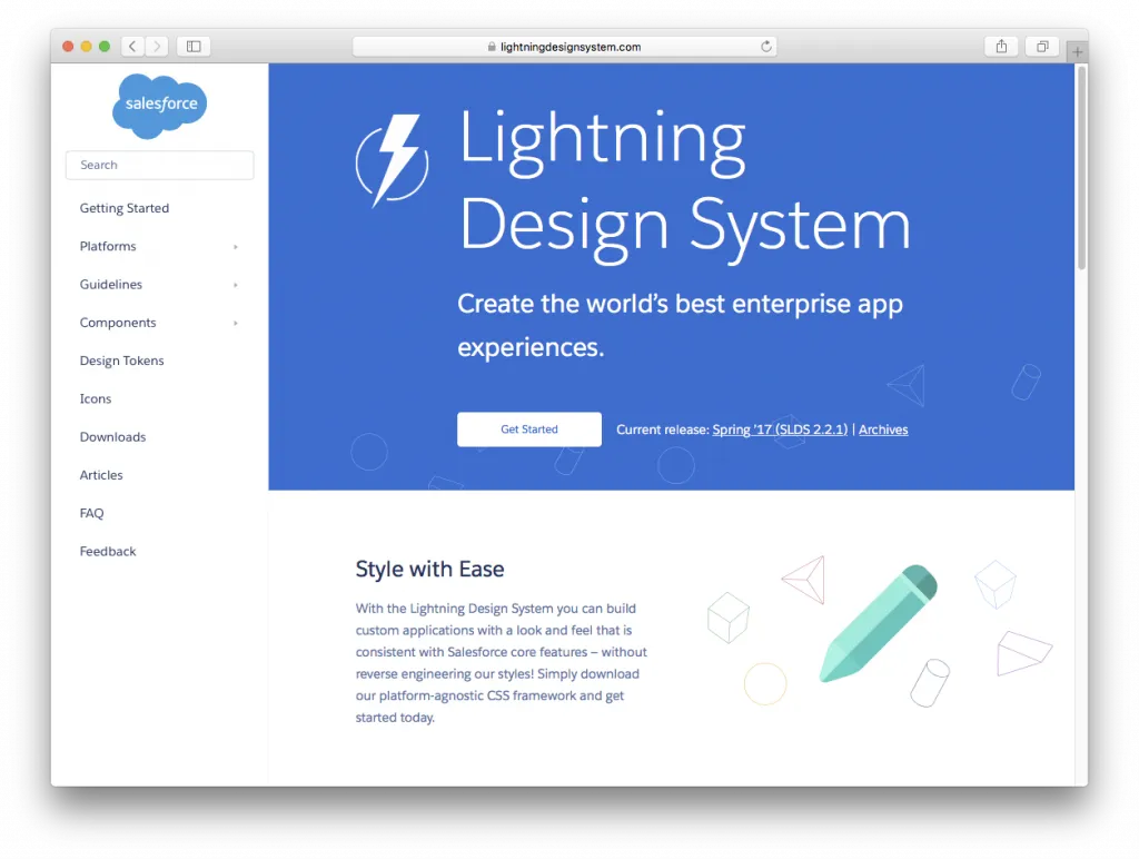
Salesforce is a star within cloud-based software, including CRM, customer service , marketing automation, analytics, and application development. The American company displays a thorough and well-documented design system called Lightning, which is an open-source project focused on building business apps which include guidelines on various platforms, accessibility, UI components, UI patterns, utilities, design tokens, and more. . The design system provides a professional and comprehensive guide to accessibility, components, patterns, utilities, design tokens, and more.
Lightning was a way to keep everything unified and easy to access for anyone designing for the platform. Instead of focusing on pixels, the design system focuses on application logic, user experience, interactions, and flows. You will find in-depth guidelines and examples that cover not only design guidelines but also accessibility issues and component blueprints.
5. Atlassian
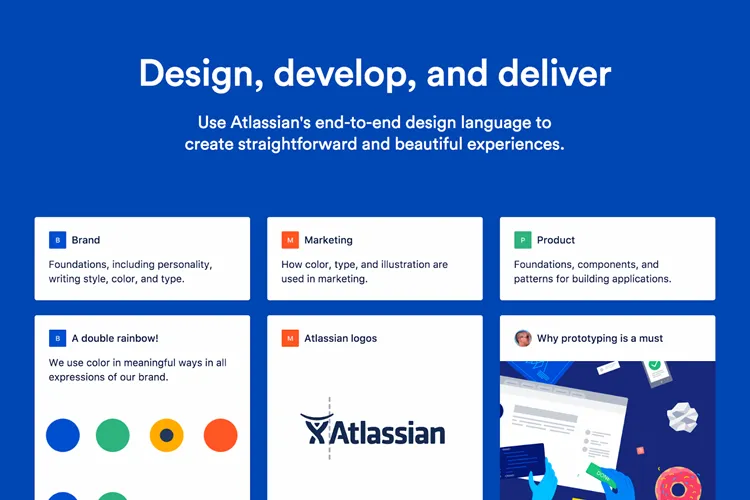
Atlassian is an Australian software company best known for its issue tracking application, Jira. Their design system describes not only how to use their logo, brand colors, fonts, and other design elements but they also let their brand personality shine through. With color names such as Dragon’s Blood and Herky Jerky, it’s easy to see why they describe their style as bold, optimistic, and practical with a wink.
Atlassian comprises various components including icons, fonts, buttons, badges, banners, pagination, tabs, tags, tables, and spinners. That helps the user have outstanding experiences. On September 12, 2017, Atlassian became a second product of the day and the fifth of the week on ProductHunt. By now, it has received 2,301 upvotes.
The system is very detailed and is composed of design patterns, code components, and a library of UI assets in Sketch. You can also find the reasoning behind each choice made.
6. Fluent Design by Microsoft
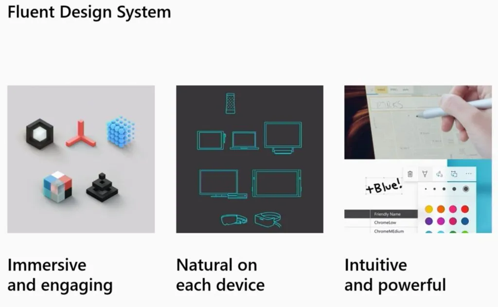
The Fluent design system was developed by Microsoft in 2017 and it aims to create simplicity and coherence through open design systems developed for all the platforms. It focuses on uniting the fundamentals of principled design, technology innovation, and customer needs. It also lays out guidelines for developing apps for Windows, Android, and iOS devices.
Representing a rethinking of Microsoft Design Language 2, Fluent contains instructions for visuals, effects, and interactions employed within the software. It is noteworthy, that the system is being improved according to real-world customer needs.
The sensory elements are based on five key components: light, depth, motion, material, and scale, with the increasing intent to be applied beyond flat screens.
7. Polaris by Shopify
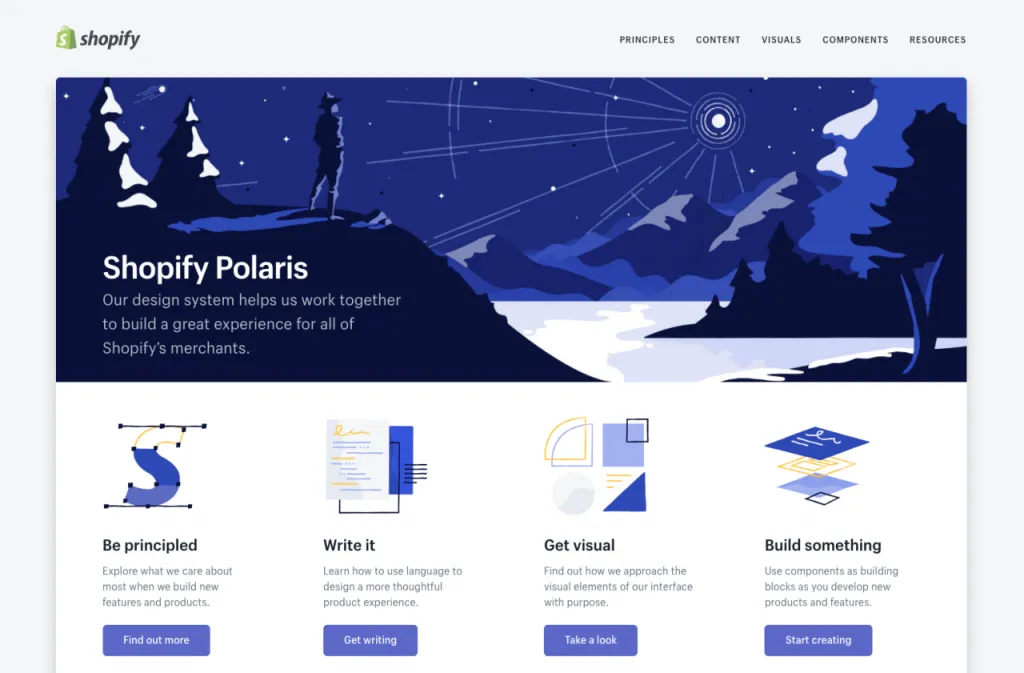
Shopify Polaris was developed so all Shopify merchants could enjoy a great experience and benefit from a beautiful store design. This design system has guidelines for crafting every part of the Shopify experience; from admin screens down to product experience and various apps for Shopify. You will also find helpful links to third-party tools that can serve as an inspiration or help you learn how to effectively design for Shopify.
This solution allows UI/UX designers and engineers to create user-friendly applications for Shopify merchants. Providing teams with plenty of tools, styles, and elements, it helps them build engaging user experiences that work on every device, on every operating system, and in every language. On the product’s official website, you can find in-depth sections on content, typography, components, illustrations, with guidelines for the tone of voice, grammar, and copywriting tips.
8. Marvel Design by Marvel

Developers don’t want to repeat the same work on different mediums. Companies want to be more efficient. Product designers and owners want the products they work on to be faster, more accessible whilst still looking sharp and consistent. They have also developed a few static sites: A marketing website, a WordPress blog, a bunch of isolated back-end templates.
They have a bunch of design values for colors, typography, layout, and more, structured in a simple JSON format. From there, it is sent to a few places. On one hand, they have a swift style guide generator which generates the design values consumed by iOS and Mac apps. On the other, there is a simple atomic CSS framework, which then gets consumed by anything that uses web technology; be that React, PHP, or old school email table templates.
So the advantages work out to be solutions to the mentioned problems such as shipping consistent and accessible products across different mediums, reusing and maintaining code and design in a more efficient way. And of course, improve cross-team collaboration.
9. Apple design system
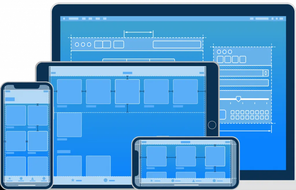
Apple’s design system is meant to facilitate the design of apps and Apple’s suite of products but there’s plenty to learn and admire in their style guide. For starters, you can download the SF icons which are meant to complement the system font for Apple’s devices. You will also find guidelines and instructions for UX design, making apps more accessible, and accessories.
Similar to Microsoft’s Fluent, Apple’s design system is meant to enhance the experience of the suite of Apple products and services. In this design system, you can watch video sessions and tutorials for building user-friendly and future-proof experiences, as well as how to optimize the experiences for iPhone X-e.g. designing for sound and writing for push notifications.
10. Airbnb design system
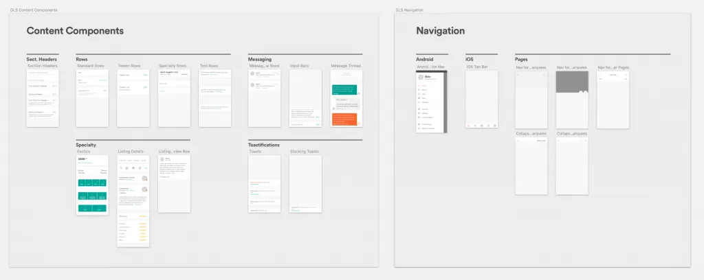
Airbnb shares a comprehensive overview of its design. The main characteristic of their design language is that each component can live on its own as a separate entity and even evolve further while also being a part of a larger cohesive unit, comparing their design system to a living, breathing organism. It not only offers affordable hospitality services around the globe. The company also shares insights about their featuring cutting edge techniques.
In the process of building the system, Airbnb also integrated internal and third-party tools. For example, the React-sketch app which is an open-source library that lets you write React components that render to Sketch documents.
With this design system in place, Airbnb is able to speed up development. Engineers are able to focus on writing the feature logic rather than the view code, and it enables faster prototyping and experimenting at a lower cost.
These were the top 10 must-know design systems. I hope you enjoyed the countdown. Don’t forget to check Iconscout to discover millions of icons, illustrations, and stock photos which you can use in developing your Design system.
We will be back with many more such countdown. Yeah and don’t forget to check out our other blogs. See you next time.
Happy Designing!!!


