Colors in UI Design — Theory, Psychology & Practice
Today's blog is a little different, how colors are used in UI design, theory, psychology and practice. Hope you like it!
We all are surrounded by colors 24/7. We see things and with every color we see we get different emotions. Colors affect us mentally and physically in many ways. To raise blood pressure, a strong red color has been shown, while a blue color has a calming effect.
Color is the easiest and most important aspect of engaging the user with the product in Design. Many people believe that choosing colors for the UI depends mostly on the taste and sense of beauty of the designer. The color selection process, however, is more complicated than it appears and plays an important role in the design.
You can set a mood with colors, draw attention, or make a statement. To energize or cool down, you can use color. You can create an atmosphere of elegance, warmth or tranquility by choosing the right color scheme, or you can convey an image of playful youthfulness.
The choice of color is based on some color psychology and theory. So let’s begin with the psychology of color.
Color Psychology
The color preference between men and women is different. It also varies with age groups.
According to Joe Hallock’s study, there is a significant difference in the choice of color between genders. The study was carried out for the colors that were most favorable and less favorable.
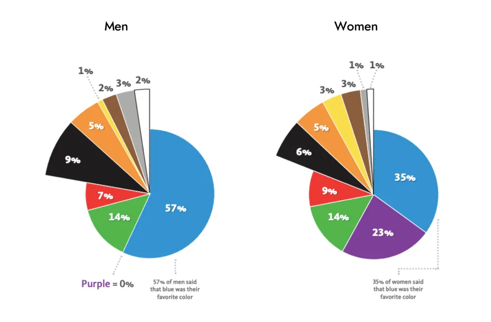
As we can see, the blue color is significantly favored by both men and women, and Brown is the least liked color.
Let’s understand it with a demo app
Therefore, the goal is to design an app to manage the expenses and the target audience is male and female. Let’s assume that a designer, who’s a beginner and doesn’t know more about color’s, chooses Brown as the primary color for the app because brown is his favorite color. The result would be as follows:
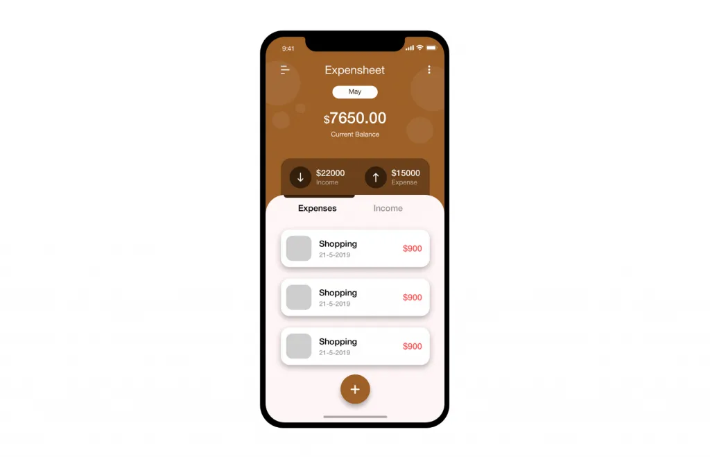
We can clearly see that the design is good enough, but due to color selection, the app may not work. So, what can we do to improve it? Later in this article, we’ll see what we can do with just a change of color.
The meaning of colors comes in. Designers need to understand what colors mean and what reaction they evoke in order to convey the right tone, message and call users to do the expected action. Each color has its own influence on our mind, and knowledge of possible reactions can assist designers in transferring the right message and calling users to take action.
You need to know the meaning of colors if you’re a designer reading this. So let’s shorten it. (The meaning of color can be read in detail here: http://www.color-wheel-pro.com/color-meaning.html)
Color Theory
In interface design, there are a lot of colors to use. The first thing that comes to mind when we talk about colors is Color Wheel.
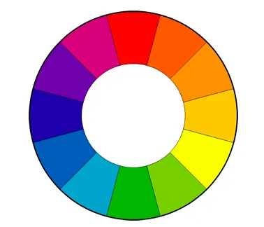
Now, another important topic is how colors can be combined. There are several ways to combine colors, but warm and cool colors must be balanced. Here are various ways of combining color:

There are 3 important color things that every designer should know when talking about colors: Hue, Value & Saturation. This was described so well by Christian Vizcarra, so I tried to implement it on my own.
Hue
Hue is the color in the natural state. Blue, yellow, green, red, and so on. Without any light and dark variation. Basically, colors that appear in the wheel of color without any other light and shadow alterations. See Image:

Value
Value in color is the amount of light and darkness color has. Nature, for instance. We see in everyday life that in the morning and at night some elements have a different color. Tree and mountains, for example, have lighter morning tone and darker tones as the day pass due to less light.

We see things closer to light with white tones and other things that are in the background with more darkness.
The value plays a significant role in UI Design. We can get a good contrast if we use it well.
If any color has the 100% value it results in white color. When a color has the 0% value it results in black color. See Image:

Saturation
Saturation is the intensity of the color. when we saturate a color, we have more intense and vivid color. When we desaturate color, we have a dull color.

Before we use saturation in design, we need to know what we are designing for printing or digital purposes. In printing material, we can’t use more saturation because CMYK is used and there are limitations.
Color in User Interface Design
Golden Ratio — 6:3:1 Rule
The principle of 60 percent + 30 percent + 10 percent is the best proportion to achieve color balance. We have to choose a dominant color and use it in 60% of the space, a secondary color in 30% and a final color in the remaining 10%. It can ease the eye of users to move from one point to the next comfortably.

Shadows in UI
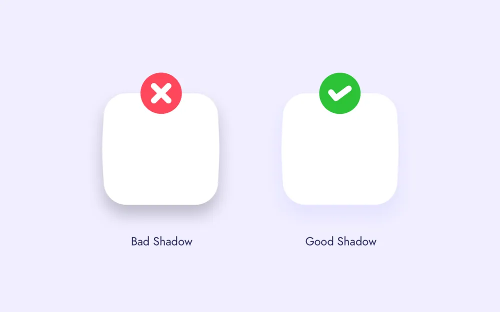
Shadows are never black. Shadow is the object’s color tone shaded by the value tones. See the picture for reference below.
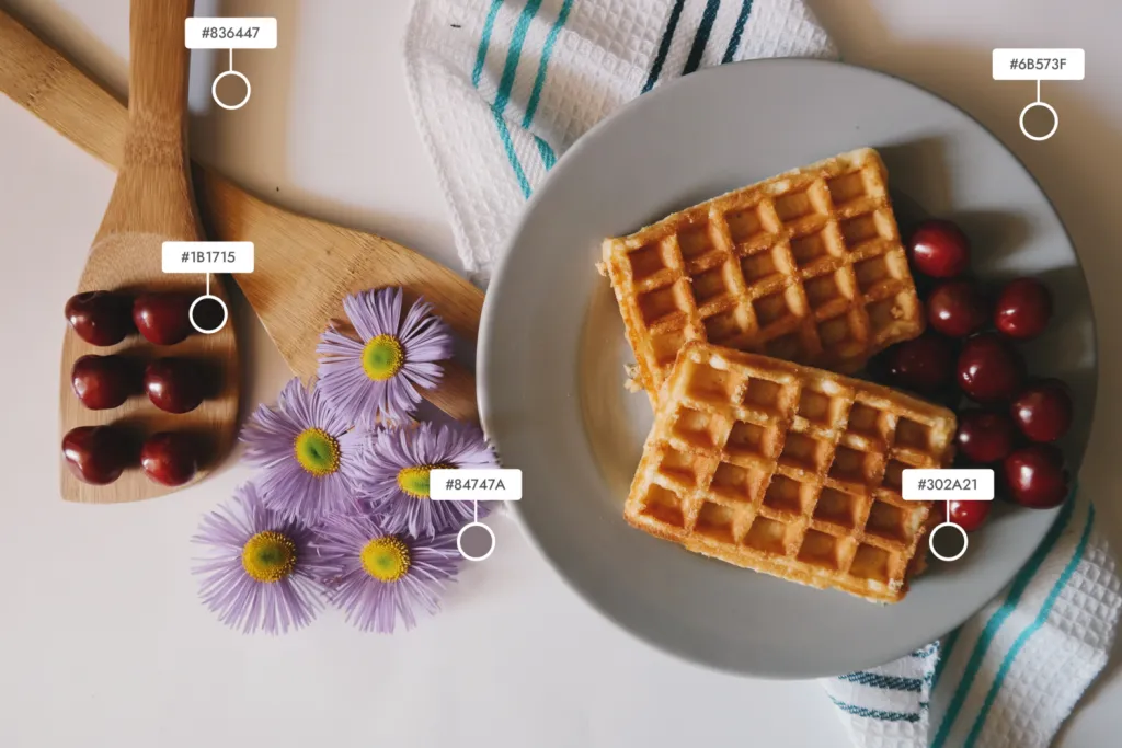
Cherry’s shadow is dark red, it looks almost black, but it’s not black. Look at the flower shadow, the plate, the waffle. Depending on light and darkness, you can see the amount of shadow.
What common mistake we all make in UI design is, we think we need a black color with opacity to make a shadow.
Color in Typography
Most of the UI is white nowadays, all focus on making the interface as minimal as possible. So Typography is another important element.

The text color on the left side is black (# 000000) and the one on the right side also looks black, but it’s dark blue (# 181441). This plays a major role when the interface is mostly white. How do you do it? See the below picture.
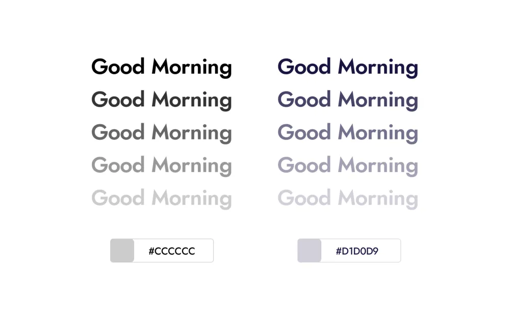
After applying the same opacity to both texts, we can see the difference. Clearly, the result is different. One of them is gray, the other blue-gray. Using text with a certain tone of color will have a noticeable impact on the UI. See the image below.

So, using black and gray is bad? Nope. People frequently use the word “With black everything is cool” So it’s up to the individual. But the color tone comes when we use it. Better contrast and harmony can be achieved.
Let’s get back to our Expense Manager App
If we go with green color, the app should look better after these things. Because we need to show strong emotion for money and growth in this app, and the green color describes money and the financial world, both men and women like green as well.
The outcome after all these things have been taken care of:
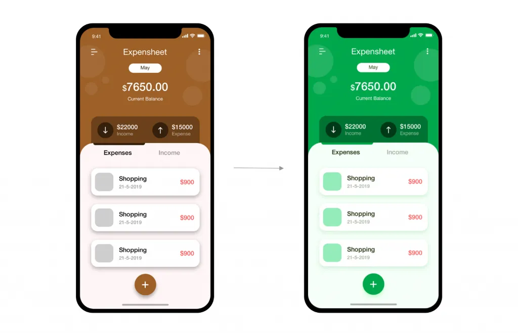
Looks better than before? No? Hopefully yes. As we can see, we can design an effective user interface if we focus on some small things about colors.


