Google Chrome is one of the most popular web browsers out there. In fact, 65.70% are using it over other browsers such as Safari, Edge or Firefox.
One of the great things about Google Chrome is that it has a lot of extensions, plugins and add-ons that make our lives easier, while also improving our productivity.
Chrome extensions are mini versions of software that you can install on your browser to help you get things done more efficiently, without having to switch around between other programs. For us creative minds especially, there are many Chrome extensions for designers that can help you with everything, from finding new inspirations for projects, to checking the user interface (UI) of your website design.
So, here are the 20 best Google Chrome extensions for UI/UX designers that you’ll probably need.
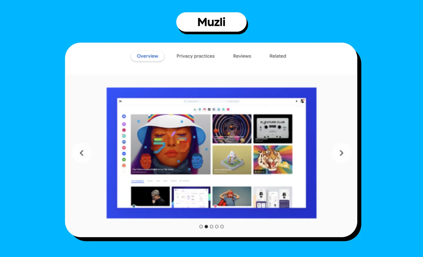
1. Muzli
What it does: Muzli is a great Chrome extension for designers as it updates you with the latest design or UI/UX news inspiration. Once you install Muzli, you’ll see a bunch of design-related content that’s been picked from all around the web every time you open a new tab - essentially, Muzli will become your browser homepage. You can also customize the feed you’d like to see from Muzli’s picks.
Use case: Discovering innovative illustrations, design features, unique websites, photography, and visual art, as well as opinions and articles from design experts from all around the web.
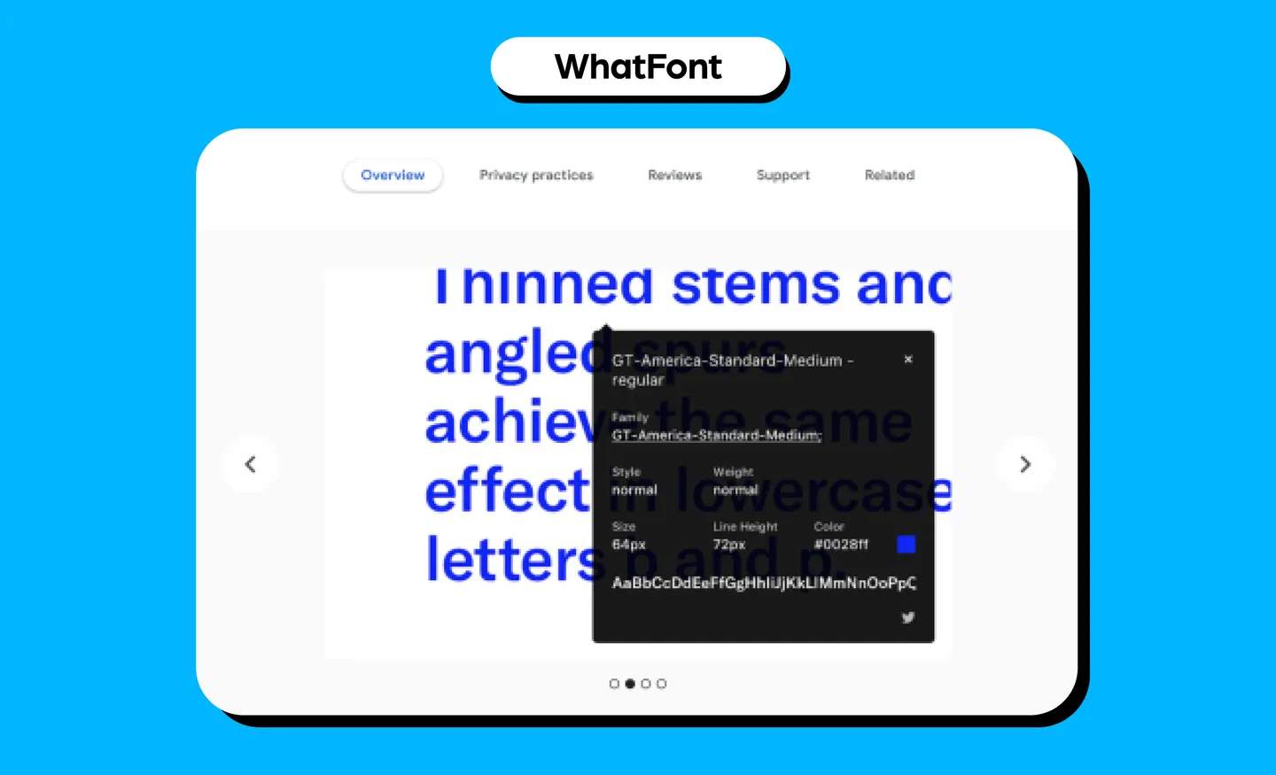
2. WhatFont
What it does: WhatFont identifies fonts on web pages. It lets you click on any font on a web page and it will show you details like font and styling attributes including style, weight, size and color. It also detects the services these web pages use for their web fonts, and supports Typekit and the Google Fonts API.
Use case: As designers, you’ll constantly be looking at fonts to match your projects. Using this, you can find fonts and get inspiration on how they’ll look on a web page.
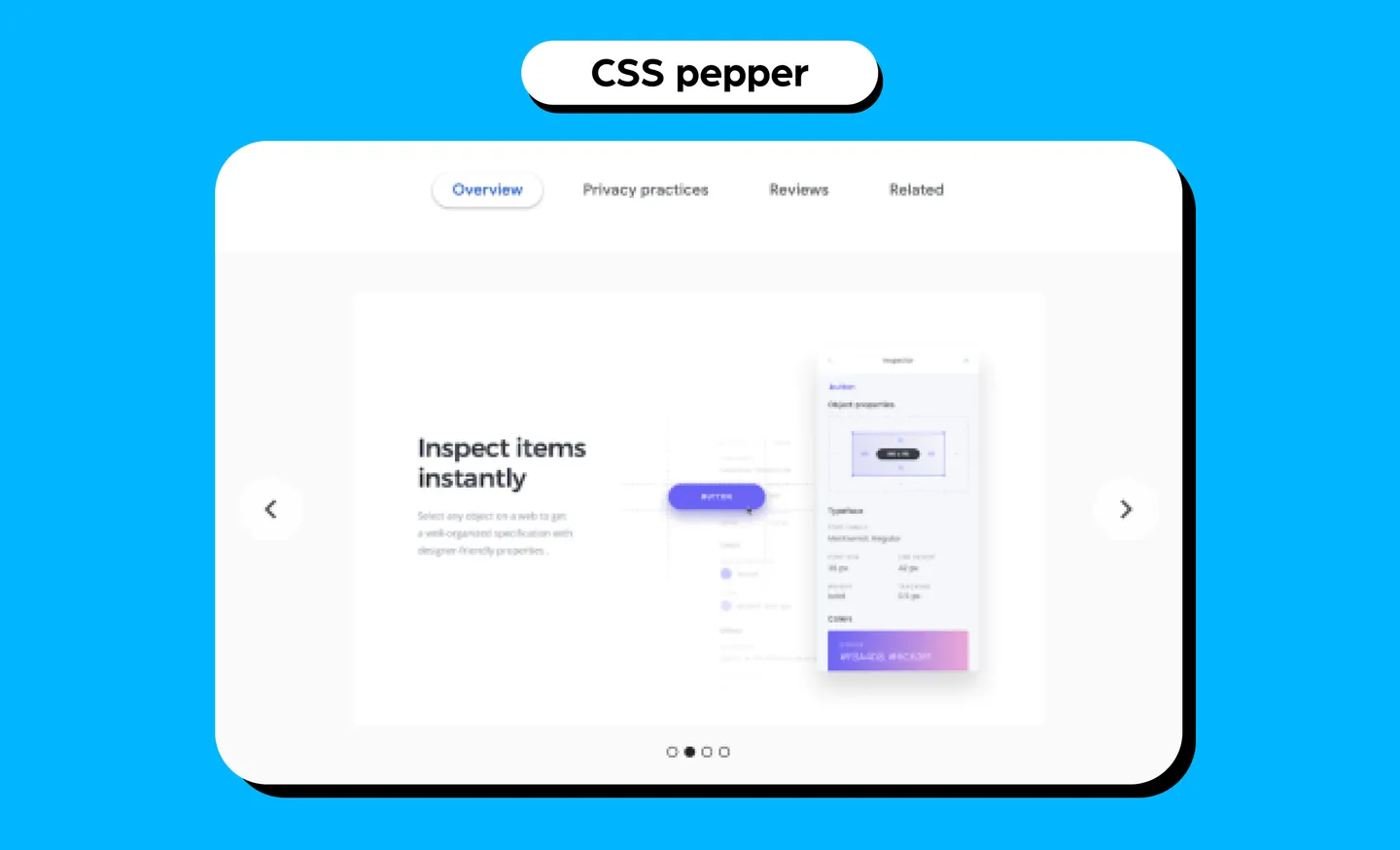
3. CSS Peeper
What it does:CSS Peeper allows you to inspect styles in a simple and organized way, instead of you having to dig around in code. You can inspect items instantly, browse colors in a visual way and export nested assets. You can also check the hidden CSS styles of objects, colors, and assets on the web. In other words, it’s a CSS viewer in your browser.
Use case: Get inspiration with this asyou can view other designs and check how it is made to apply to your own work.
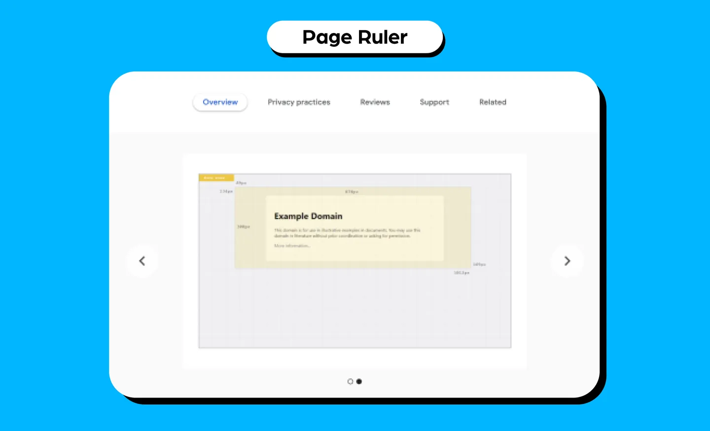
4. Page Ruler
What it does:Page Ruler works as a drawing ruler to get pixel dimensions and positioning, while measuring elements on any web page. You can get the width, height, as well as top, bottom, left and right positions of a web page. When you move your mouse on the page, it draws a rectangular ruler, while size and numerics are updated every time you move your mouse.
Use case: Measuring web elements and getting their pixel dimensions and positions to help your work.
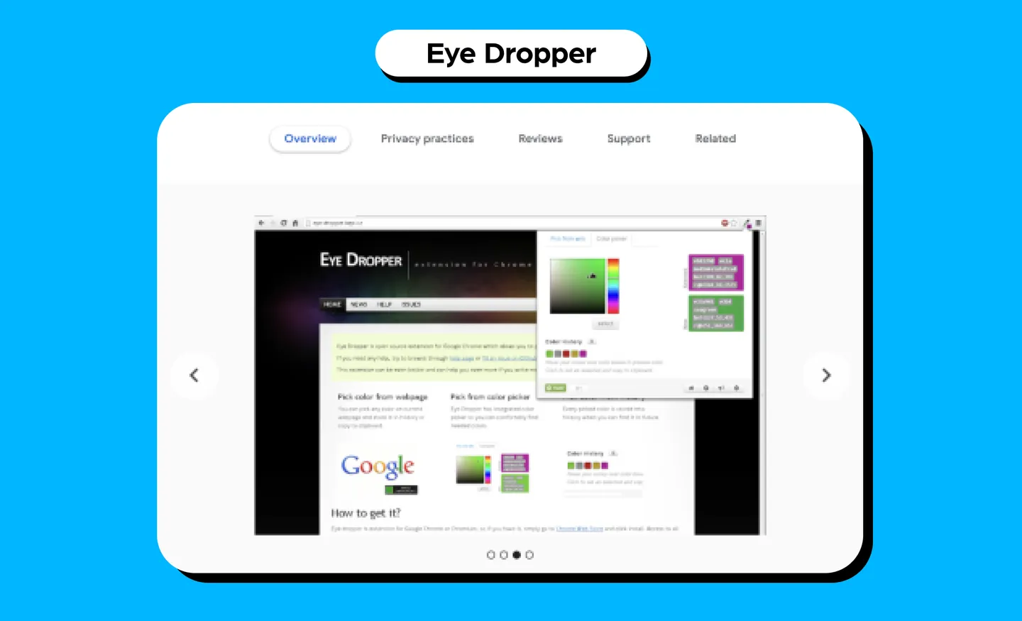
5. Eye Dropper
What it does: Eye Dropper is an open-source extension that lets you select colors from web pages, through color pickers, and from your personal history of colors. You can also find out the HSL (hue, saturation, lightness) and RGB (red, green, blue) value of the color.
Use case: If you are a web designer, this is a great tool as you can find colors to apply to your own project, and you get to view how they look on a live website.
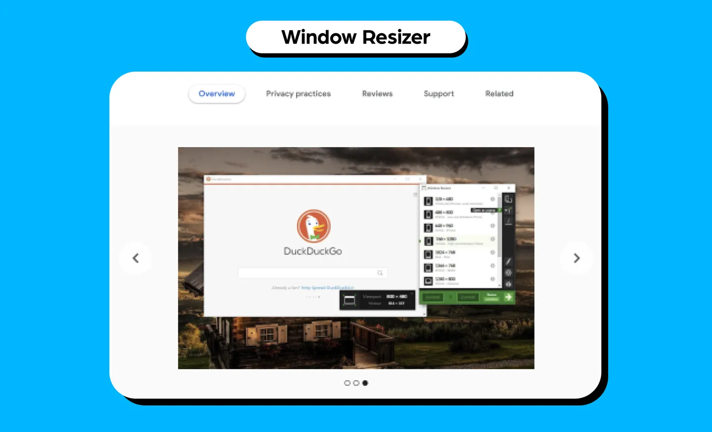
6. Window Resizer
What it does: Window Resizer is mostly used by web designers and developers to resize the browser window to emulate various screen resolutions. You get customizable global key shortcuts and an option to export and import your setting on another computer. You can also set the window height and width, window position, preset icons, as well as apply the new dimensions to the entire window or viewport.
Use case: It can help you test your layouts on different screen sizes and mobile devices, so you can develop responsive web designs.
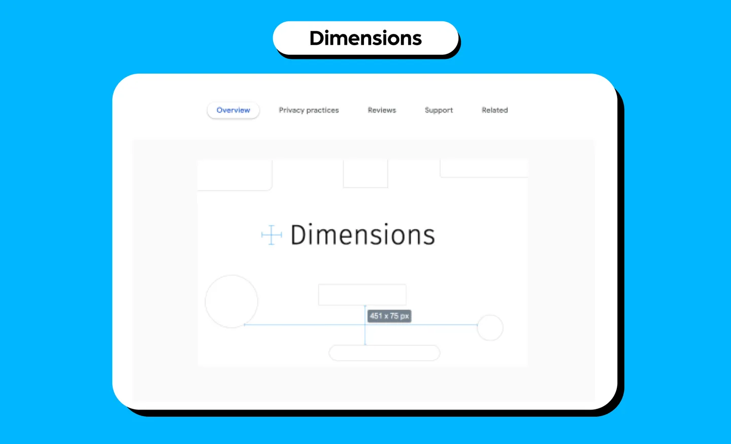
7. Dimensions
What it does:Dimensions helps designers measure a website’s screen dimensions. You can measure distances between elements like images, icons, buttons, videos, gifs, text, input fields on a website. However, this does not work well with images because the color changes from pixel to pixel.
Use case: For web designers and developers, you can drop any mockups as PNGs or JPEGs into Chrome and start measuring the dimensions.
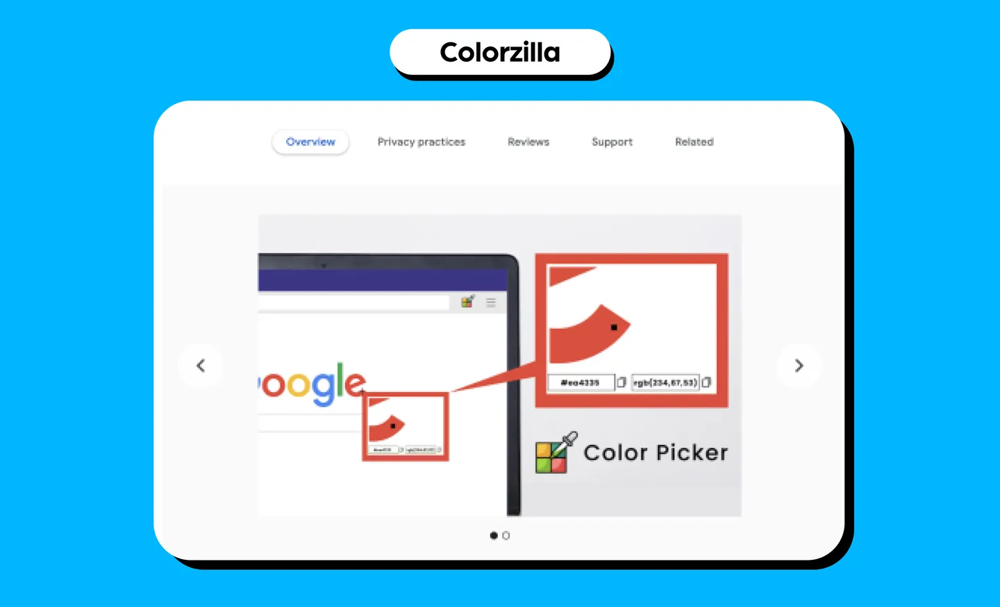
8. Colorzilla
What it does: If you’ve been on the web long enough, you may remember Colorzilla as one of the most popular Firefox extensions that was later made available on Chrome. This extension helps you find any color code on webpages with HEX and RGB codes for any element. You can copy and paste these codes for your own use.
Use case: Finding colors for your designs and you would have already seen how they look on live websites.
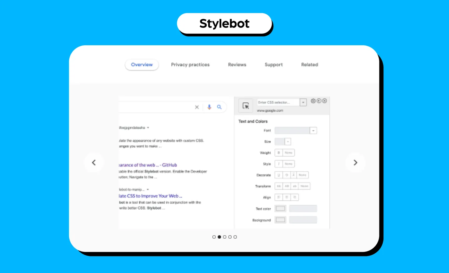
9. Stylebot
What it does: Stylebot changes the appearance of a web page instantly with CSS customizations. You can change elements such as the font, color, margins, visibility and more. It also has a readability mode that allows you to read articles on any website without elements such as sidebars, footers, and ads. You can also manually enter CSS code to see how it affects the web page.
Use case: This is great for website designers. You can toggle around with key elements of a web page to see how it’ll look like. You can use this tool to preview how certain elements on a website will look visually before applying them to your own project.
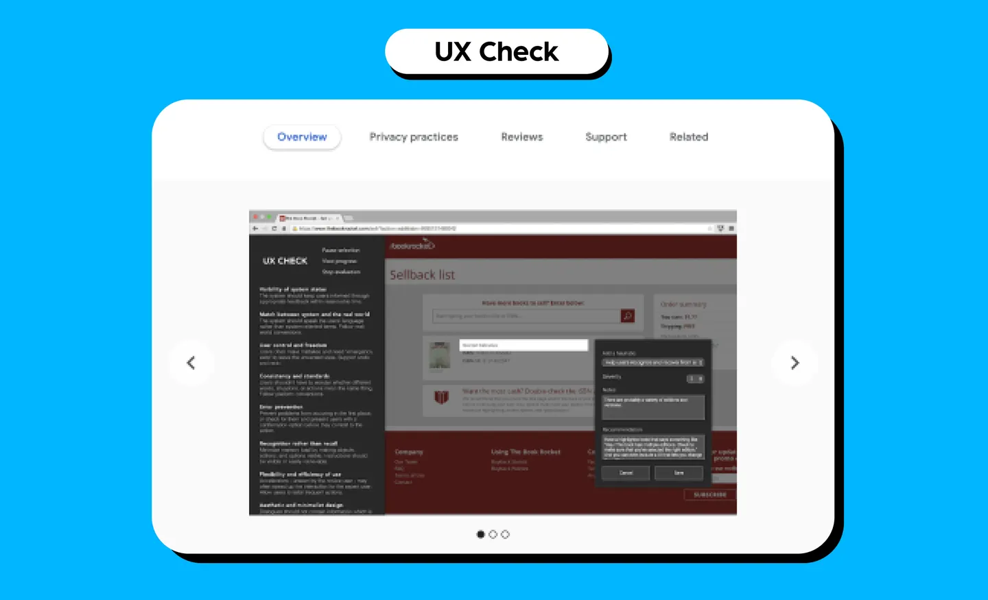
10. UX Check
What it does:UX Check runs a heuristic evaluation on your website based on Nielsen’s Ten Heuristics on the side panel of your website. You can click on the element that does not comply with a heuristic, add notes, and a screenshot will be saved.
Use case: Good for website designers to check if their design is optimized for user interaction.
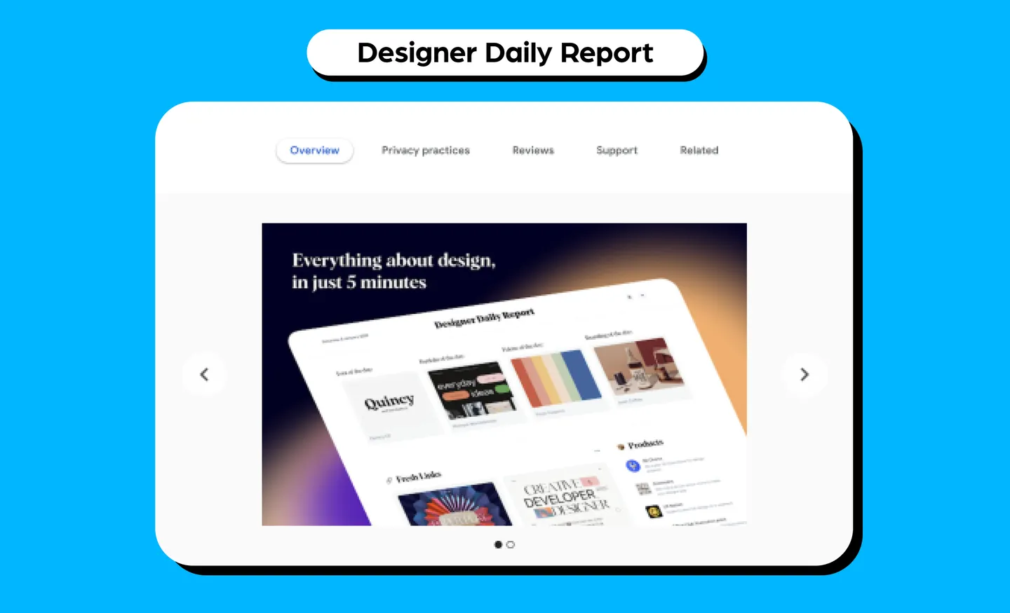
11. Designer Daily Report
What it does: Designers Daily Report opens a daily Designer Report on a background tab that has plenty of resources just for designers. It includes inspirational websites, daily products for designers, portfolio of the day, font of the day and more. It also includes job listings for designers!
Use case: This is a great tool for all designers. It helps you keep up to date with the latest design trends, while also showcasing work as inspiration, and you can discover new elements such as font styles.
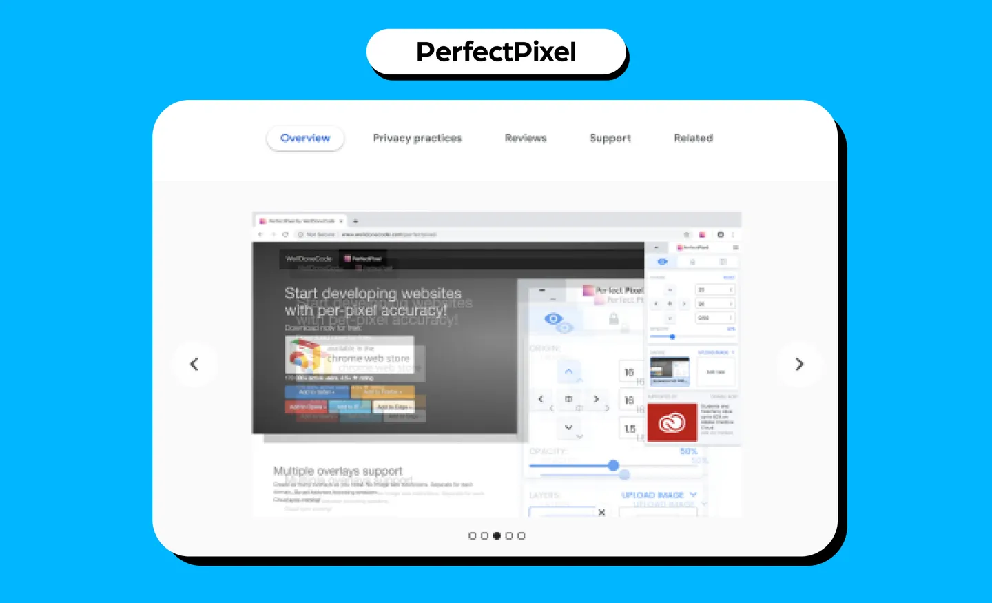
12. PerfectPixel
What it does: PerfectPixel allows developers and markup designers to put a semi-transparent image overlay over the top of the developed HTML and perform a per pixel comparison between them. It has support for multiple layers, layer inversion and scaling, as well as separate layers for each website.
Use case: This is a good tool for website designers as it makes sure elements are pixel-perfect. This makes sure you don’t have any imperfections such as distorted designs or blurring.
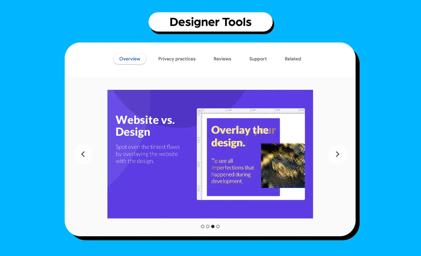
13. Designer Tools
What it does: Designer Tools adds rulers and guidelines to your browser that you can use to make sure your elements are aligned perfectly. It also measures the space between elements, and spots any alignment issues. You can use rulers to add guides, select and compare elements and view their offset, distance, and size.
Use case: For website designers, this can help make sure your web designs are aligned properly. You can spot any imperfections that occurred during development and to make sure your final website design is translated properly onto the web.
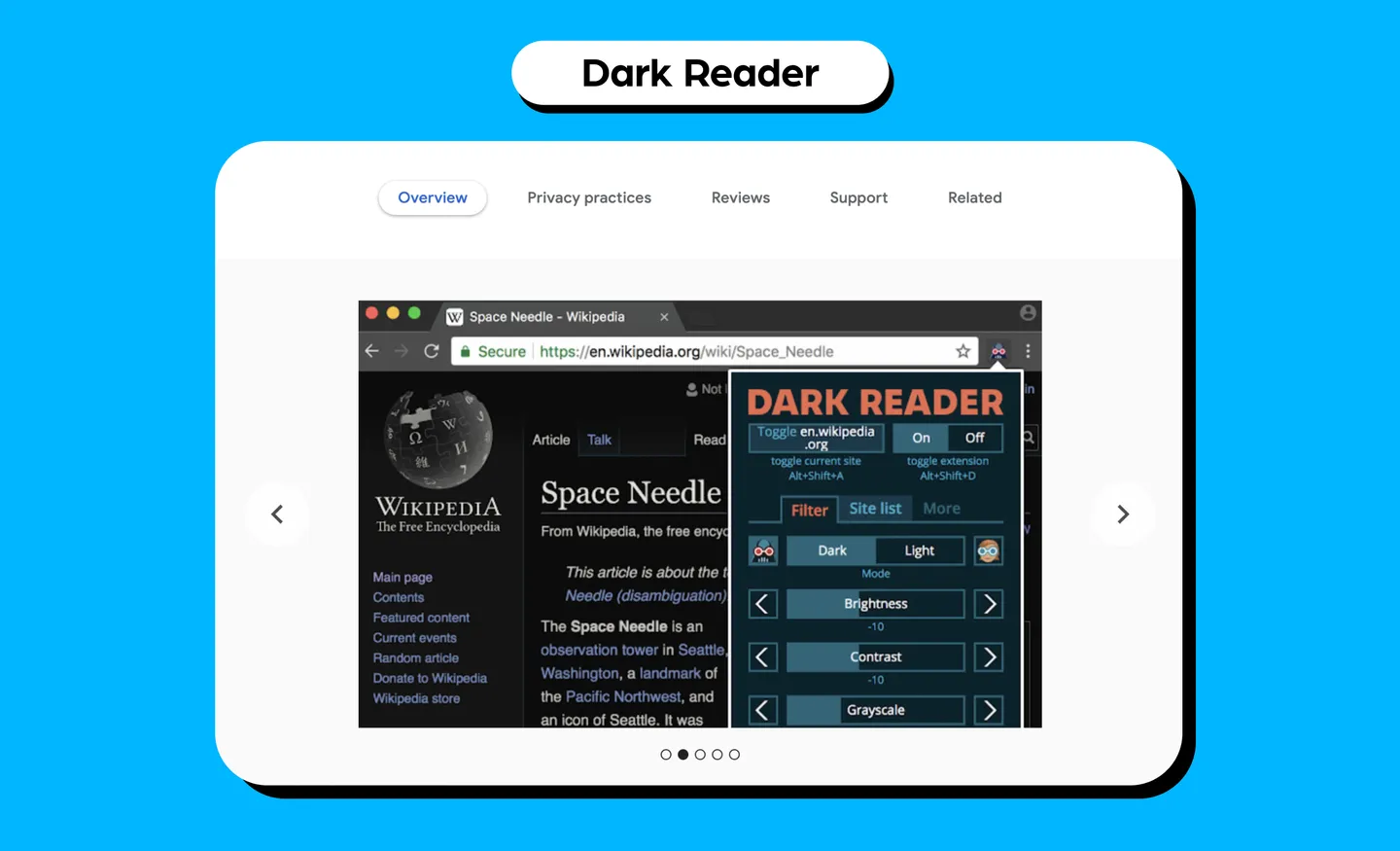
14. Dark Reader
What it does: Dark Reader is basically dark mode for website browsing. It will invert bright colors with high contrasts for easy reading. You can adjust the brightness, contrast, sepia filters, dark mode and font settings.
Use case: As a designer, you spend plenty of time looking at screens so consider this eye care. It gives your eye a break from the brightness so you can browse easily, especially at night. On top of that, you can use it to view how websites look in dark mode - a useful tool for website designers, considering that many users use dark mode on devices.
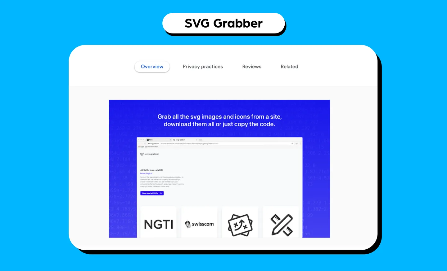
15. SVG Grabber
What it does: SVG Grabber is a tool that quickly previews and grabs all the SVG assets from a website. You can quickly preview, copy, or download the code of all the SVG icons and illustrations on a website.
Use case: You can use this to download icons from websites you like to use for inspiration when designing your own assets.
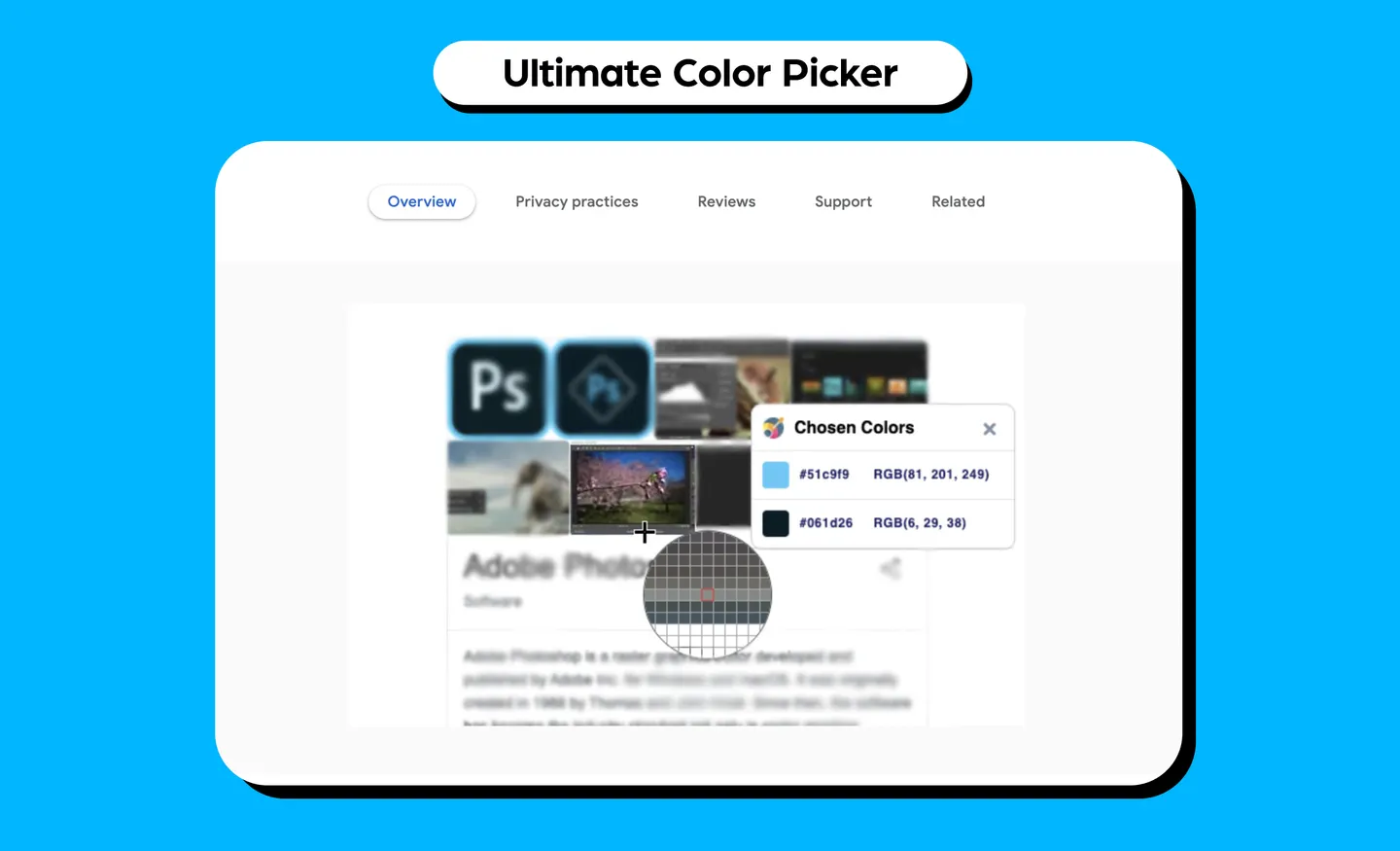
16. Ultimate Color Picker
What it does:Ultimate Color Picker quickly picks up HEX and RGB colors from a page with a lightweight eyedropper tool. It uses a single click to start color picking and shows your color selection history. It copies colors in RGB and HEX format, as well as lets you zoom in.
Use case: You can pick up colors that you like on other websites to use on your projects, especially website landing pages or other assets.
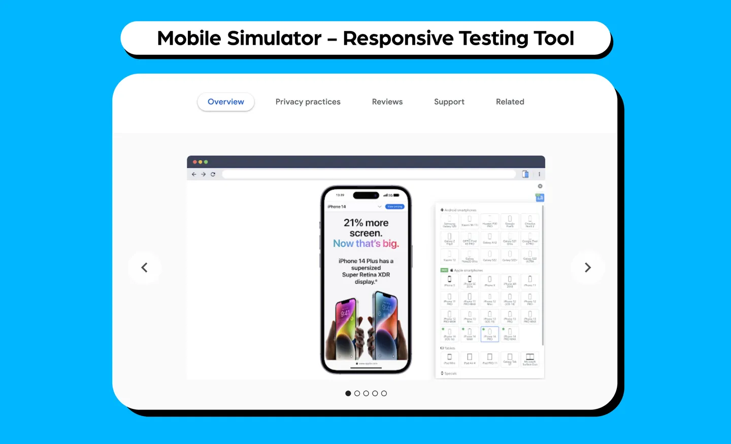
17. Mobile Simulator - Responsive Testing Tool
What it does: Mobile Simulator is a smartphone and tablet simulator that tests the mobile responsiveness of a website. It supports 16 Android smartphones, 19 models of Apple smartphones, five tablet models, and seven special devices (which include Macbooks and Samsung Smart TVs) with very realistic viewing. It creates screencasts in GIF formats easily, and allows you to take a screenshot of the smartphone in transparent PNG to insert into items such as emails and presentations.
Use case: As a designer, you have to think about different mobile devices, especially if you’re designing for the web. With this tool, you can optimize it for different mobile devices to make sure you’re creating responsive web designs.
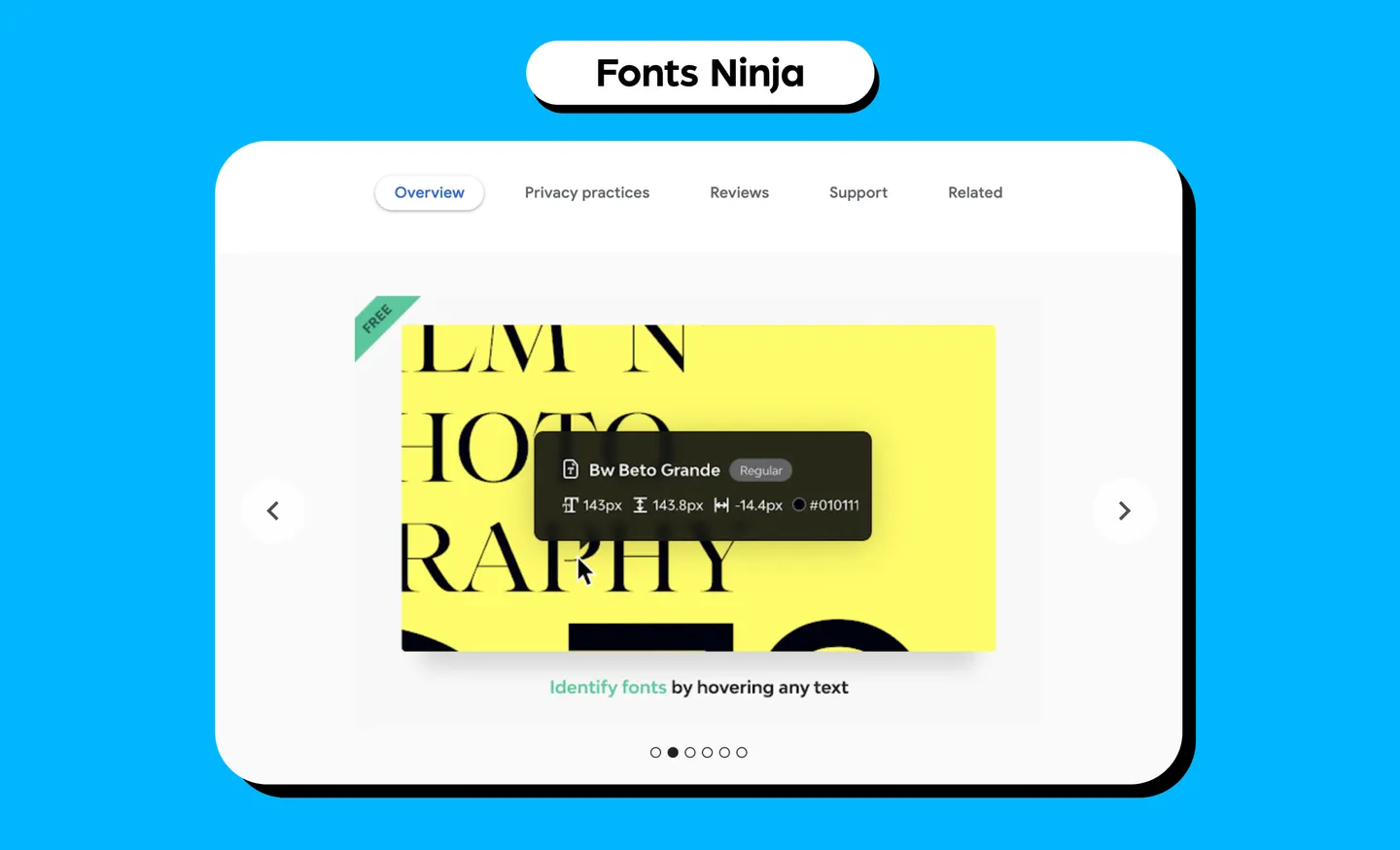
18. Fonts Ninja
What it does: Fonts Ninja identifies any fonts that you see on a website. You can also bookmark, try and buy them. The main extension window will also display a summary of all fonts used on a website.
Use case: Finding new fonts for your designs and how they can fit your projects.
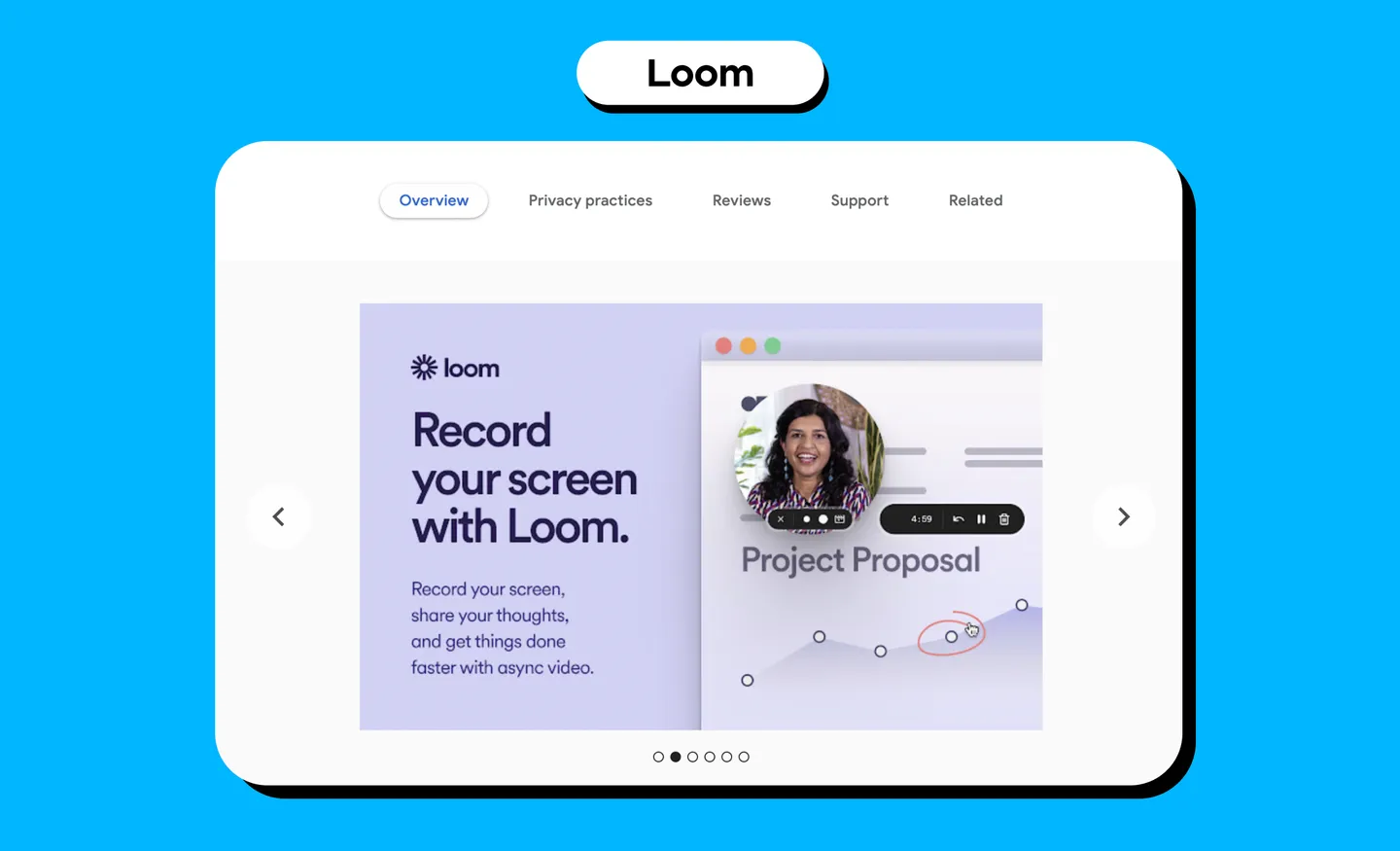
19. Loom
What does it do:Loom records your screen and generates a link that you can share with anyone. It can record your screen, camera, microphone and internal audio. It also automatically saves videos to the cloud.
Use case: When scouring for inspiration in the World Wide Web, you’re bound to stumble upon something that you want to capture. This works well if you’d like to record an entire user interface of a website design as reference, or to share with team members.
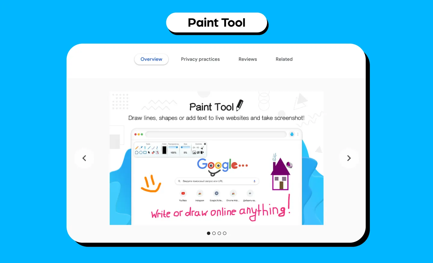
20. Paint Tool
What it does: With Paint Tool, you can draw anything such as shapes and lines, and even add text to websites in real time. You can take a full-page screenshot after drawing.
Use case: You can use this to highlight anything you find that is relevant to a project and share it with your workmates. For example, if you see a website design that you like, or some elements that you would want to incorporate, you can use this to make notes or draw out your ideas.
BTW, check out IconScout for design assets
If you are a designer, then you’d know how tiresome it can be to create your own icons, vector illustrations, 3D illustrations and Lottie animations from scratch. So, when looking for design assets to fill in the spaces of your design project, consider checking out IconScout - we have over five million design assets ready, with some that you can download for free!
Better yet, all these design assets are customizable. Use the Color Editor to quickly apply new colors to any vector icon or illustration, or use the glTF 3D viewer to change colors of a 3D illustration.
Alternatively, if you are a designer and would like to earn extra with a side gig, consider contributing to IconScout. We have one of the highest royalty payouts in the industry!
With that, we hope this article on Google Chrome extensions for UI/UX designers was useful. Until next time, happy designing!


