16 Best Color Palette Generators for Any Design Project
Facing designer’s block? Get color inspiration from these 16 color palette generator tools.
[Last Updated: 23 Oct 2023]
Colors can make or break a design.
But we know how nerve-wracking and frustrating it can be to choose the right colors. No worries – in this article, we’ll go through a few tips for picking out a color palette, and we’ll show you incredible color palette generators you can make use of. Hopefully, this will make the process of working with colors easier – and dare we say it..even fun!
What is a color palette?
A color palette is simply the combination of colors picked out for a website, mobile app, graphic design, animation, product packaging and so on. Preparing a color palette ahead of time is important, as it helps you figure out if these colors look good together – before you apply them to your design and realize you’ve made a mistake.
The role of color theory in choosing a color palette
When preparing a color palette, it’s useful to know a bit about color theory. Color theory refers to a set of principles that designers use to find pleasing color combinations. While color theory is a huge subject, knowing these basic terms can help when preparing your color palette.
The color wheel
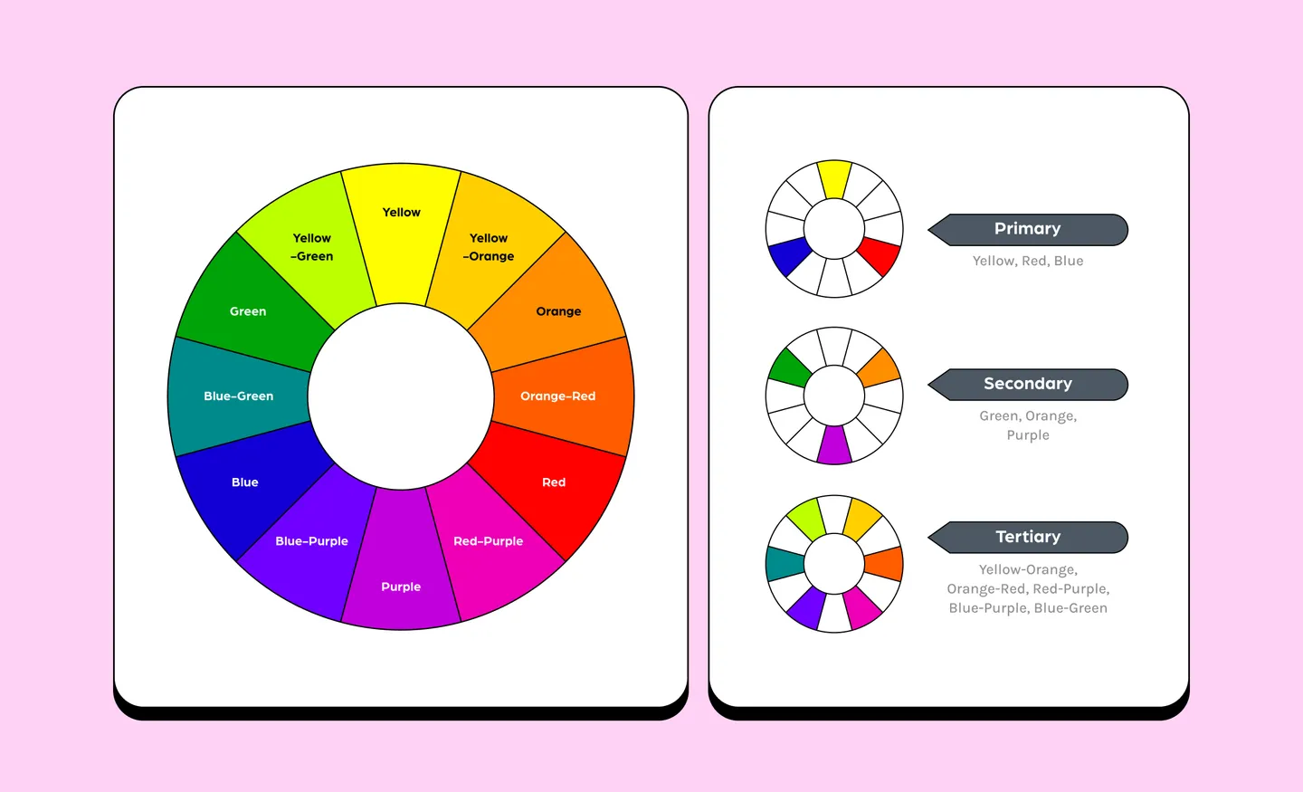
The color wheel is a chart that helps us see how colors relate to each other. There are a few types of color wheels, but the most common one displays 12 colors. They are divided into three categories:
- Primary colors are colors that cannot be produced by mixing two or more colors. They form the base of the color wheel. Red, blue, and yellow are the primary colors.
- Secondary colors are produced by mixing any two of the primary colors. Green, orange and purple are secondary colors.
- Tertiary colors result from combining a primary color and a secondary color. Tertiary colors include yellow-orange, orange-red, red-purple, blue-purple and blue-green.
Color terminology
Besides the color wheel, these other terms can help you understand and experiment with color.
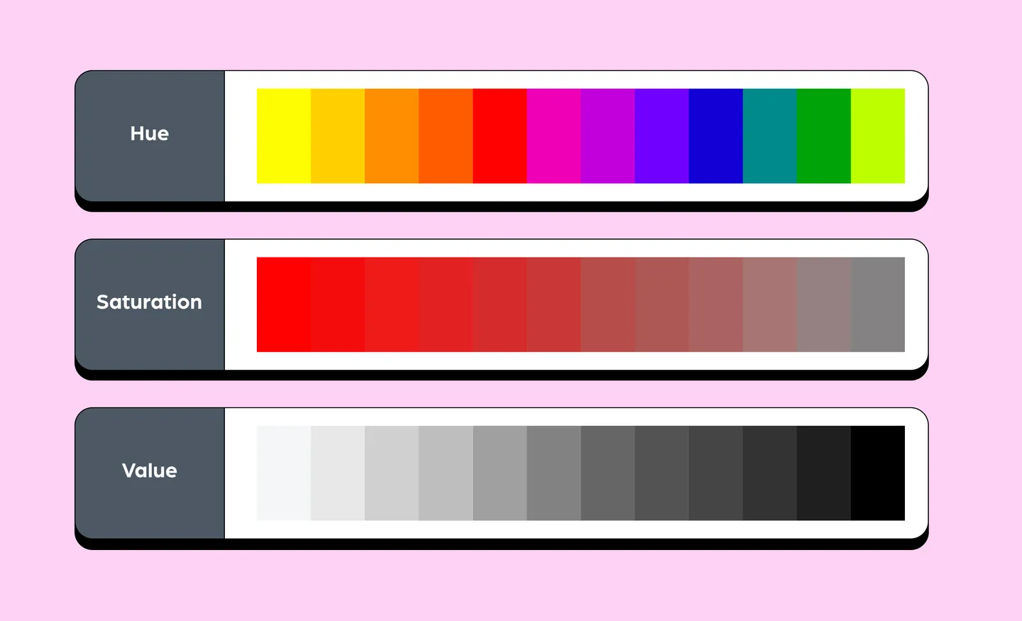
Hue
The term ‘hue’ refers to the pure, primary pigment of color. It’s what we think of when we think of ‘color’. For example, ‘green’ is a hue.
Saturation
The term ‘saturation’ refers to how light or how intense a color is.
Value
The term ‘value’ refers to how light or how dark a color is.
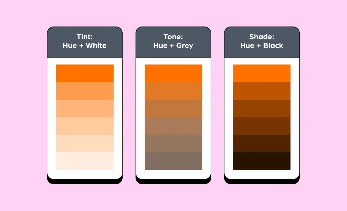
Tint
To produce a tint, you’d have to add white to a hue.
Tone
To produce a tone, you’d have to add gray to a hue.
Shade
To produce a shade, you’d have to add black to a hue.
Types of color harmonies
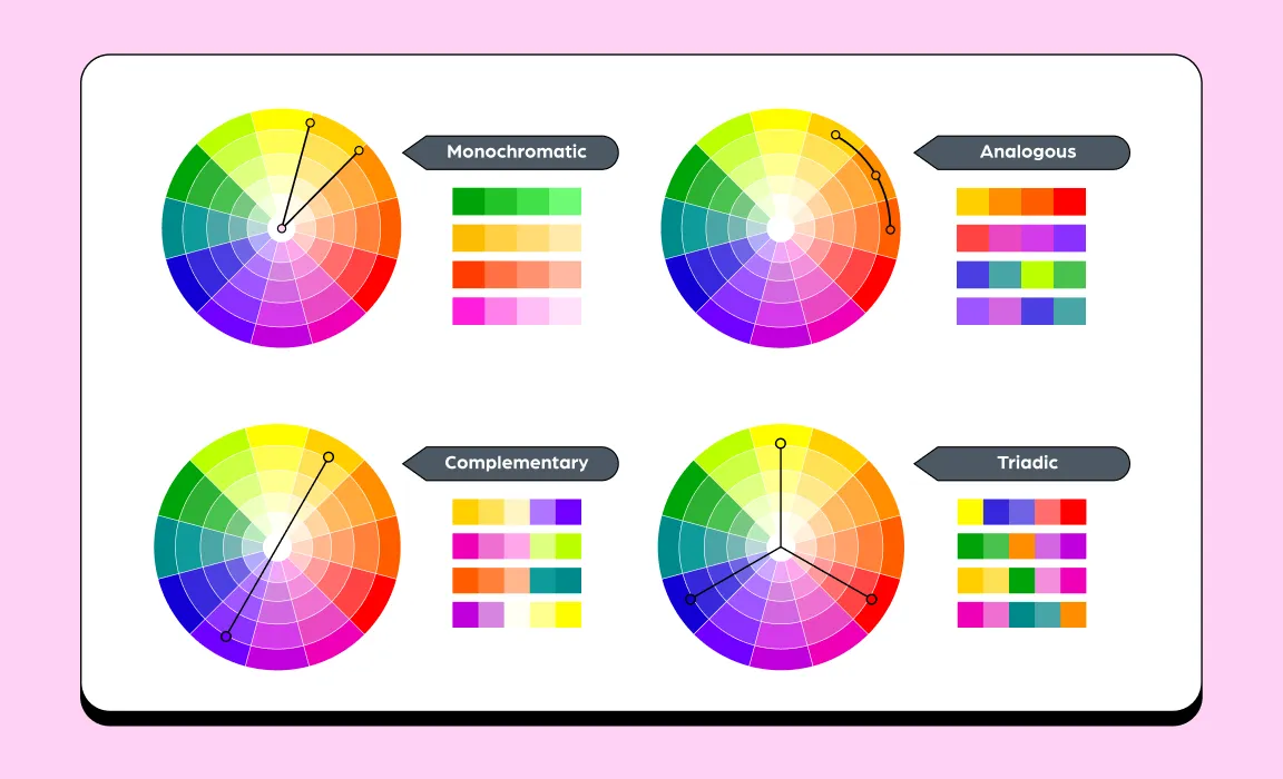
You can use the color wheel to identify color harmonies – these are combinations of colors that look good together. Some designers base their color palette on these color harmony patterns. While there are many types of color harmonies, there are four main ones that you’ll often come across:
1. Monochromatic
A monochromatic color harmony has a single hue, but variations of colors in different tints and saturations.
A monochromatic color palette is the easiest to generate and implement, This is because you are working with the same hue, which reduces the likelihood of choosing colors that don’t look good together.
2. Analogous
An analogous color harmony is also quite straightforward. This just refers to three colors that sit next to each other on the color wheel.
3. Complementary
A complementary color harmony is made up of two hues located on opposing sides of the color wheel. These color palettes are pleasant to look, but provide enough contrast to attract your audience’s attention.
4. Triadic
A triadic color harmony is when there are three colors in equally spaced positions. This can provide variety and contrast in your palette.
15 free color palette generators
Preparing a palette from a blank canvas can be tough. That’s where color palette generators come in handy – use them to create initial palettes, or use them for inspiration. Here are 15 of the best color palette tools to help you with your next design project.
1. COOLORS
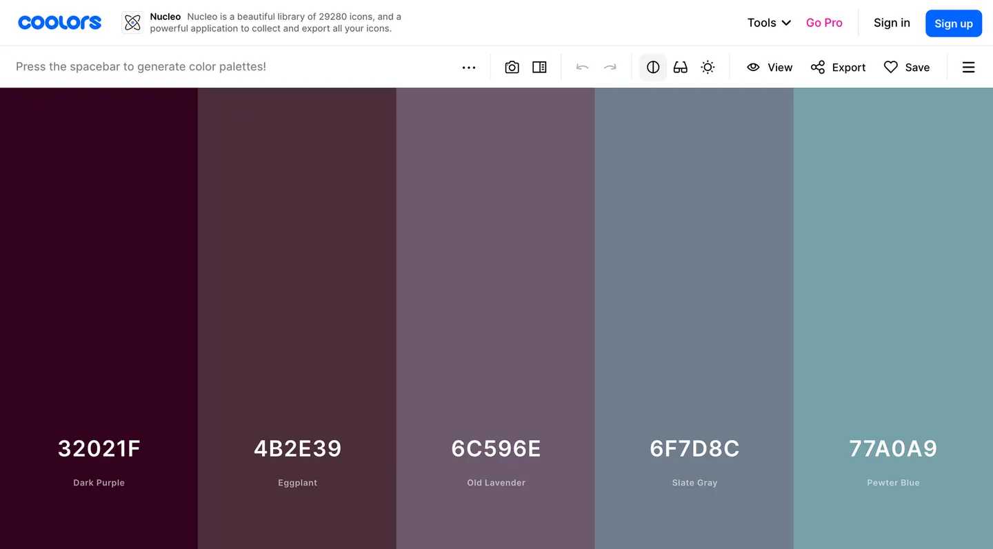
Coolors is one of the most popular, free color generators available online.
To start creating palettes, just start the generator. Hit your spacebar to quickly generate different palettes. If you find a color you like, you can lock it in place, and shuffle the other colors. You can also adjust the palette by choosing different shades for each color.
While its basic features are free, you can also upgrade for $3 a month to remove ads, generate palettes with more than five colors and more. Coolors is also available as an iOS app.
We like: Generating new palettes is super quick, and it’s easy to adjust individual colors.
2. LottieFiles Mobile App
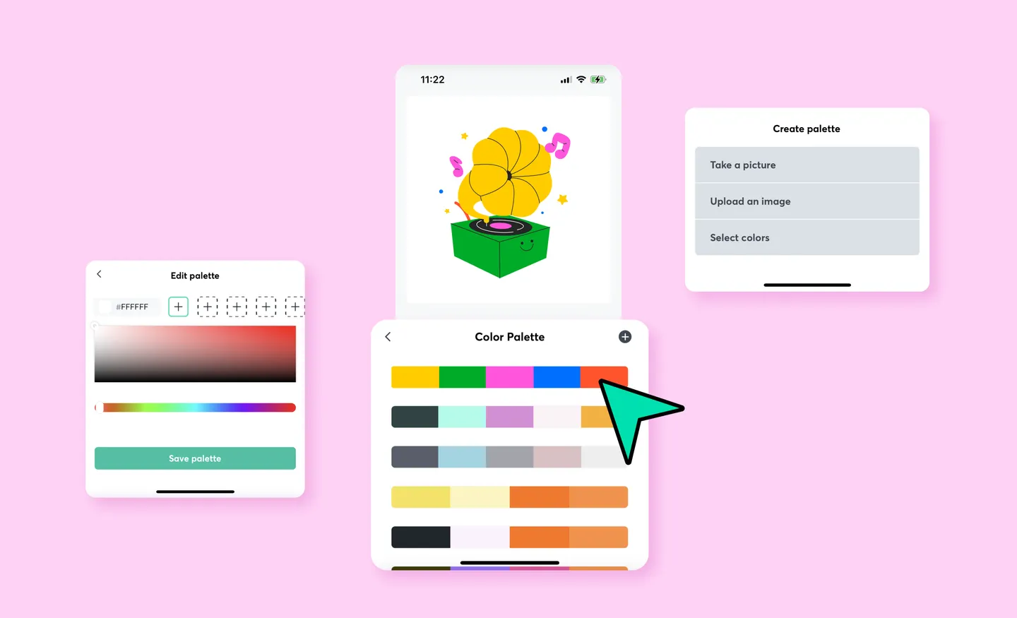
The LottieFiles Mobile App isn’t specifically a color palette generator, but it does allow you to generate a color palette based on an image or photograph.
Then, you can use the palette to instantly customize the colors of a Lottie animation, even if you don’t know anything about motion design. This means that you’ll be able to get free animations that look like they’ve been custom-made for your brand or visual aesthetic.
Besides that, the app offers other features for those interested in animation. You can automatically create animation from SVG files, share animations on social media and more.
If you don’t want to be limited to mobile, LottieFiles’ Color Palette feature also allows you to apply your custom colors to animations on the web and in Figma.
We like: It’s easy to generate a color palette from an image or photograph and apply it to animation.
3. Adobe Color (formerly Adobe Kuler)
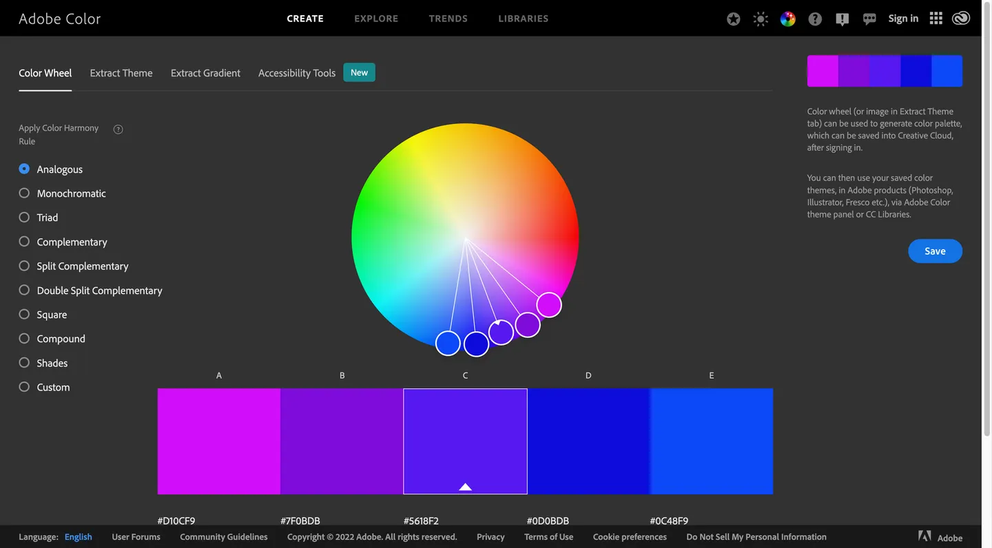
Adobe Color is an excellent tool for generating palettes based on color harmonies.
Its Color Wheel tool allows you to choose a specific color harmony – such as analogous, monochromatic, complementary or triad. When you adjust individual colors in the palette, all the other colors are adjusted automatically to ensure that your palette is always harmonious.
Adobe Color also allows you to generate color palettes and color gradients from an image. It also offers accessibility tools to make sure that your chosen colors have enough contrast to be visually accessible.
We like: The ability to generate color palettes based on color harmony rules.
4. Canva Color Palette Generator
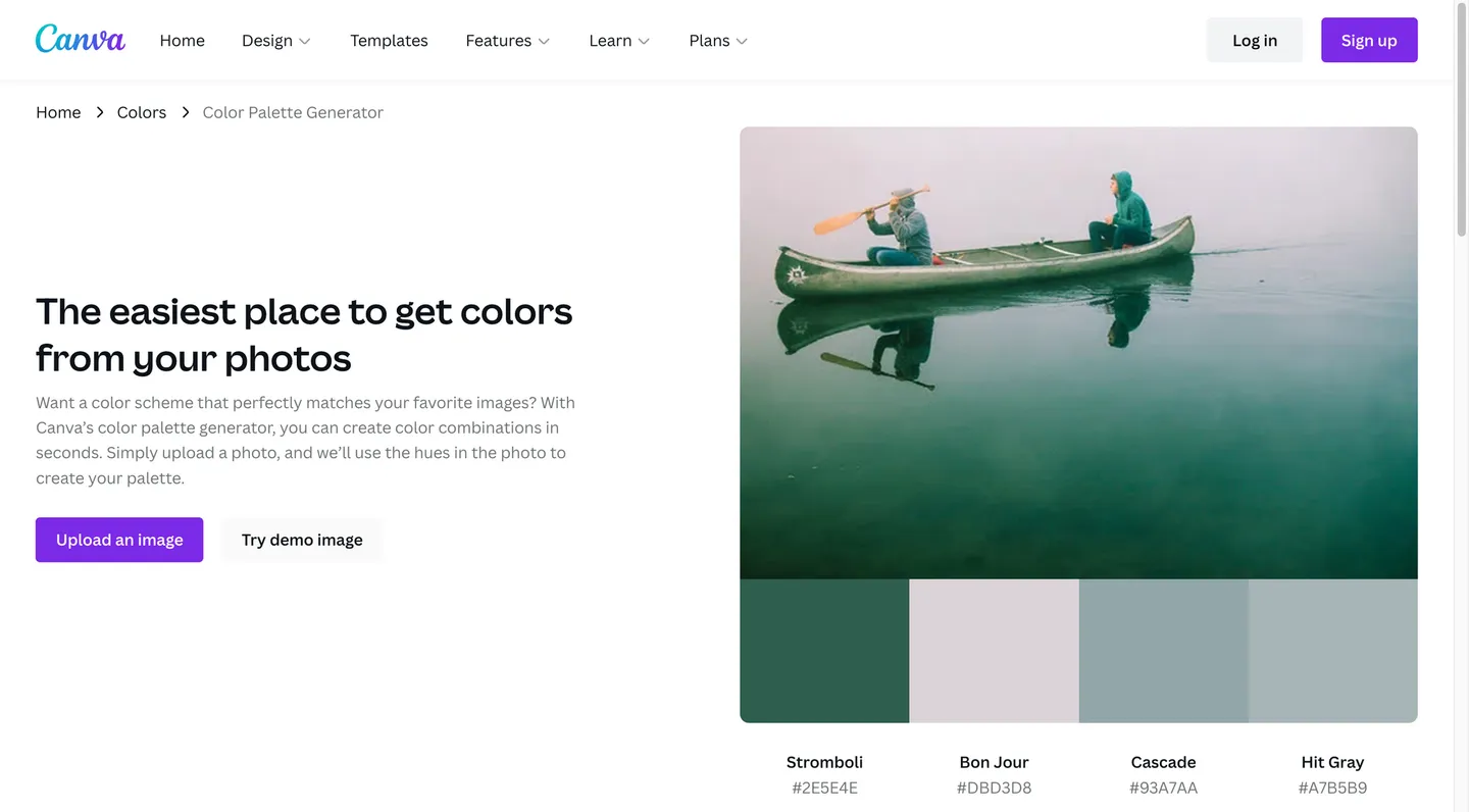
The Canva Color Palette Generator is a super quick tool for generating color palettes from images.
Just upload an image, and it will generate a palette of four colors. While there isn’t any option to change these colors, or generate other variations, Canva has a wide range of preset palette options that you can explore. You can search these palettes by color, theme or keyword. Click on any palette, and you’ll be able to see related color combinations.
We like: Wide range of pre-made palettes to explore.
5. Paletton
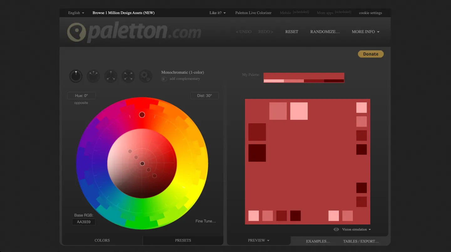
Paletton is similar to Adobe Color, in that they both allow you generate color palettes based on color harmonies.
However, Paletton offers slightly more control. You can change individual colors and watch the entire palette adjust according to color harmony rules. You can also change colors without affecting the rest of the palette. Once you find a palette you like, you can check out its preset adjustments, which offer different variations – such as darker, brighter or more pastel – versions of your palette.
We like: Being able to generate color palettes based on color harmony rules, and then tweaking them to perfection.
6. Color Hunt
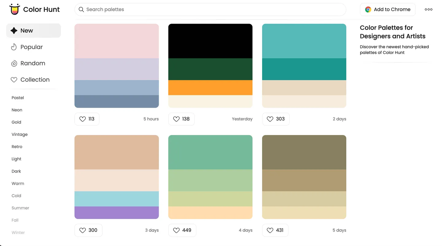
Okay, Color Hunt isn’t exactly a color palette generator.
But we thought we would feature this site anyway, because it’s an awesome resource for finding color palette inspiration. It features tons of color palettes that are organized into collections (such as ‘vintage’ or ‘summer’), making it easy to find what you need.
Copying colors is as easy as clicking on the hex code that appears when you hover over each color. You can also download each palette as an image – this makes it convenient to use the image as a reference when you’re working with design tools.
We like: Lots of color palette inspiration; easy to copy colors.
7. Toptal Color Palette Generator
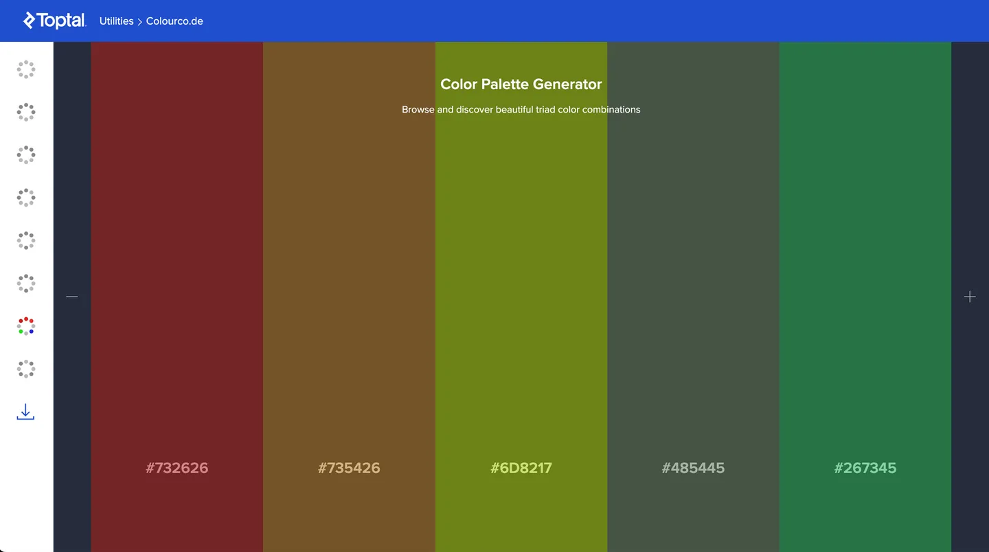
The beauty of Toptal’s Color Palette Generator is that colors change as you move your mouse. This allows you to rapidly sift through different color palettes.
Like Adobe Color, you can generate color palettes based on color harmonies. It also gives you the flexibility to add or remove colors, so you can have as many as ten colors in your palette. And finally, it doesn’t just give you the option to download your color palette as an image – it also allows you to download it as a CSS or SCSS file, in addition to other formats. This can be incredibly useful for frontend developers looking to quickly implement these colors.
We like: The ability to rapidly generate new colors; flexible options for saving the palette.
8. Colordot
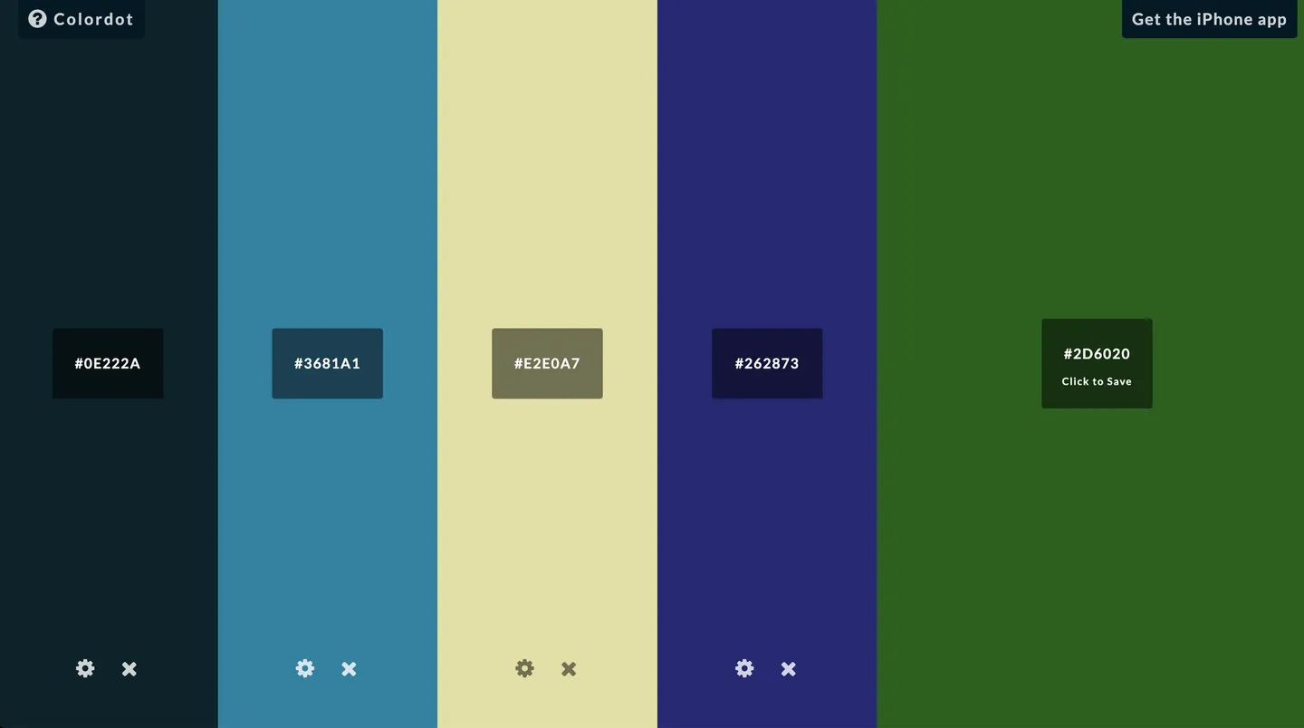
Similar to Toptal’s Color Palette Generator, Colordot allows you to choose colors by moving your mouse.
However, it doesn’t come with preset settings or palettes. Instead, you’ll choose individual colors on your own. But this isn’t necessarily a bad thing – in contrast to other tools listed here, this could force you to carefully think about each color choice, and how it fits into the entire palette. Besides, its intuitive controls mean that its easy to quickly generate pleasing color combinations.
This tool is also accessible as an iOS app.
We like: It’s easy to create a new palette entirely from scratch.
9. Cohesive Colors
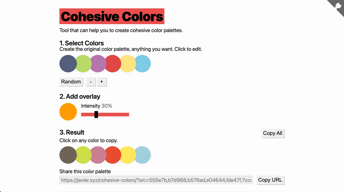
Cohesive Color is an excellent tool to tweak your existing palette.
This tool applies an overlay that shifts the colors in your palette to automatically look more cohesive. You can choose the color of the overlay and adjust its intensity. This tool works well if you already have an existing palette that you’d like to tweak, but might not be useful to create one from scratch..
We like: Great for making an existing color palette more cohesive.
10. Galactic Ink
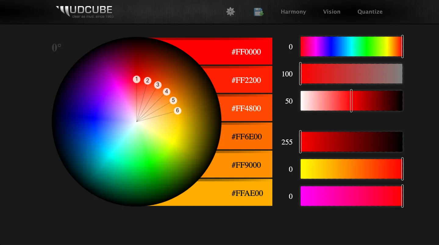
Galactic Ink is similar to Paletton and Adobe Color, in that it also allows you to generate palettes based on color harmonies.
There are specific sliders for you to adjust the hue, value, saturation, reds, greens and blues of the palette. This gives you fine-tune control over these values. Besides that, you can make the website switch between a light and dark theme, allowing you to see how your palette will look against a light or dark background.
We like: Being able to preview colors on a light or dark background.
11. Colormind
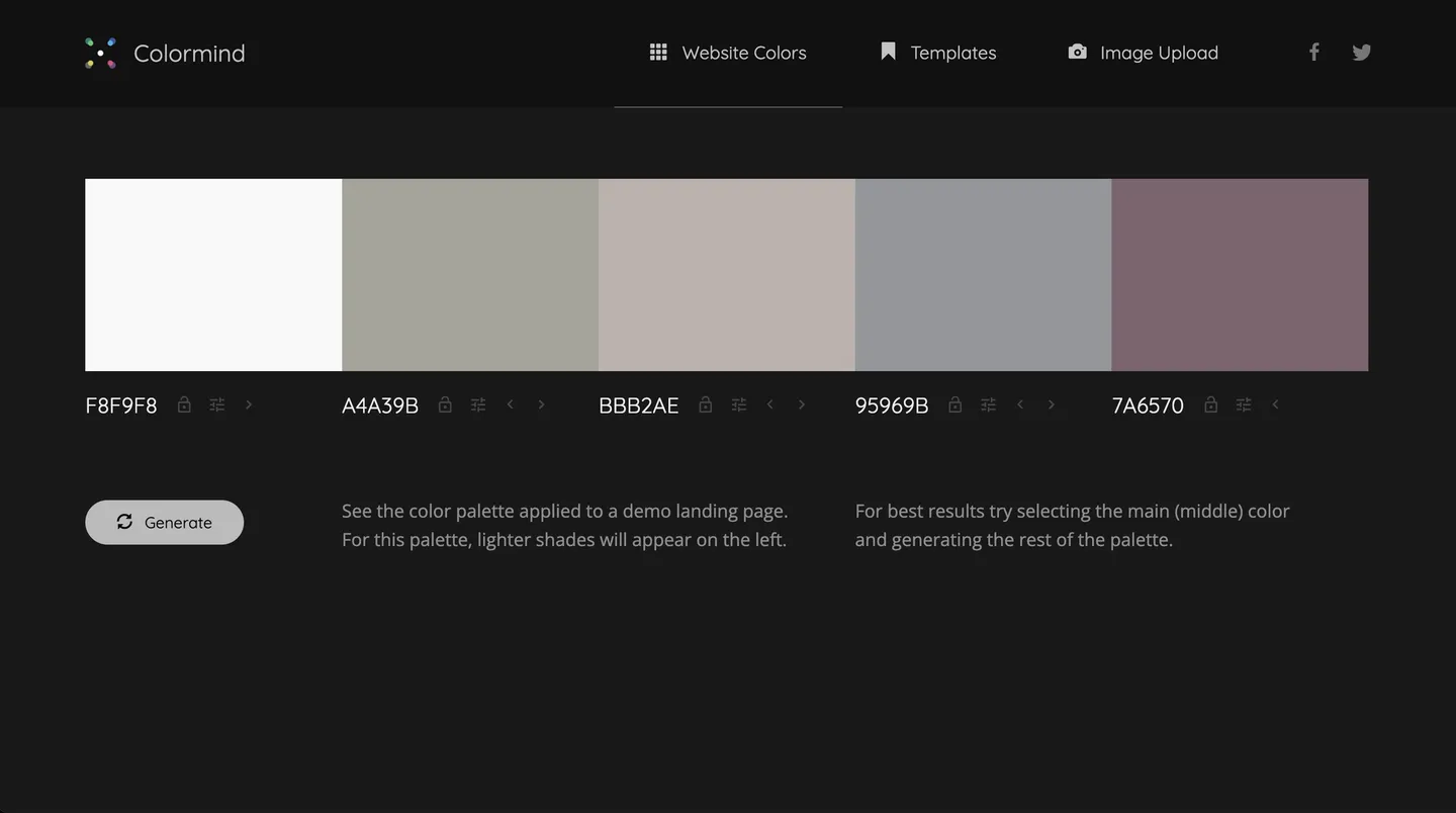
Colormind touts itself as a color scheme generator that uses deep learning.
You can randomly generate colors, adjust individual colors and ‘lock’ colors while you shuffle the rest of the palette.
The cool thing about this site is that it can generate a color scheme and automatically apply it to a demo site. If you’re designing websites, this can be useful to see how a palette would look like on a site, and how you can apply colors to different elements.
We like: Being able to see the palette on a real-life website design.
12. Khroma
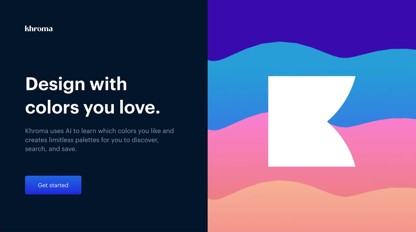
Khroma uses artificial intelligence (AI) to generate colors.
As you start using Khroma, it will ask you to pick out 50 of your favorite colors. This will be used to train an algorithm that produces colors you’ll like.
Unlike other sites, which typically pick out colors at random for you, Khroma can be a great tool for picking out colors options that are personalized for you.
We like: Easily generate personalized color options.
13. Color Generator by SEO Checker
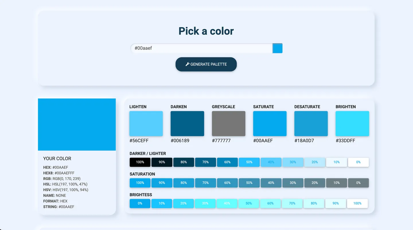
The Color Generator tool by SEO Checker is useful if you have a base color that you’d like to use to form a palette.
It prompts you to pick a base color, then shows different variations of this color, based on different saturation and darkness. It also generates six different palettes based on various color harmony rules.
Even though this tool doesn’t offer a lot of customization options, users can still see the many variations that a single hue might take, and play with other color combinations to understand how various possibilities can look.
We like: It’s easy to generate different palettes based on a single color.
14. Color Designer
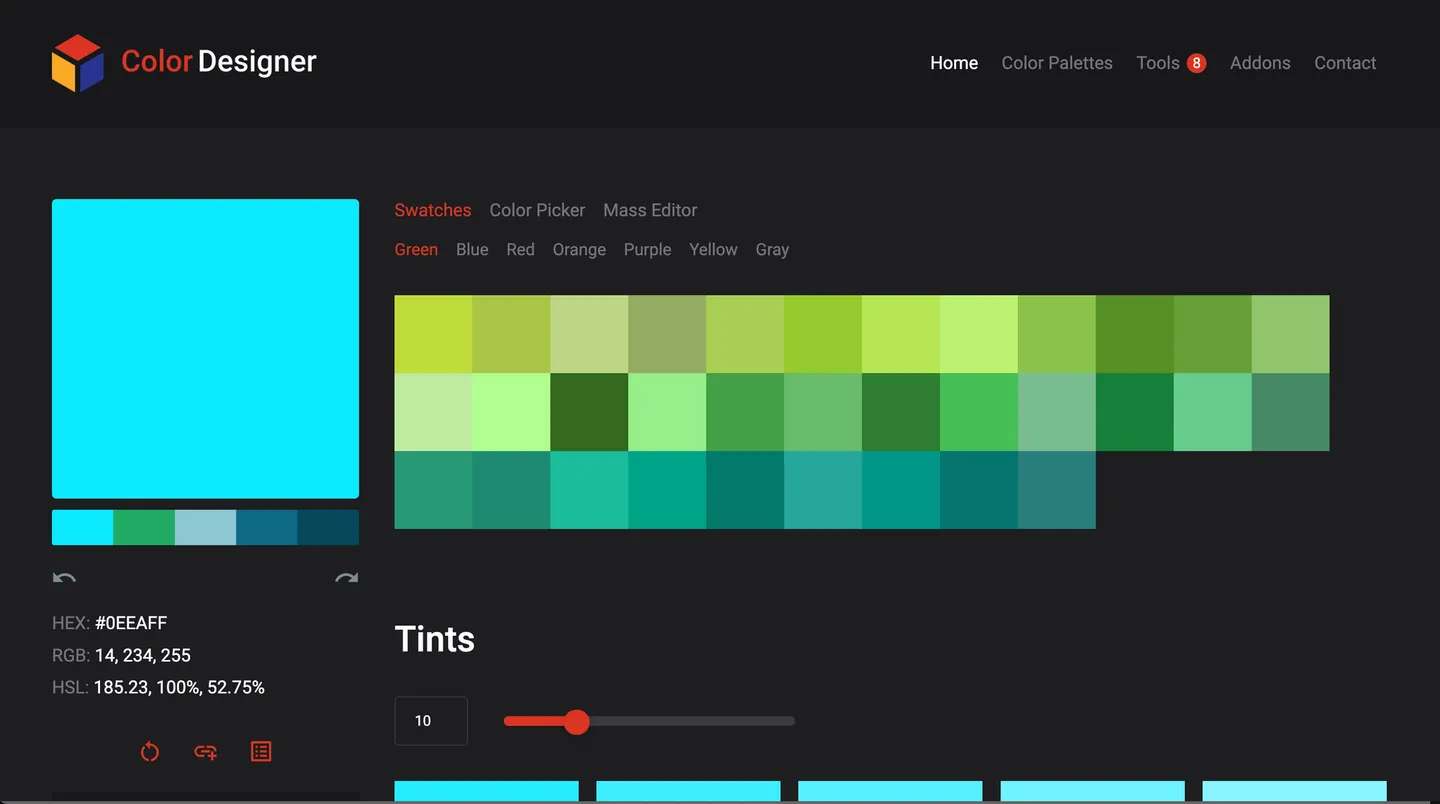
Color Designer is useful for exploring different variations of a hue when creating your palette.
You can pick each color in the palette by using its color picker tool, or choose a color based on swatches of green, blue, red, orange and so on. Then, you’ll see other variations of the hue based on different tints and shades. You can lower or increase the intensity of the tints and shades. And finally, the tool displays other colors that match your base color, based on color harmony rules.
We like: Instantly generate variations of a single color.
15. Muzli Colors
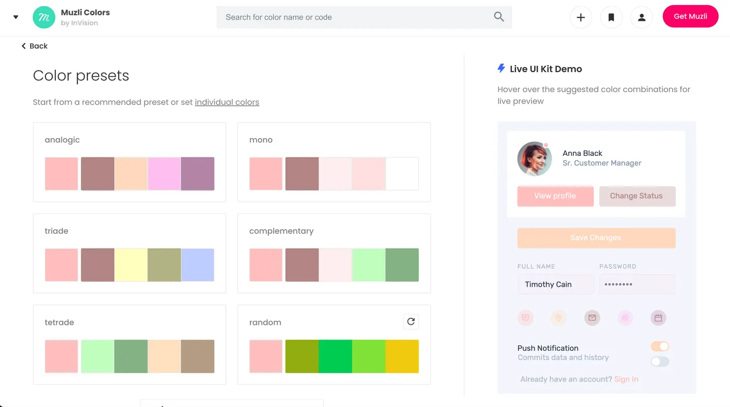
With Muzli Colors, you can pick a base color, and the site will recommend preset colors based on your choice. Alternatively, you can create a palette from scratch.
What sets Muzli Colors apart from other generators is that it automatically applies your palette on a demo mobile application. This can be useful if you want to see how the colors will look like in an app, or if you’re looking for inspiration on how to apply these colors. It also shows you a gallery of pictures that use these color palettes.
We like: Automatically preview colors on a demo mobile application.
16. Hubspot
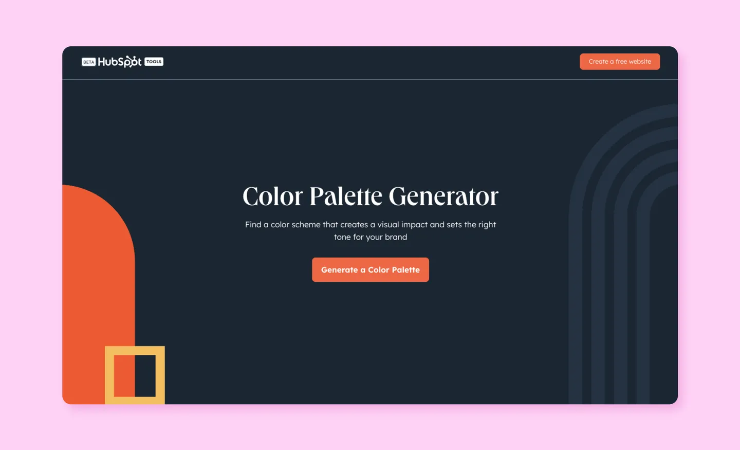
Hubspot's Color Palette Generator allows you to discover the power of color in brand identity for free! First, you select your primary color. Then you select secondary color schemes. HubSpot understands that colors are more than just aesthetics – they are the emotional language of your brand. With the ability to evoke specific feelings and associations in your audience’s mind, selecting the perfect color scheme matters, which is why there are thousands of color options and recommendations to explore.
Set the tone for your brand and make a visual statement whether it is from standard colors or a customized palette. To create a custom color palette for your brand, start by choosing your company’s main color, which will serve as the foundation for your palette. Next, select your brand’s primary color, the one that best represents your brand. The color picker will then suggest three complementary colors for your brand. You can experiment with different shades to find the perfect palette.
This chosen palette will be automatically applied to your logo in the brand kit generator. Additionally, you’ll receive hex codes and swatches for each color, making it easy to incorporate them into your brand identity materials and designs.
Making a visual impact that resonates with your target audience – try Hubspot's Color Palette Generator today and watch your brand come to life!
We like: Automatic application of the color palette.
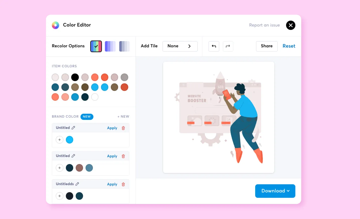
Automatically apply your favorite colors to design assets
Picking colors is as much art as it is science, so we hope these tips and color palette generators help.
And once you’ve picked out the right color palette, why not try applying it to the millions of design assets available on IconScout? That’s right, if you have an All Access subscription, you can automatically apply your own custom color palette to vector illustrations, icons or Lottie animations on IconScout. This means being able to access tons of assets that look like they’ve been custom-made for your brand, without designing from scratch.
Related Blogs
Access the world's largest Design Ecosystem: Assets, Integrations, and Motion.

We care about you data, and we’ll be using cookies to make your experience better.
