Icon Trends Coming in 2025: Everything You Need to Know
Icons are a crucial element in web design. Get ahead of the curve with these upcoming trends to elevate your projects in the coming year.
Icons are everywhere in the digital world, helping us navigate apps and websites with ease. They're like visual shortcuts in UX/UI designs that we instinctively understand. For instance, a thumbs-up or heart icon shows approval, a lock suggests security, and a tick indicates something has been checked or approved.
While these symbols might seem straightforward, the world of icon design is rich and varied, offering numerous styles to match different brands and designs. As we look ahead, here are some fresh icon trends to look forward to in the coming year to make interfaces more engaging and intuitive.
3D icons
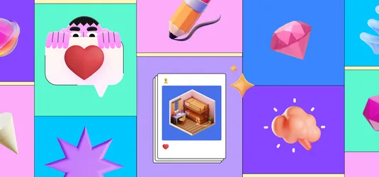
3D icons have been trending and are still hot to this day, and it doesn't seem like it will be going down. They bring in gradients, shadows, and depth that make them jump right off the screen. These dynamic visuals don't just look cool—they genuinely enhance user interaction. By incorporating motion and a sense of realism, 3D icons add a modern, eye-catching appeal that can elevate any user interface or digital experience. It's amazing how a bit of depth can make such a big difference.

Isometric icons
Building on the idea of 3D, isometric icons are cleverly created to give an illusion of a 3D effect while still being two-dimensional designs. Using an isometric grid ensures that all the icons in a set have a consistent and balanced appearance, which is super important for a cohesive look. Isometric design is super versatility—you can keep it simple or get really intricate, depending on what you need. Plus, they're scalable, so they work great whether they're small icons on a mobile app or larger graphics on a website.

Animated and interactive icons
An animated icon adds that extra bit of magic to user experiences, making them more engaging with just a hint of movement. Think about the like button on your social media apps or the hamburger menu on a website—these are animated icons you encounter all the time, often without even realizing it. Chances are, you've seen even more examples sprinkled throughout your digital journeys!
Interactive animated icons are fantastic for providing immediate feedback and creating a hands-on experience with user actions. For instance, an icon that transforms into a checkmark right after you complete an action not only looks cool but also reinforces your confidence that everything worked as it should. This kind of interactive touch is set to become an even more crucial element in design moving forward.

Minimalistic flat icons
Flat design is still a favorite in the design world, and it's not hard to see why. Its clean, minimalistic aesthetic works wonders across a variety of applications. By focusing on simplicity and clarity, flat icons are incredibly adaptable and effective for both digital interfaces and even physical product designs. When creating these graphics in this style, skip the shadows, depth, and extra details - instead, focus on basic colors and shapes to create the object.
Flat icons are often found in icon font collections, offering styles like thick or thin lines, monochrome, or solid shapes. One go-to resource for these types of icons would be IconScout’s Unicons—you can download them as SVGs or simply copy and paste the icon font, Vue, or React code right into your project.

Organic and hand-drawn icons
There's something about organic and hand-drawn icons that just hits differently. With their imperfect lines and free-flowing style, they add a human touch to digital designs. These icons aren’t just visuals—they bring warmth, personality, and a sense of authenticity. Perfect for brands that value creativity and sustainability or just want to convey a laid-back, approachable vibe. Hand-drawn icons are ideal for softening the sharp edges of traditional digital interfaces and giving projects a bit of a whimsical flair. They’re amazing for creative or playful contexts, though you might want to avoid them for more formal settings.

Conclusion
We hope this rundown of icon design trends has sparked some inspiration! It might seem like a small detail, but icons play a major role in enhancing your overall UX. They can significantly influence how users engage with your website or app. With IconScout’s vast icon library, you’ll find everything you need—from the styles we covered here to countless others that might suit your design even better.
Related Blogs

Weekly Design Inspiration - Week #10
Access the world's largest Design Ecosystem: Assets, Integrations, and Motion.
